Services
The Services page is the primary APM view in KubeSense. It provides a real-time catalog of every service detected across your infrastructure, with key performance metrics, deep drill-downs into individual service health, and seamless correlation with traces, logs, and infrastructure data — all without requiring any code changes.
Service Catalog
The service catalog lists every service discovered by KubeSense, with real-time APM metrics for quick health assessment.
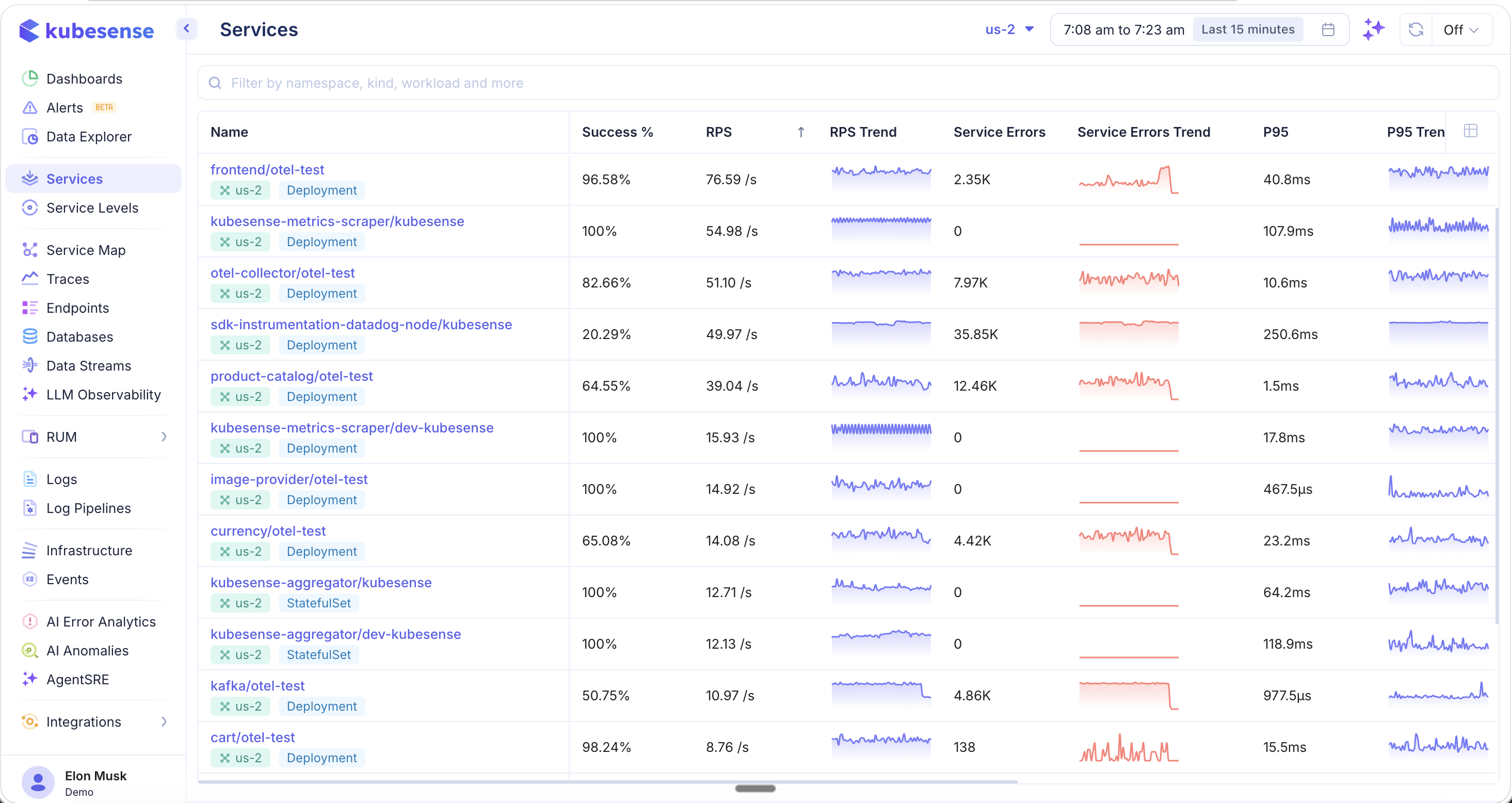
Each service row displays at-a-glance performance data:
| Column | Description |
|---|---|
| Name | Service name with namespace and workload type (e.g., Deployment) |
| Success % | Percentage of successful (non-error) requests |
| RPS | Current requests per second |
| RPS Trend | Sparkline showing request rate over the selected time window |
| Service Errors | Count of 5xx server errors |
| Error Trend | Sparkline showing error count over time |
| P95 | 95th percentile latency |
| P95 Trend | Sparkline showing P95 latency over time |
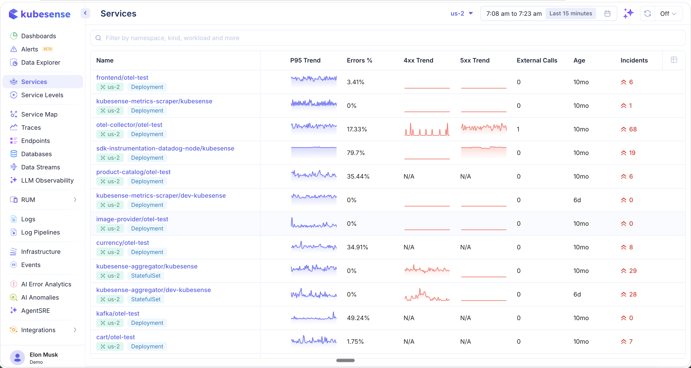
Additional Columns
Scroll right or customize your view to reveal additional metrics:
| Column | Description |
|---|---|
| Error Rate (4xx) | Client error rate for the service |
| Error Rate (5xx) | Server error rate for the service |
| External Calls | Number of outbound calls to external services |
| Age | How long the service has been running |
| Incidents | Active incident count linked to this service |
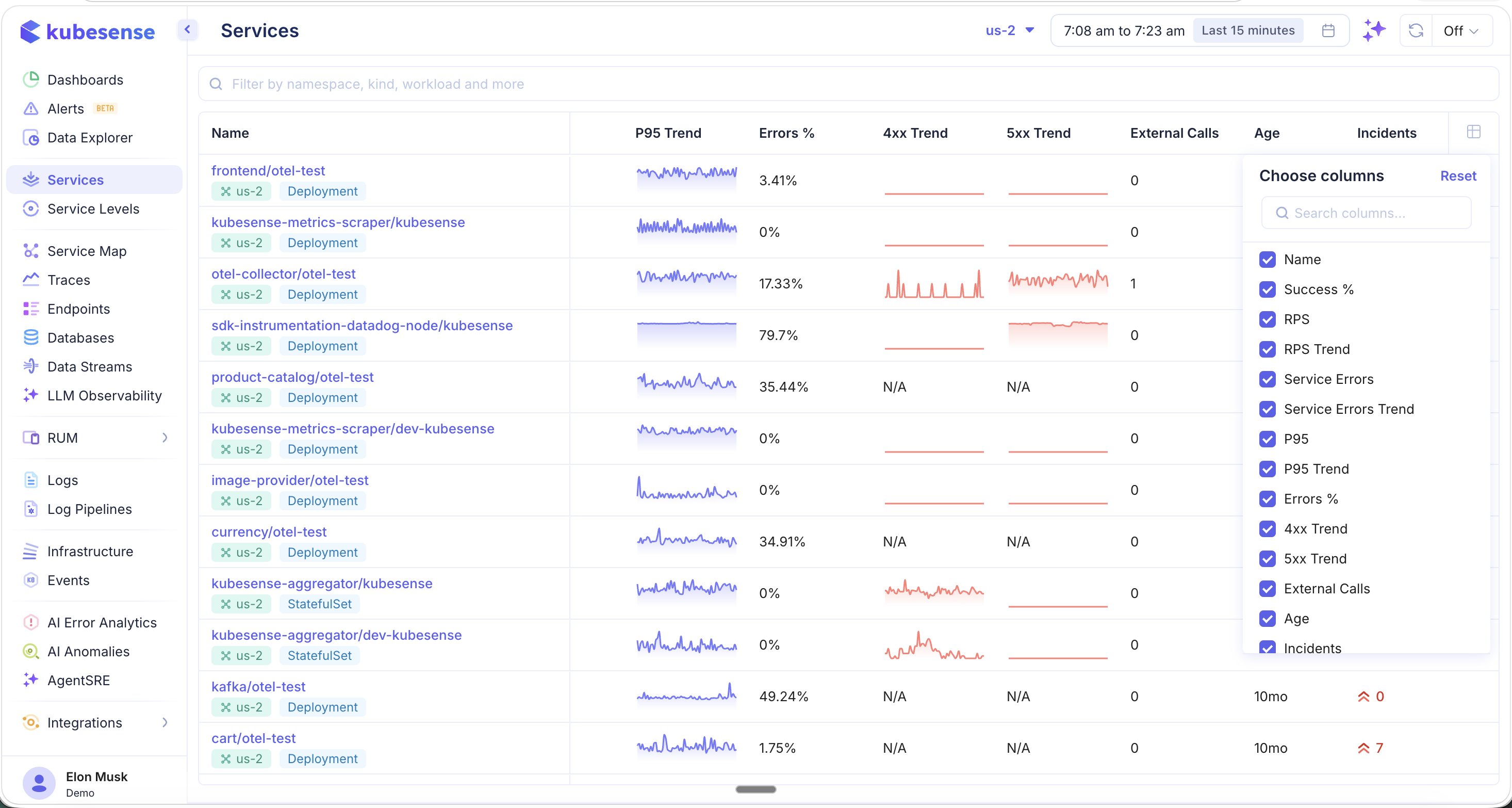
Column Picker
Click the column picker icon in the table header to customize which columns are visible. This lets you tailor the catalog view to the metrics most relevant to your team — whether you are focused on latency, error rates, or resource utilization.
Filters and Search
- Search bar — Filter by namespace, workload name, or environment type
- Cluster selector — Switch between clusters (top bar)
- Time range — Adjust the time window using the time picker (e.g., "Last 15 minutes", "Last 1 hour")
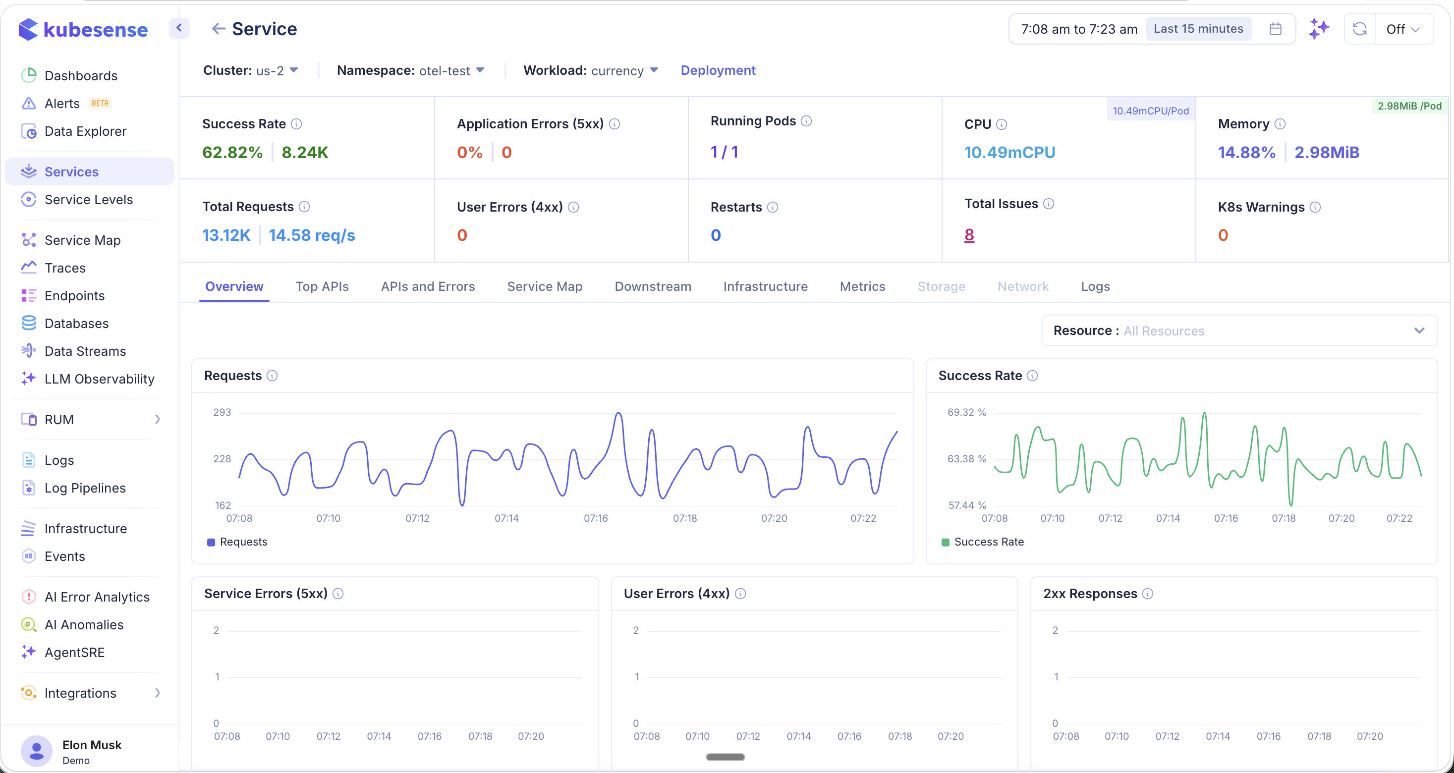
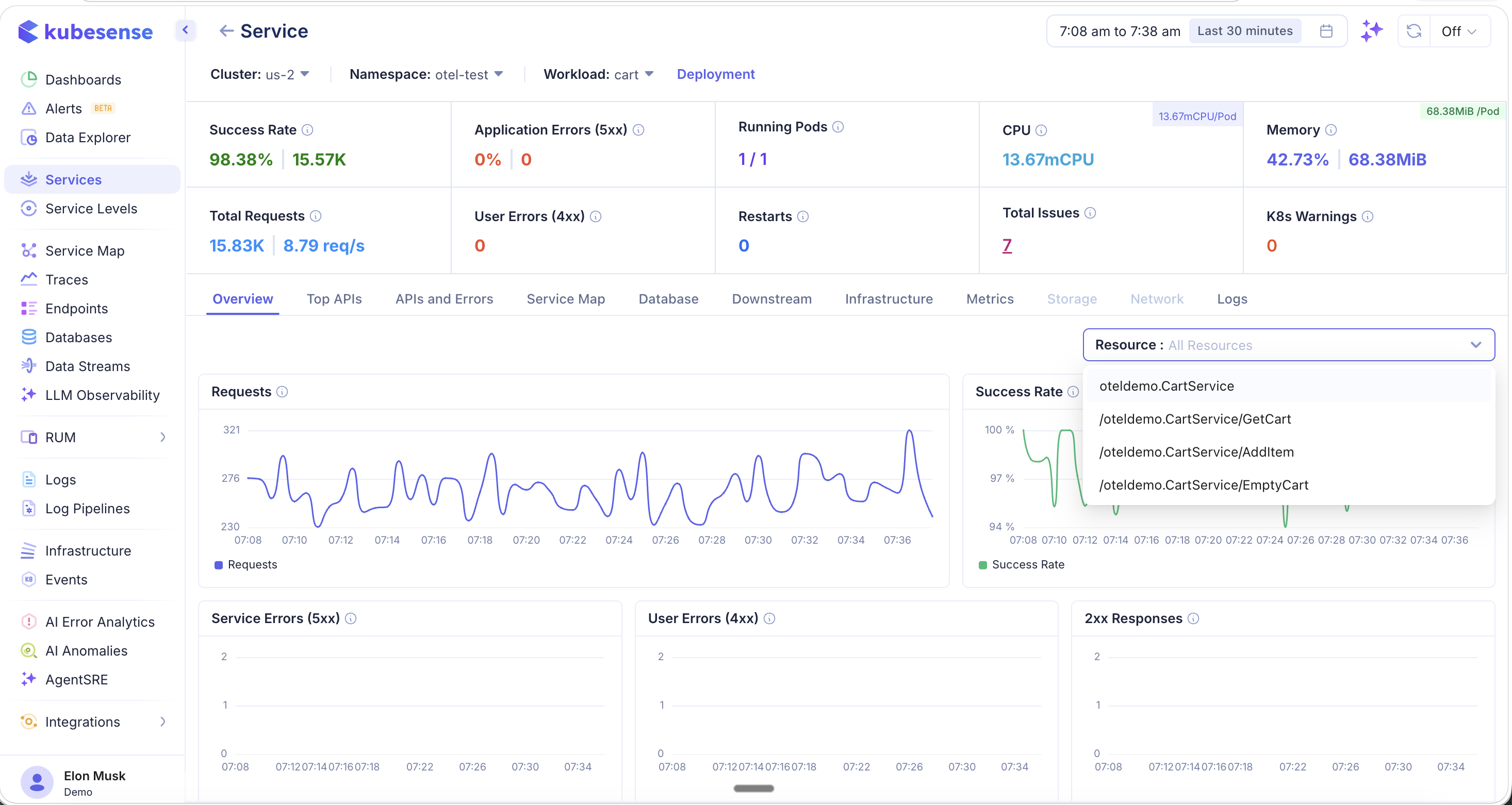
Service Detail View
Click any service row to open the Service Detail view. This page provides a comprehensive breakdown of the service's health across multiple tabs, all scoped to the selected cluster, namespace, and time range.
At the top of the detail view, you will find a summary bar showing:
- Success Rate — Overall success percentage and total successful requests
- Application Errors (5xx) — Server error percentage and count
- Running Pods — Current vs. desired pod count
- CPU — Current CPU usage (with per-pod breakdown)
- Memory — Current memory usage (with per-pod breakdown)
- Total Requests — Total request count and current RPS
- User Errors (4xx) — Client error count
- Restarts — Pod restart count
- Total Issues — Aggregate issue count
- K8s Warnings — Kubernetes warning event count
Overview
The Overview tab shows time-series dashboards for the key service metrics: request volume, success rate, 5xx errors, 4xx errors, and 2xx responses.
Resource-Level Filtering
Use the Resource dropdown to filter all dashboards by a specific endpoint or API. When you select a resource, every chart on the Overview tab updates to show metrics for that endpoint only — making it easy to isolate performance issues at the API level.
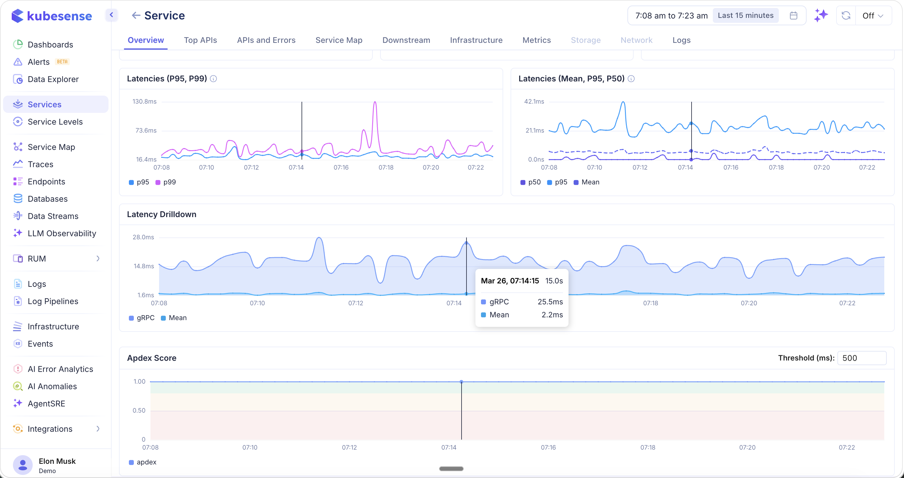
Latency Dashboards
Below the main overview charts, you will find dedicated latency dashboards including P95 and P99 latency trends, latency drill-downs by endpoint, and APDEX score tracking.
Top APIs
The Top APIs tab ranks the busiest and slowest endpoints for the service. This is essential for identifying hot paths and latency bottlenecks.
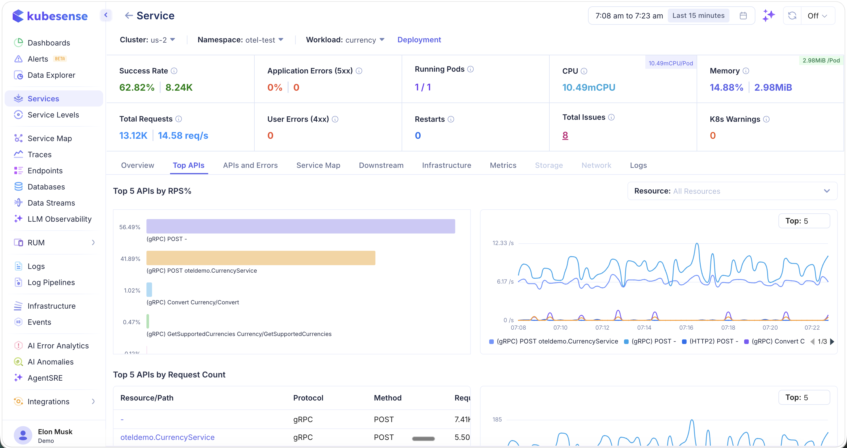
The top section shows:
- Top 5 APIs by RPS% — Which endpoints handle the most traffic (bar chart + time-series)
- Top 5 APIs by Request Count — Table with resource path, protocol, method, and request count
Scroll down to see latency-focused rankings:
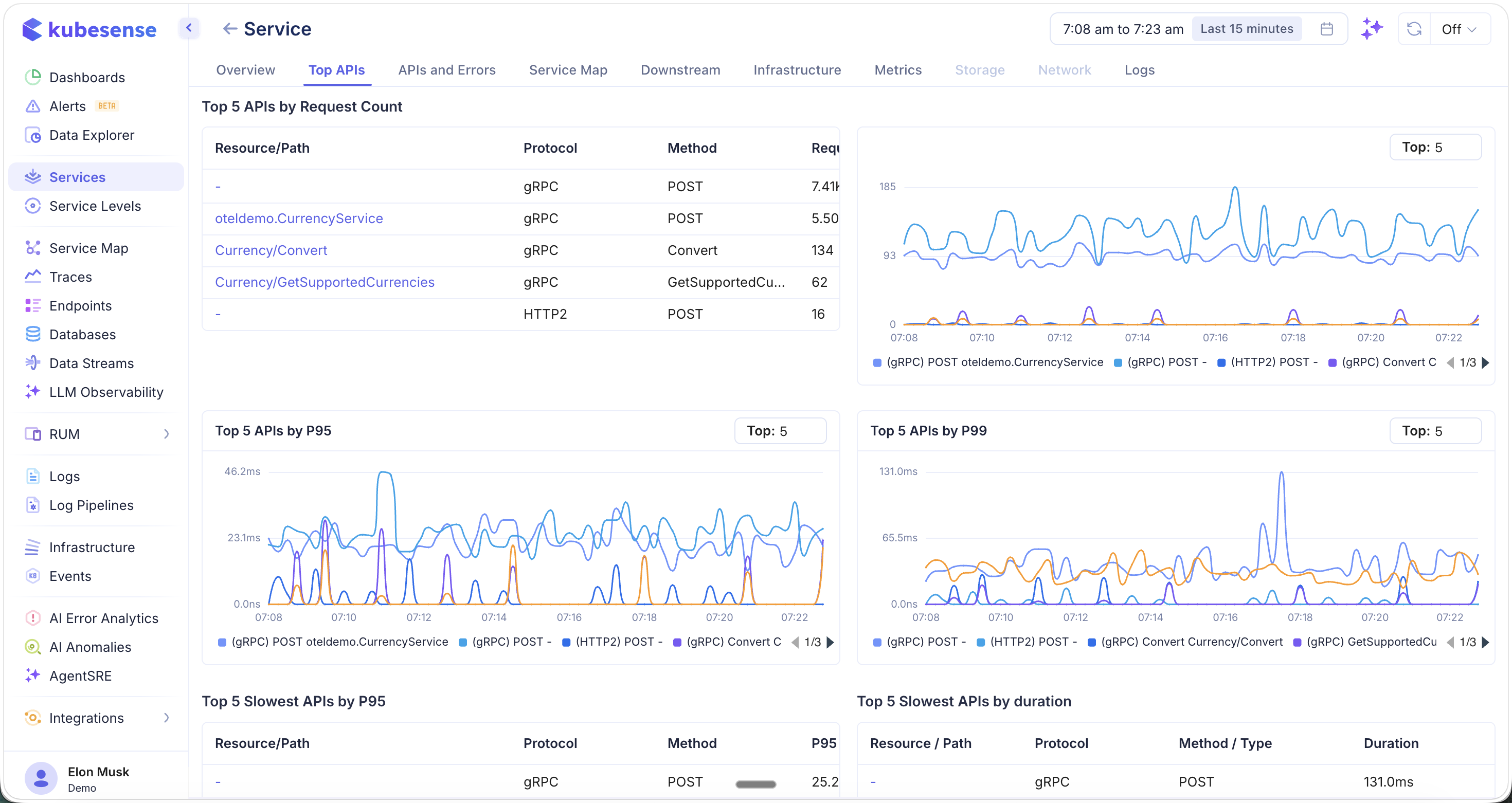
- Top 5 APIs by P95 — 95th percentile latency trends per endpoint
- Top 5 APIs by P99 — 99th percentile latency trends per endpoint
- Top 5 Slowest APIs by P95 — Table of slowest endpoints by P95
- Top 5 Slowest APIs by Duration — Table of slowest endpoints by total duration
Use the Top selector to adjust how many APIs are shown in each chart (default: Top 5).
Service Map
The Service Map tab shows the upstream and downstream topology for this service. The selected service appears in the center, with incoming callers on the left and outgoing dependencies on the right.
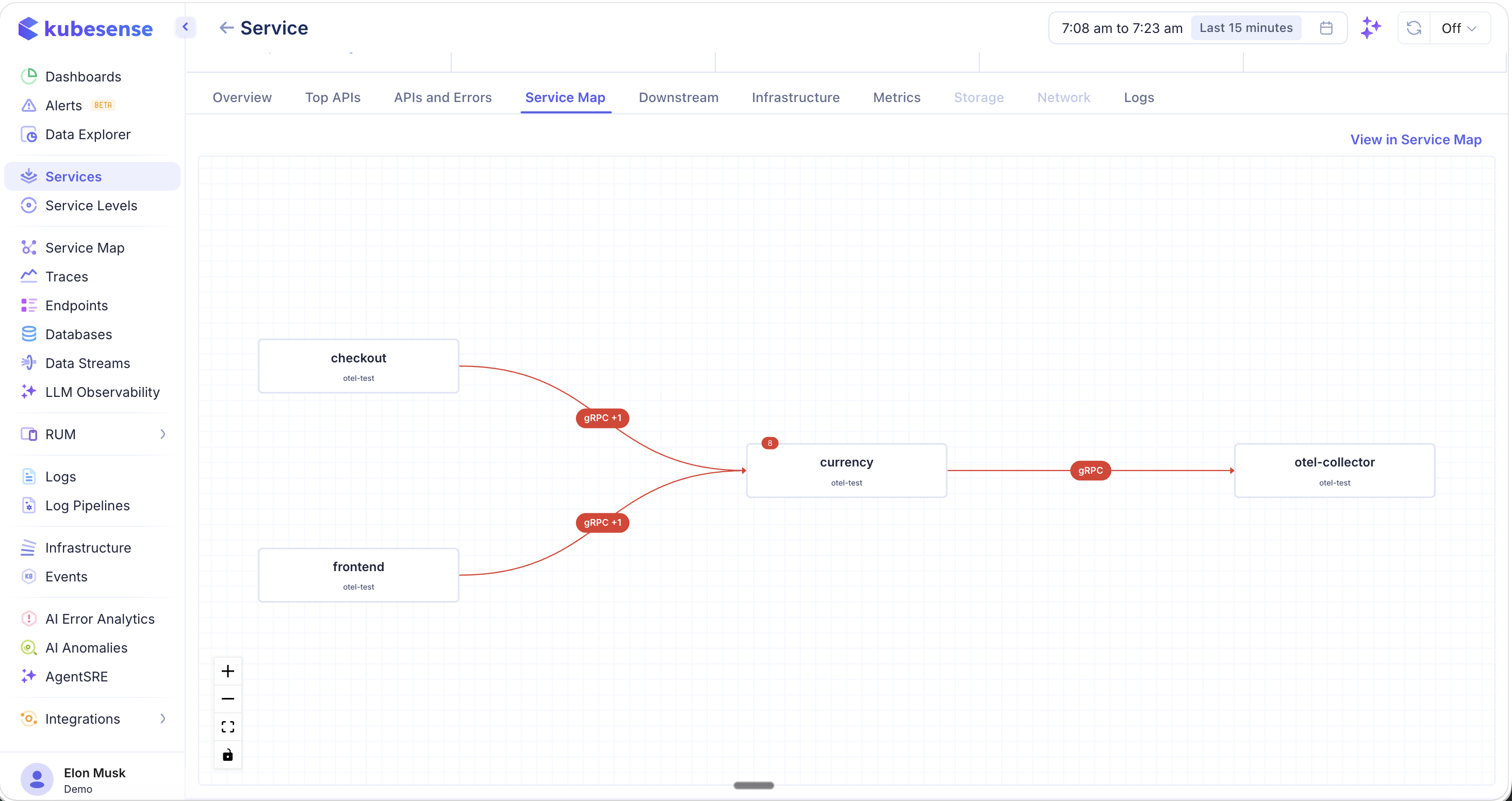
- Red lines indicate error paths — connections where errors have been detected
- Protocol badges (e.g., gRPC, HTTP2) appear on each connection
- Error badges show the count of errors on a given path
- Click "View in Service Map" to open the full-page service map for broader topology exploration
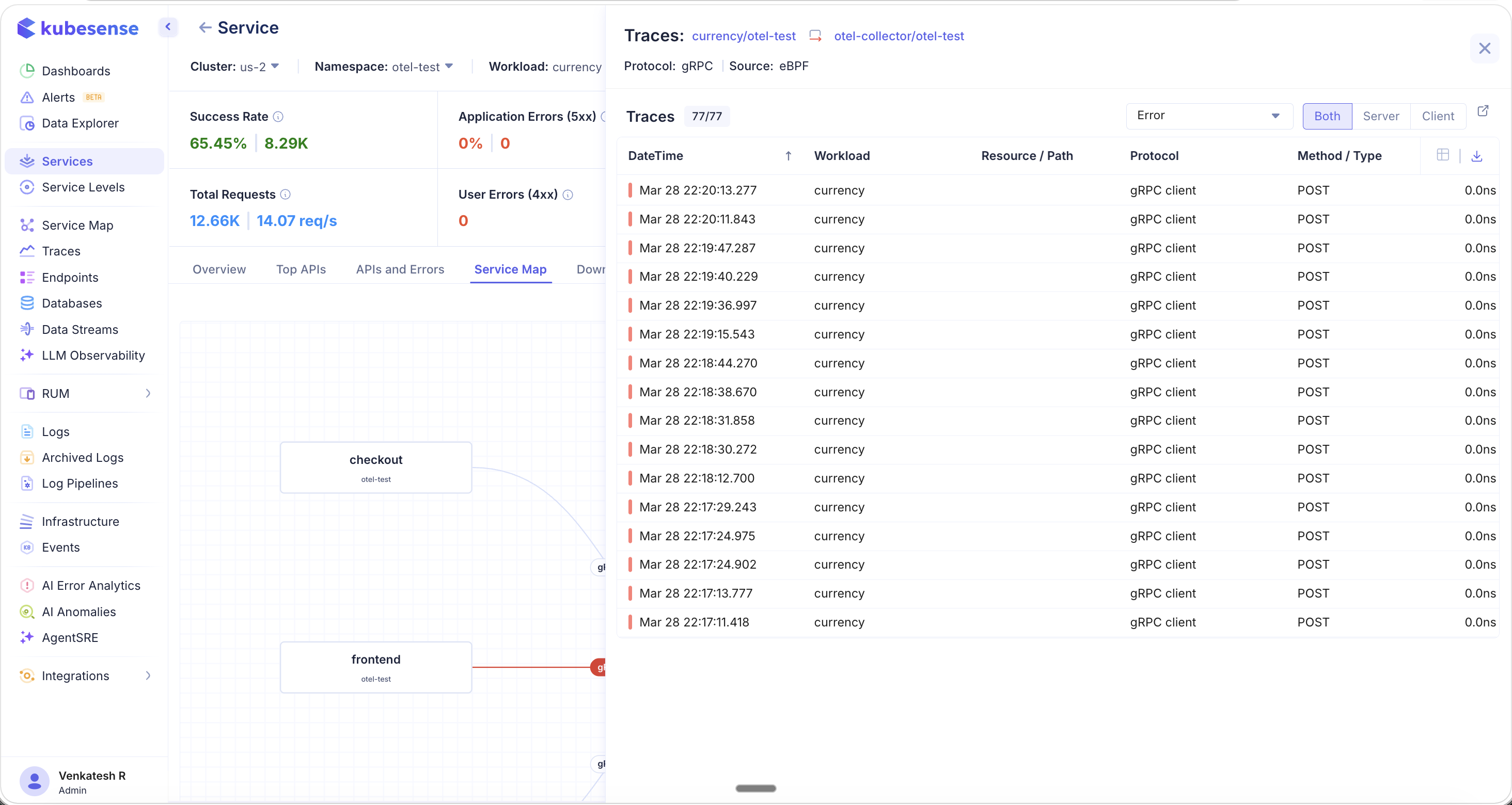
Navigating from Service Map to Traces
Click on any connection line (especially error paths) to open a Traces panel that lists all individual traces flowing through that path. The panel shows the protocol, source (eBPF or OTel), trace count, and a filterable list with timestamp, workload, resource/path, protocol, and method.
Click on any individual trace to open the Trace Detail view. This provides full end-to-end visibility into the request, including:
- Workload metrics — Request volume (OK vs. Error) and latency percentiles (P50, P95, P99)
- Container resources — CPU and memory usage with defined requests and limits
- Pod resources — Pod-level CPU and memory breakdown
- Tabs for Metrics, Logs, Errors, Headers, Container Info, and Tags
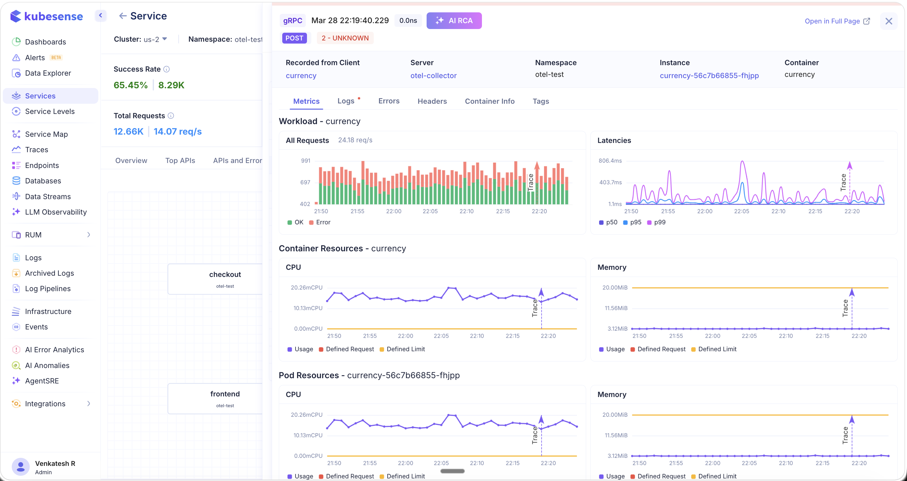
This flow — from Service Map to error path to individual trace — allows you to quickly pinpoint where bottlenecks and failures originate, and even perform root cause analysis directly from the trace detail view.
Downstream
The Downstream tab shows all services that this service calls, including third-party and external services like payment gateways or external APIs.
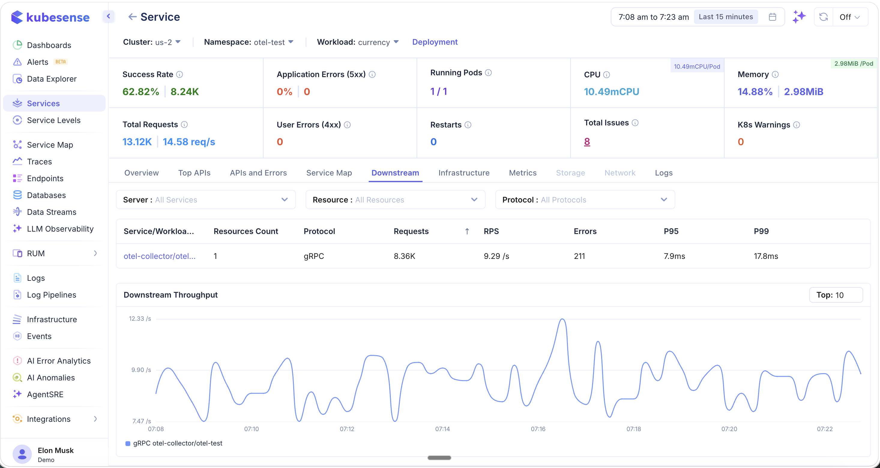
Filter downstream dependencies by:
- Server — Filter by downstream service
- Resource — Filter by specific endpoint or resource path
- Protocol — Filter by protocol type (gRPC, HTTP, HTTP2, etc.)
The table shows each downstream dependency with:
- Service/Workload name and resource count
- Protocol, total requests, RPS
- Errors, P95, and P99 latency
Below the table, the Downstream Throughput chart shows time-series request rates for each downstream service, making it easy to spot traffic spikes or dependency slowdowns.
Infrastructure
The Infrastructure tab provides a Kubernetes-native view of the service's underlying compute resources.
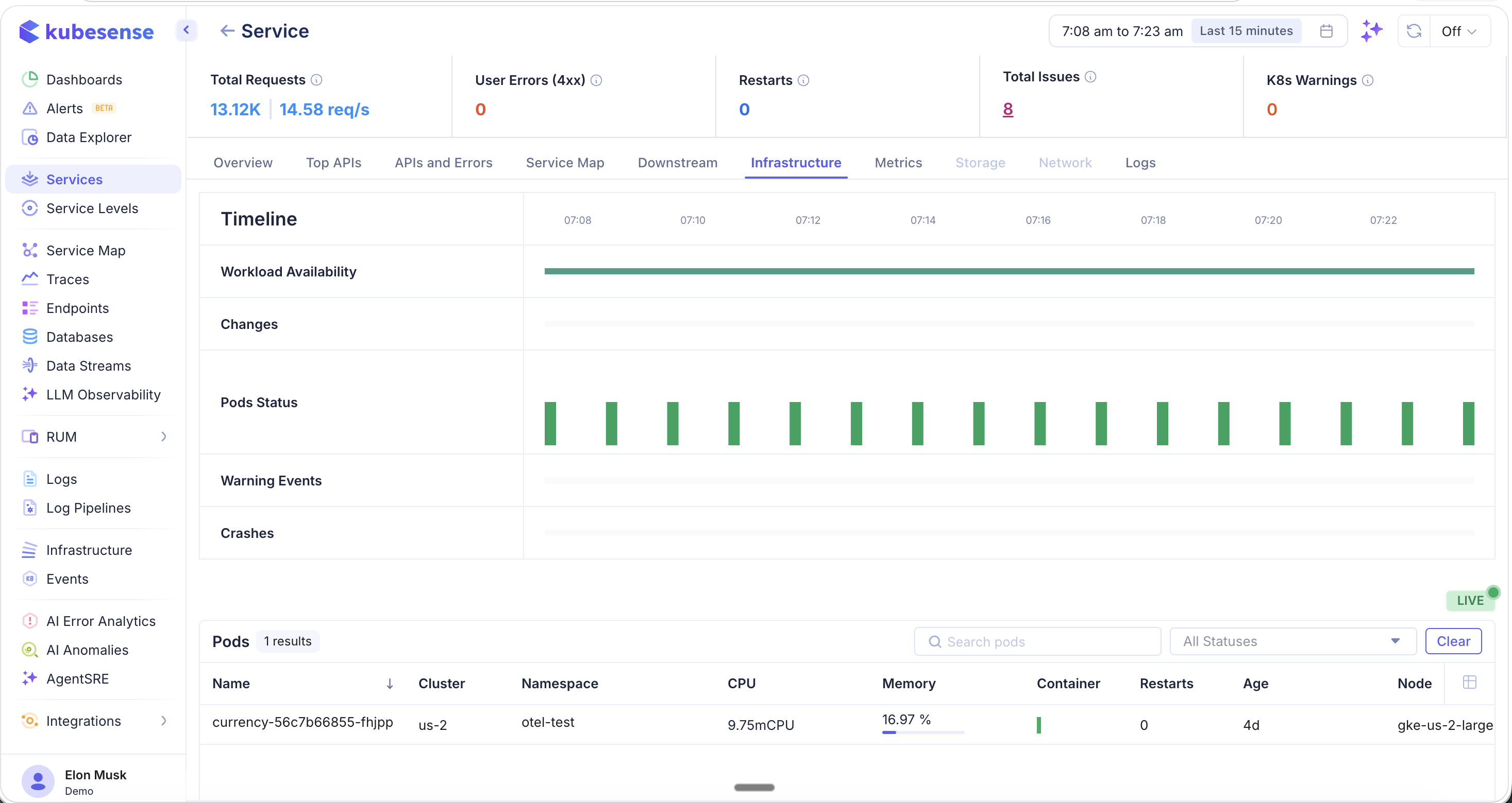
- Timeline — A visual timeline showing:
- Workload Availability — Whether the workload has been healthy over the time window
- Changes — Deployment or config changes detected
- Pods Status — Pod health over time (green = healthy)
- Warning Events — Kubernetes warning events
- Crashes — Pod crash events
- Pods table — Lists all pods running this service with name, cluster, namespace, CPU, memory, container count, restarts, age, and node
The LIVE indicator shows real-time pod status updates.
Metrics
The Metrics tab provides detailed resource utilization charts for the service's pods and nodes.
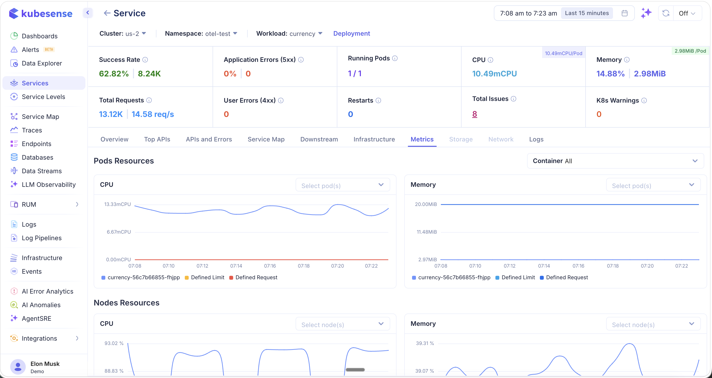
- Pod Resources — CPU and memory usage per pod, with:
- Usage (actual consumption)
- Defined Request (Kubernetes resource request)
- Defined Limit (Kubernetes resource limit)
- Node Resources — CPU and memory for the nodes running this service's pods, useful for identifying noisy neighbor issues
- Container filter — Filter metrics by specific container within the pod
Logs
The Logs tab shows all logs associated with this service, automatically filtered by namespace, workload, and environment type.
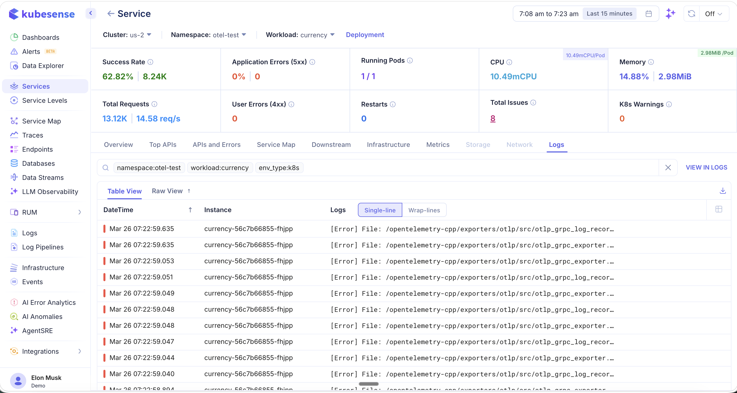
- Logs are pre-filtered with tags like
namespace:otel-test,workload:currency, andenv_type:k8s - Toggle between Table View and Raw View
- Within Table View, switch between Single-line and Wrap-lines display modes
- Click "VIEW IN LOGS" to open the full Log Explorer with the same filters applied
- Download logs using the export icon
How It Works
KubeSense uses eBPF probes attached at the kernel level to capture every network request between services. No SDK or code modification is needed — services are auto-discovered and metrics are collected in real-time.
Supported instrumentation sources include:
- eBPF — Zero-code, kernel-level instrumentation
- OpenTelemetry — SDK-based traces sent via OTLP
- Datadog Agent — Traces forwarded from Datadog-instrumented services