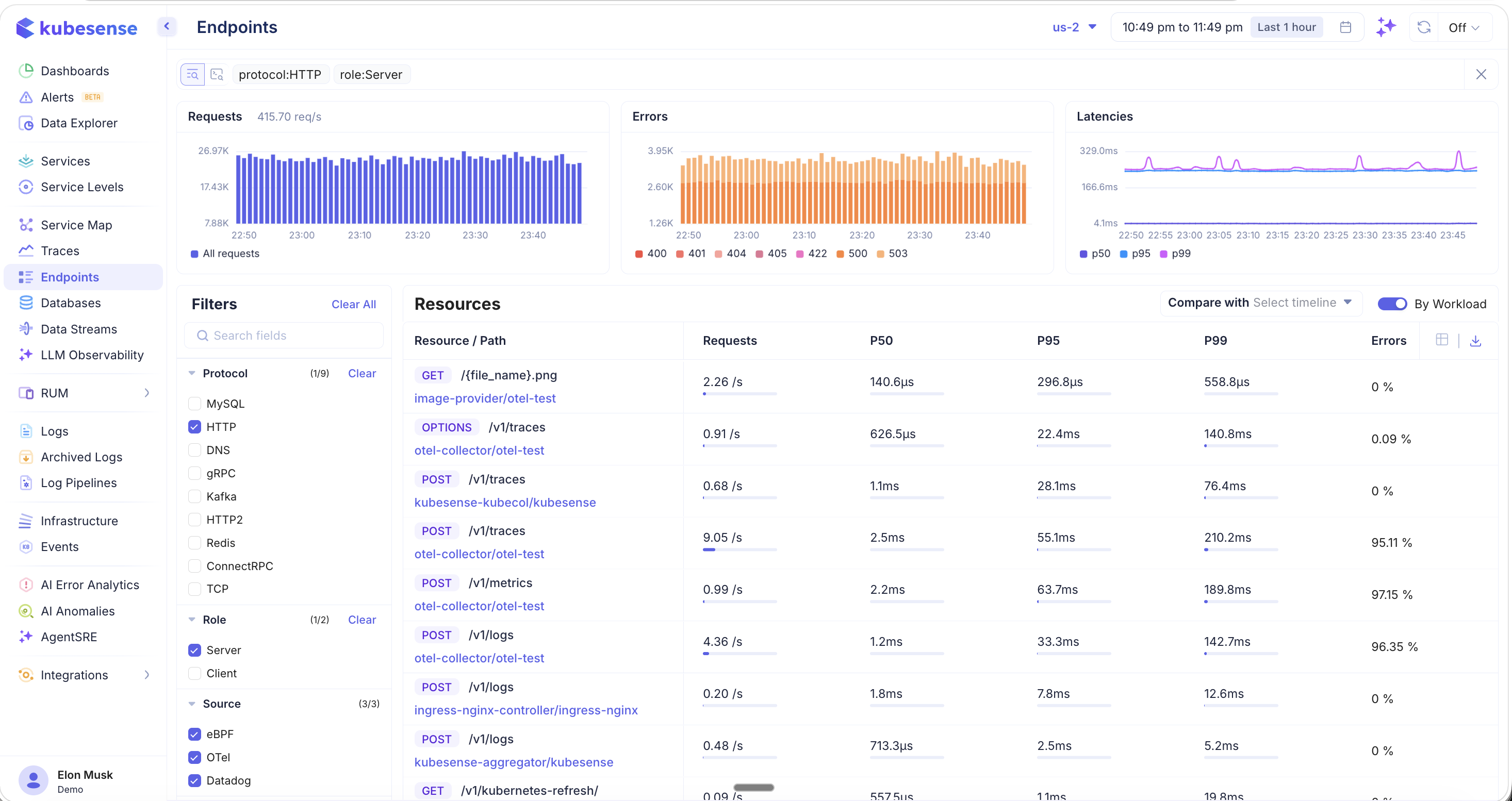
Endpoints
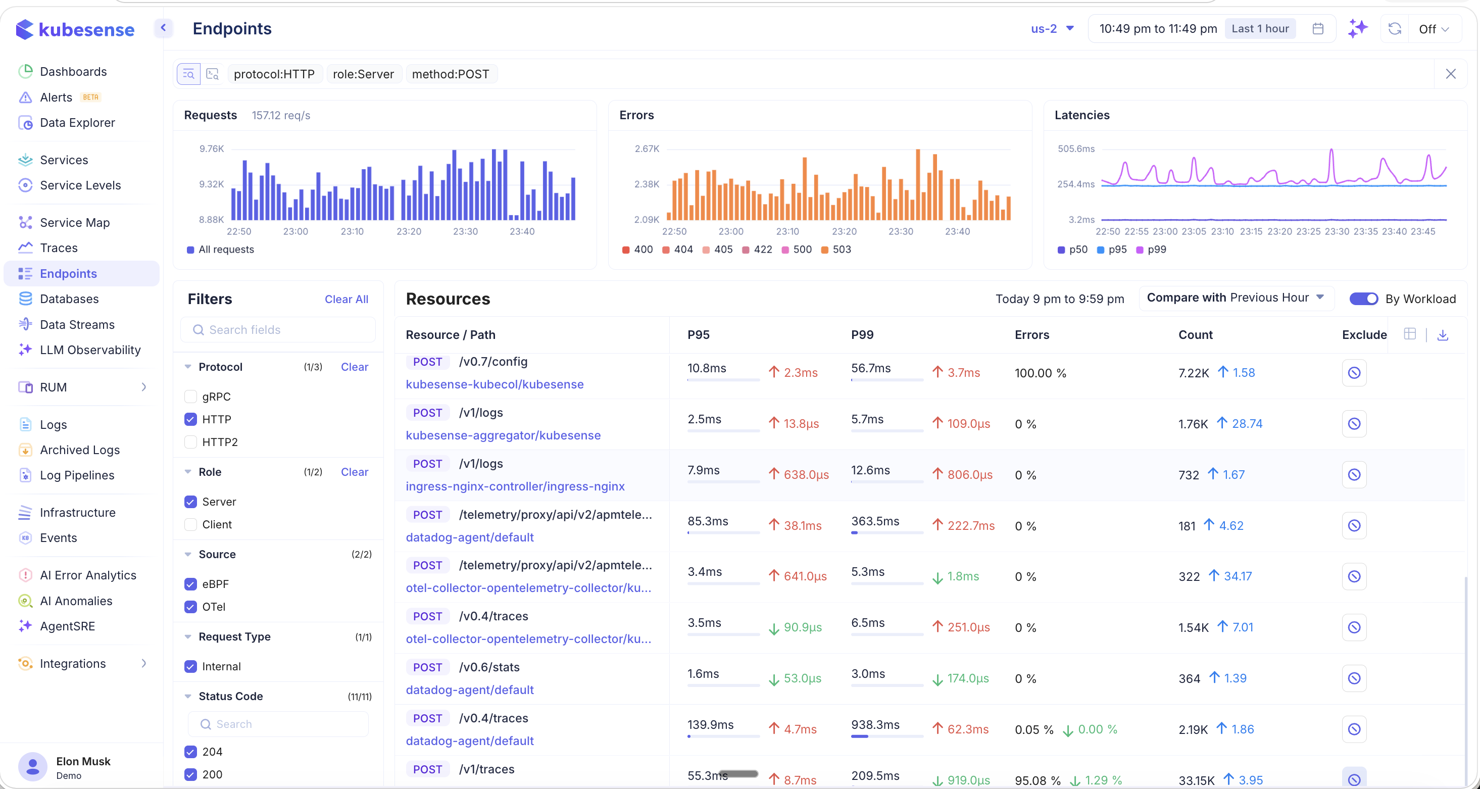
The Endpoints page aggregates performance data at the individual API endpoint level across your entire infrastructure. While the Services page shows service-level health, the Endpoints page drills down to specific Resource / Path combinations — helping you identify exactly which routes are slow, error-prone, or experiencing traffic spikes. All data is scoped to the selected cluster and time period.
Endpoint Overview
The Endpoints page displays a resource table listing every discovered endpoint with key performance metrics, along with summary charts and a comprehensive filter panel.
Summary Charts
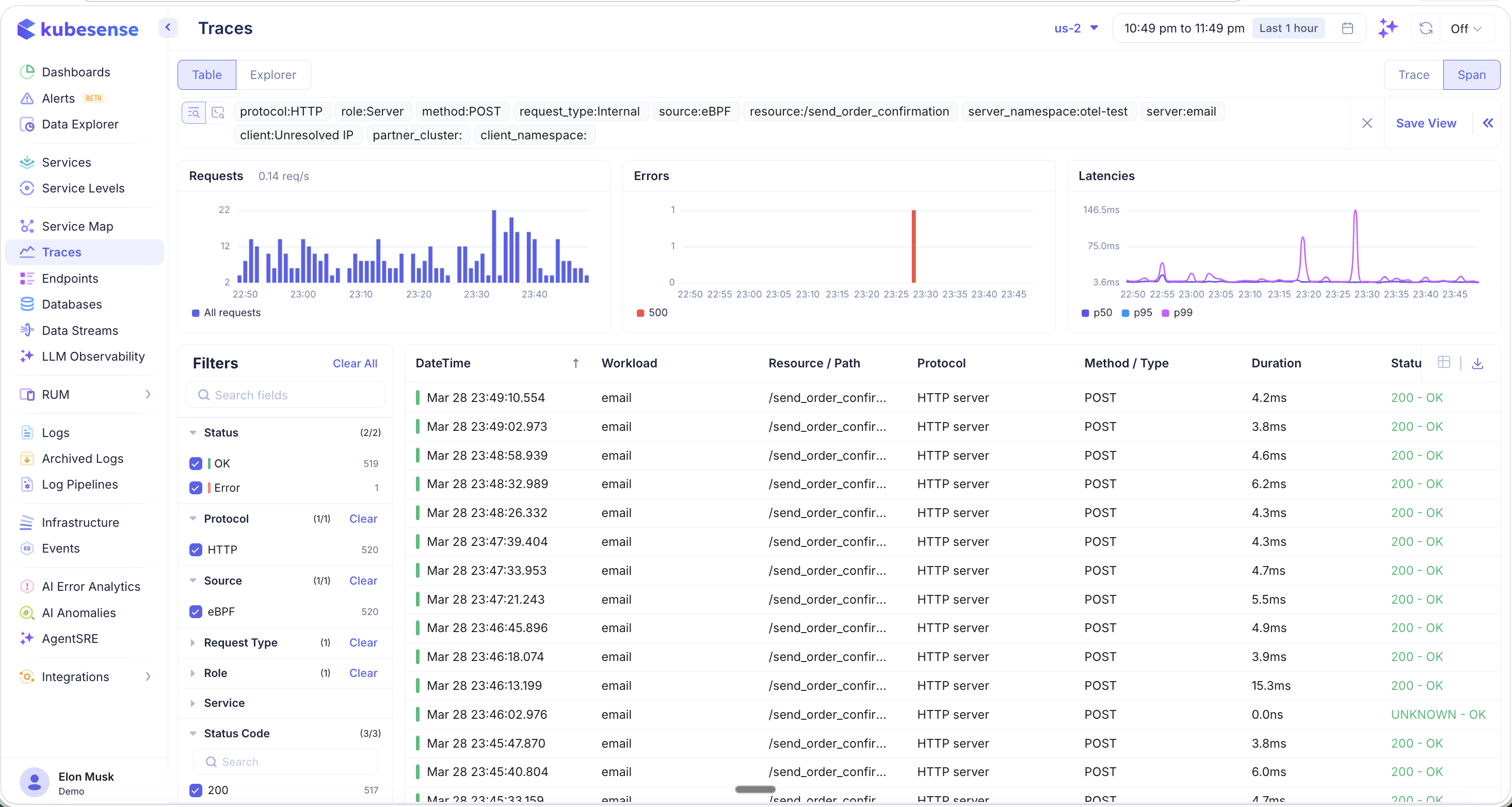
Three charts at the top provide an aggregate view of endpoint health:
- Requests — Total request throughput (req/s) over time as a bar chart
- Errors — Error volume broken down by HTTP status code (400, 404, 405, 422, 500, 503). Hover to see per-code counts.
- Latencies — Latency percentile trends (P50, P95, P99) over time
Resources Table
The main table lists each endpoint with:
| Column | Description |
|---|---|
| Resource / Path | HTTP method badge (GET, POST, PUT, OPTIONS) and URL path |
| Workload/Namespace | The service and namespace serving this endpoint (when "By Workload" is enabled) |
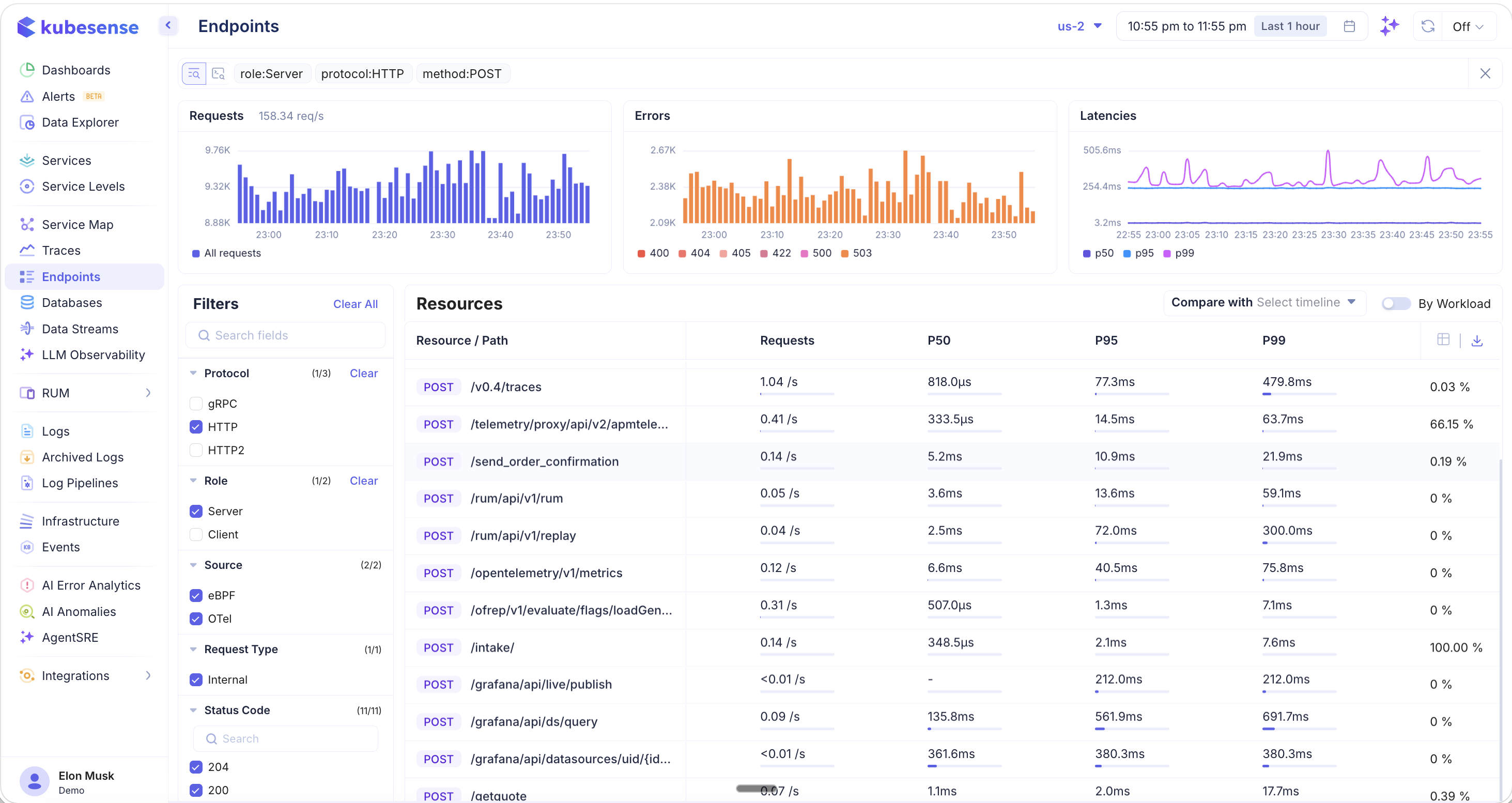
| Requests | Current requests per second |
| P50 | 50th percentile (median) latency |
| P95 | 95th percentile latency |
| P99 | 99th percentile latency |
| Errors | Error rate percentage |
You can scroll and snap on any of the summary charts to zoom into a specific time range — the resource table updates to show metrics for that selected period.
Filters
The left-hand filter panel provides extensive faceted filtering to narrow down endpoints:
Protocol
Filter by communication protocol (e.g., MySQL, HTTP, DNS, gRPC, Kafka, HTTP2, Redis, ConnectRPC, TCP). Each protocol shows its endpoint count.
Method
Filter endpoints by HTTP method:
- GET, POST, PUT, OPTIONS
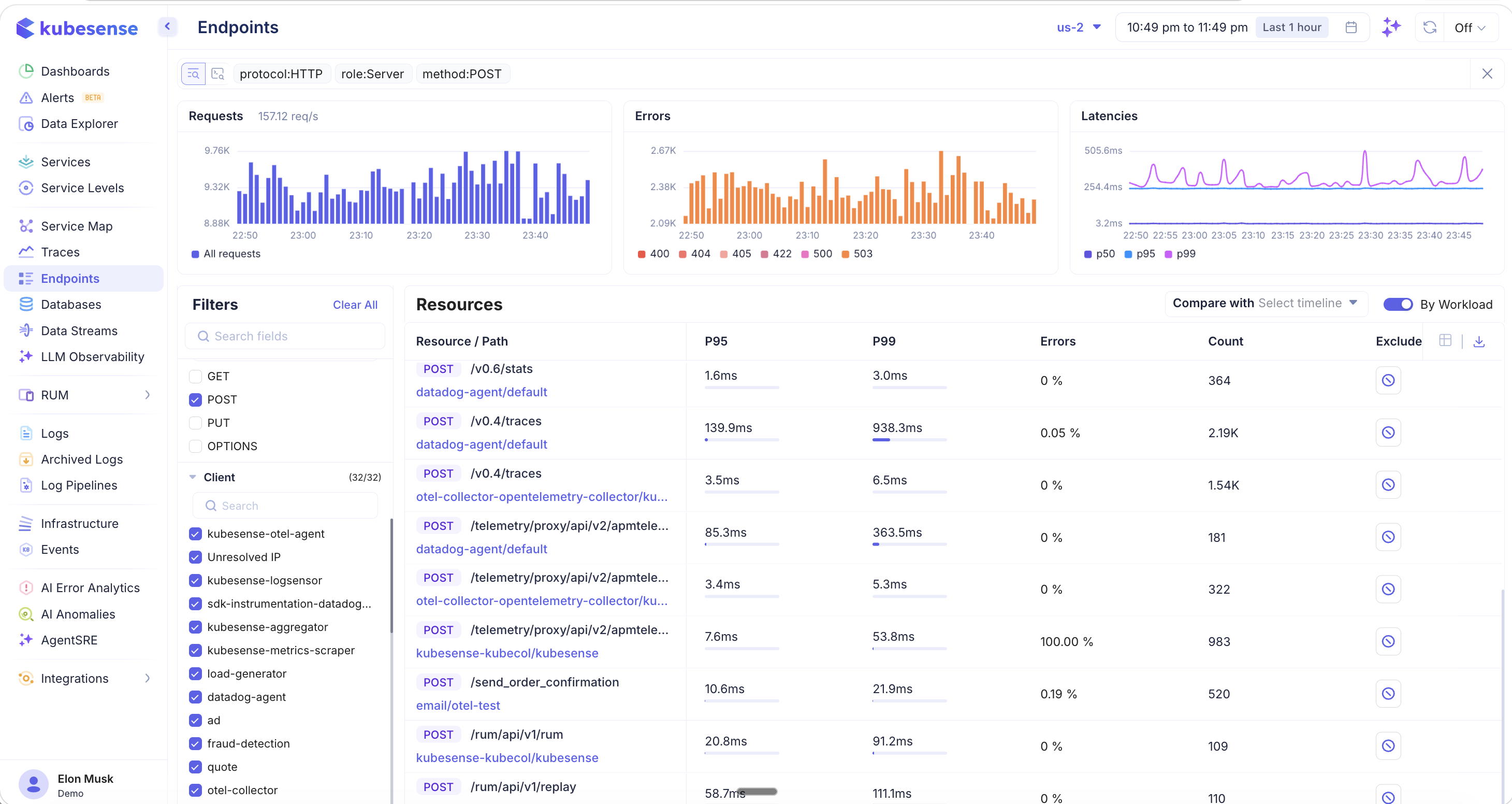
When you apply a method filter (e.g., POST), the table updates to show additional columns like Count (total requests) and an Exclude button per endpoint. The Exclude option lets you hide noisy endpoints like health checks or internal polling from the view.
Additional Filters
- Role — Server or Client
- Source — eBPF, OTel, Datadog
- Request Type — Internal, External
- Client — Filter by the calling service (e.g., kubesense-otel-agent, load-generator, datadog-agent)
- Status Code — Filter by specific HTTP status codes (204, 200, 500, 503, 404, UNKNOWN, 202, 400, 422, 308)
Grouping: By Workload vs. By Endpoint
Toggle the By Workload switch in the top-right corner to control how endpoints are grouped:
- By Workload ON — Each endpoint row includes the workload/namespace that serves it, so the same path may appear multiple times if multiple services handle it
- By Workload OFF — Endpoints are grouped purely by resource path, aggregating metrics across all workloads
This view is useful when you want to see the overall performance of a path like /v0.4/traces regardless of which workload is serving it.
Comparing with Previous Periods
Use the Compare with dropdown to compare current endpoint metrics against a previous time period:
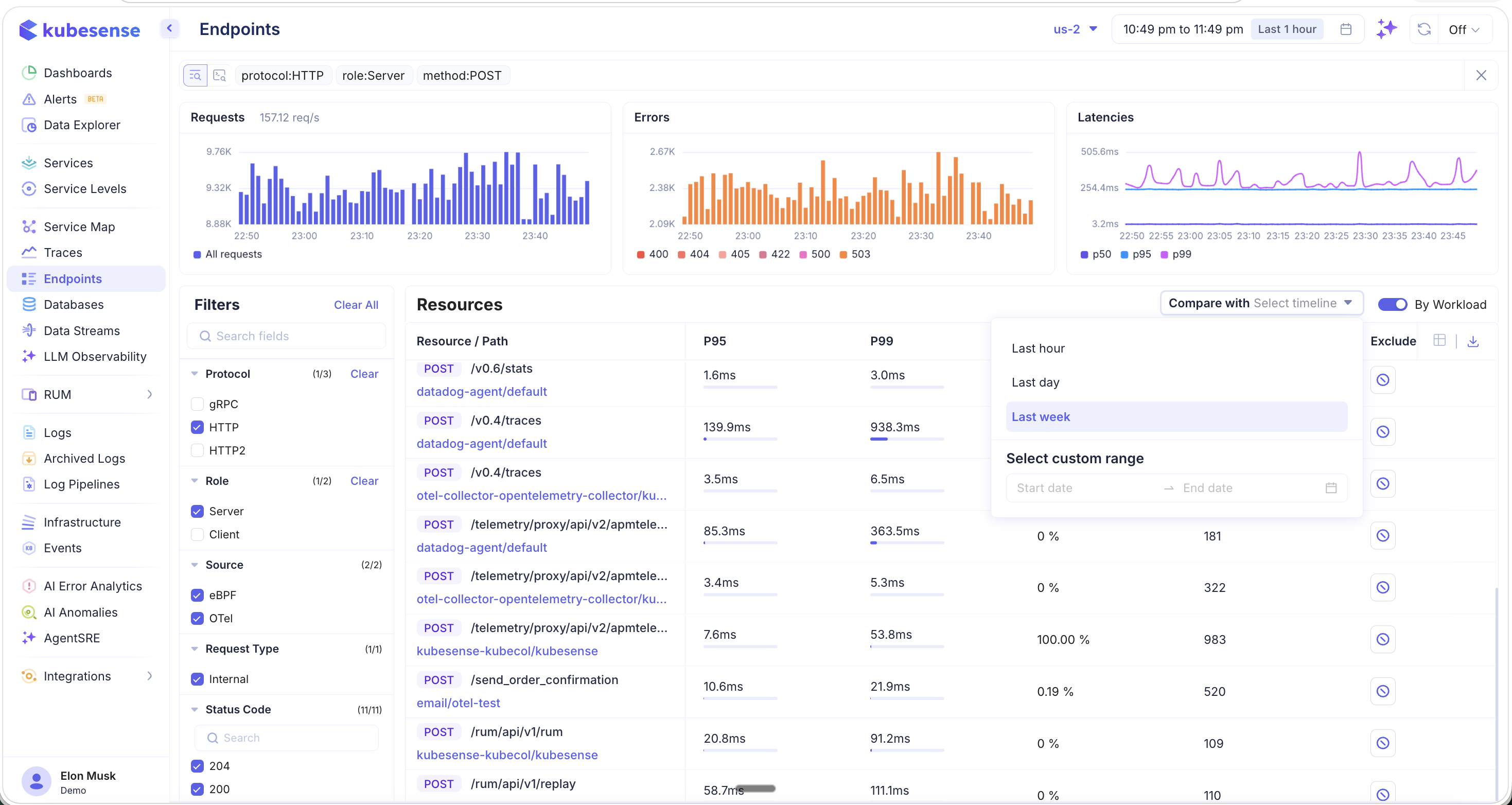
Available comparison options:
- Last hour — Compare with the previous hour
- Last day — Compare with the same hour yesterday
- Last week — Compare with the same hour last week
- Select custom range — Pick a specific start and end date for comparison
Variance Indicators
When comparison is active, each metric column displays variance indicators showing how performance has changed:
- Green up/down arrows — Metric improved (e.g., latency decreased or count increased)
- Red up/down arrows — Metric degraded (e.g., latency increased or error rate went up)
- Delta values — The exact change amount (e.g., ↑ 2.3ms, ↓ 3.7ms, ↑ 1.58x)
This makes it easy to spot regressions after deployments or validate that performance improvements are taking effect.
Auto-Refresh
Click the refresh icon in the top-right corner to configure auto-refresh for live monitoring:
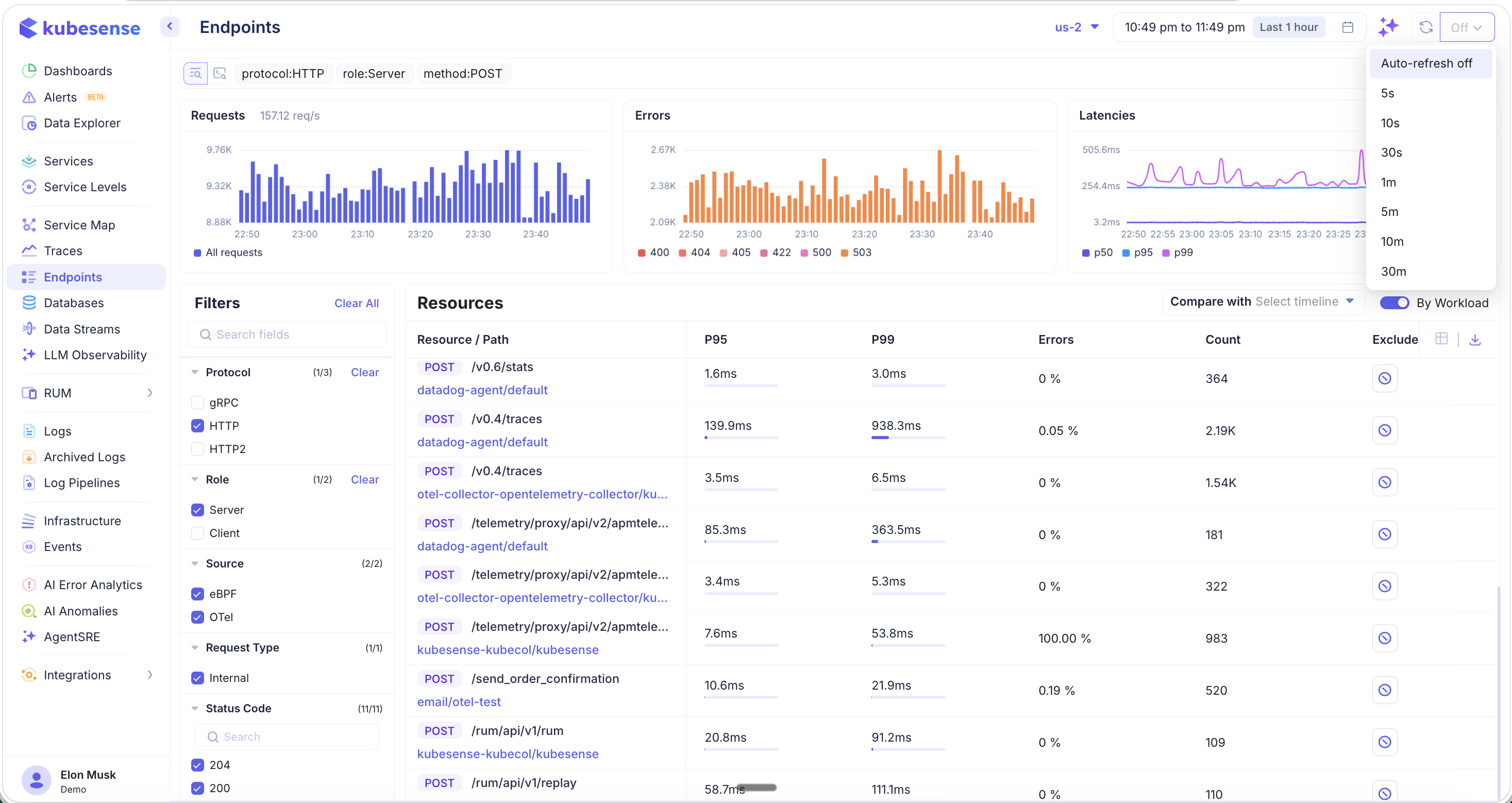
Available intervals:
- Auto-refresh off (default)
- 5s, 10s, 30s, 1m, 5m, 10m, 30m
This is useful when you are actively monitoring endpoint performance during a deployment, incident, or load test.
Column Picker
Click the column picker icon in the table header to choose which columns are visible:
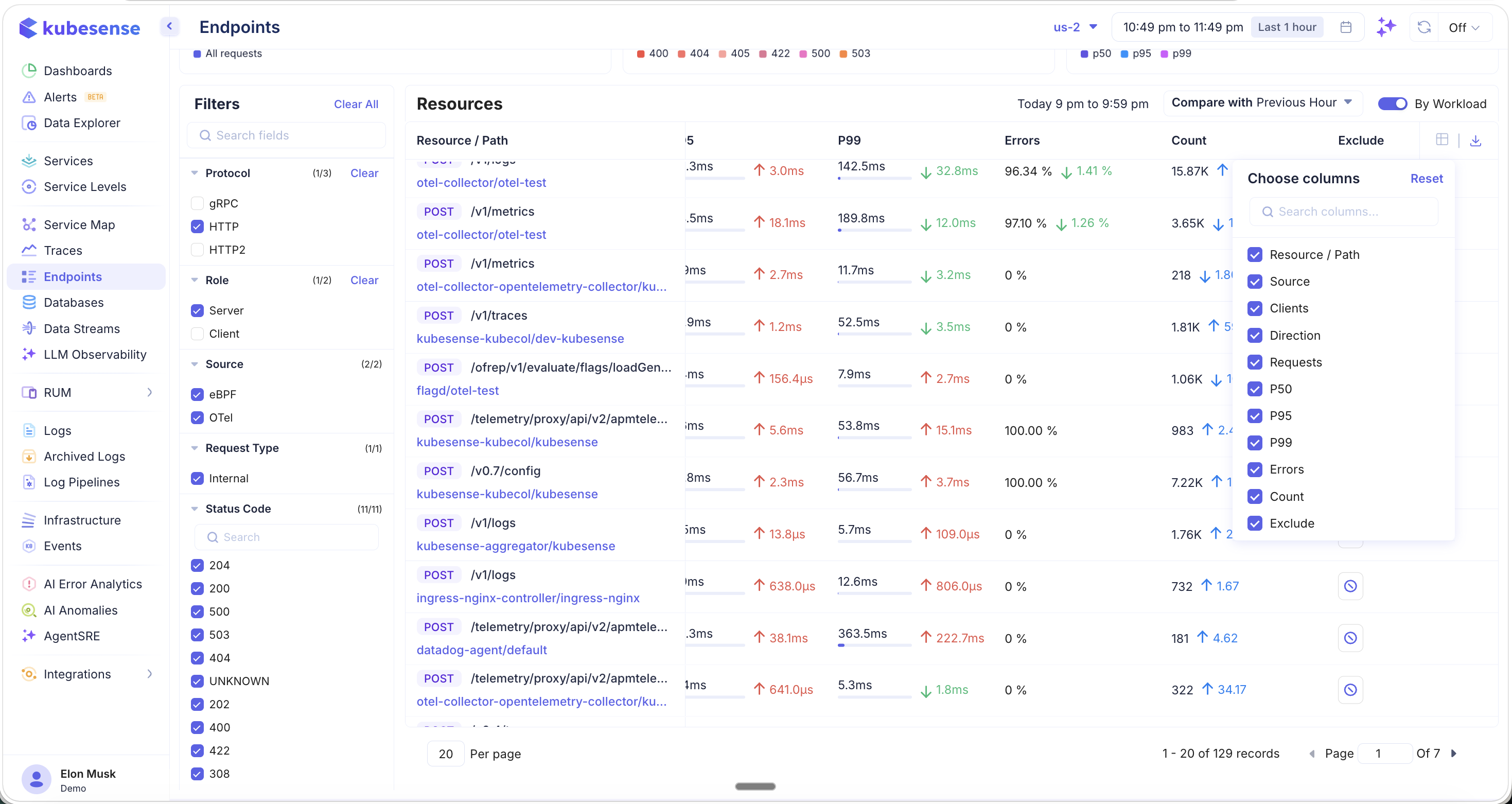
Available columns:
- Resource / Path, Source, Clients, Direction, Requests, P50, P95, P99, Errors, Count, Exclude
Use the Reset button to restore the default column configuration.
Exporting Endpoint Data
Click the download icon to export endpoint metrics:
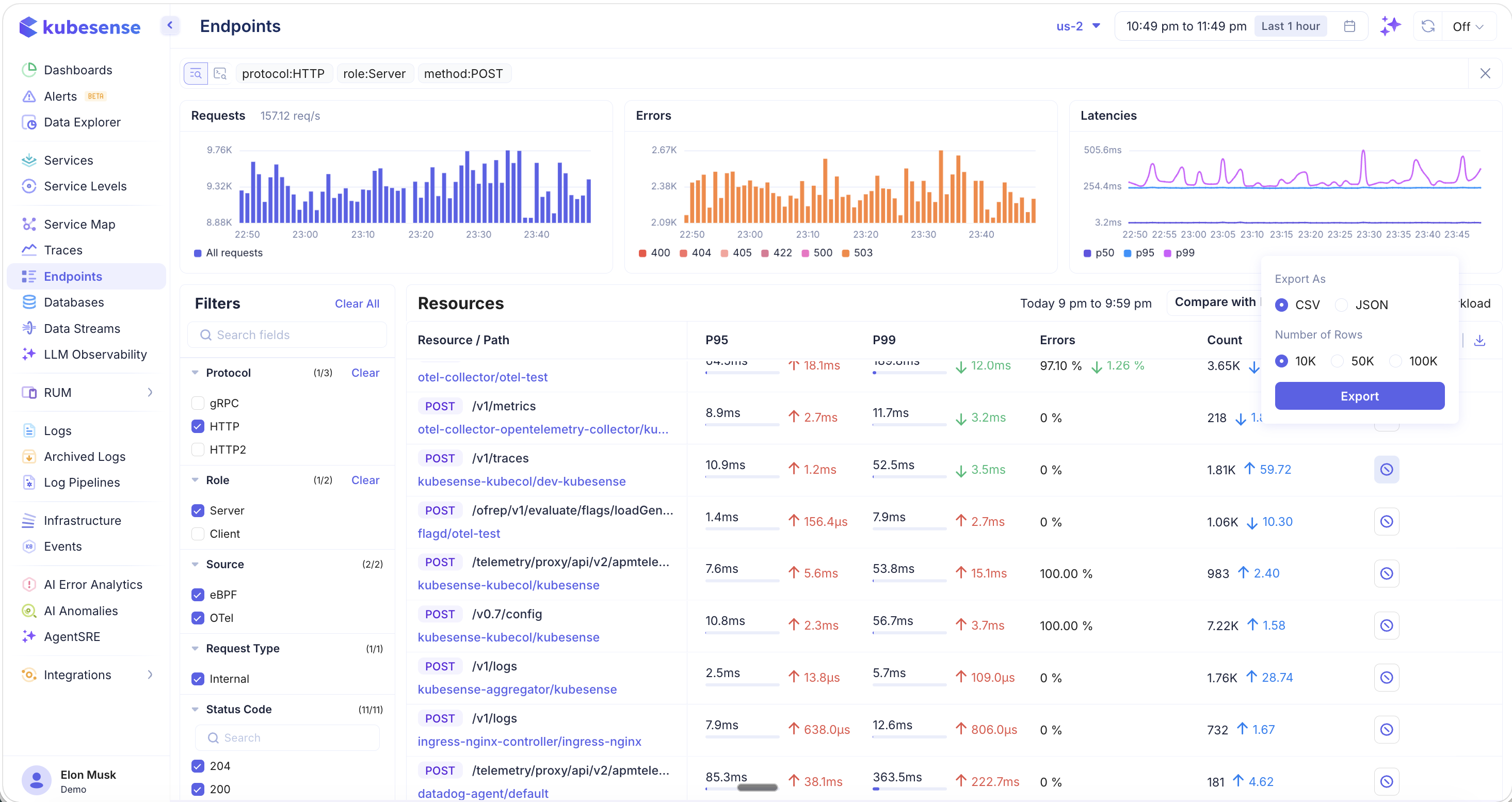
- Format — CSV or JSON
- Number of Rows — 10K, 50K, or 100K rows
Exported data respects your current filters, making it useful for offline analysis, reporting, or sharing with team members.
Drilling into Traces
Click on any endpoint row to navigate directly to the Traces page, pre-filtered to show only the raw traces for that specific endpoint:
All relevant filters are automatically applied — protocol, role, method, source, resource path, server namespace, server name, and client. From here, you can:
- Browse individual traces and spans for this endpoint
- Analyze the error and latency distribution
- Click into any trace to see the full waterfall, flamegraph, metrics, and logs
- Save the filtered view for future monitoring
Use Cases
- Identify slow endpoints — Sort by P95 or P99 to find which API routes have the highest latency
- Error hotspots — Filter by error rate to discover which endpoints are generating the most failures
- Regression detection — Use the comparison feature to spot performance changes after deployments
- Traffic analysis — Sort by Requests or Count to understand which endpoints receive the most traffic
- Exclude noise — Use the Exclude button to hide health checks, readiness probes, and other non-business endpoints from the view
- Live monitoring — Enable auto-refresh during incidents or deployments to watch endpoint performance in real time