
Overview
The LLM Monitoring > Overview dashboard summarizes the health and usage of the selected LLM application for the current time range.
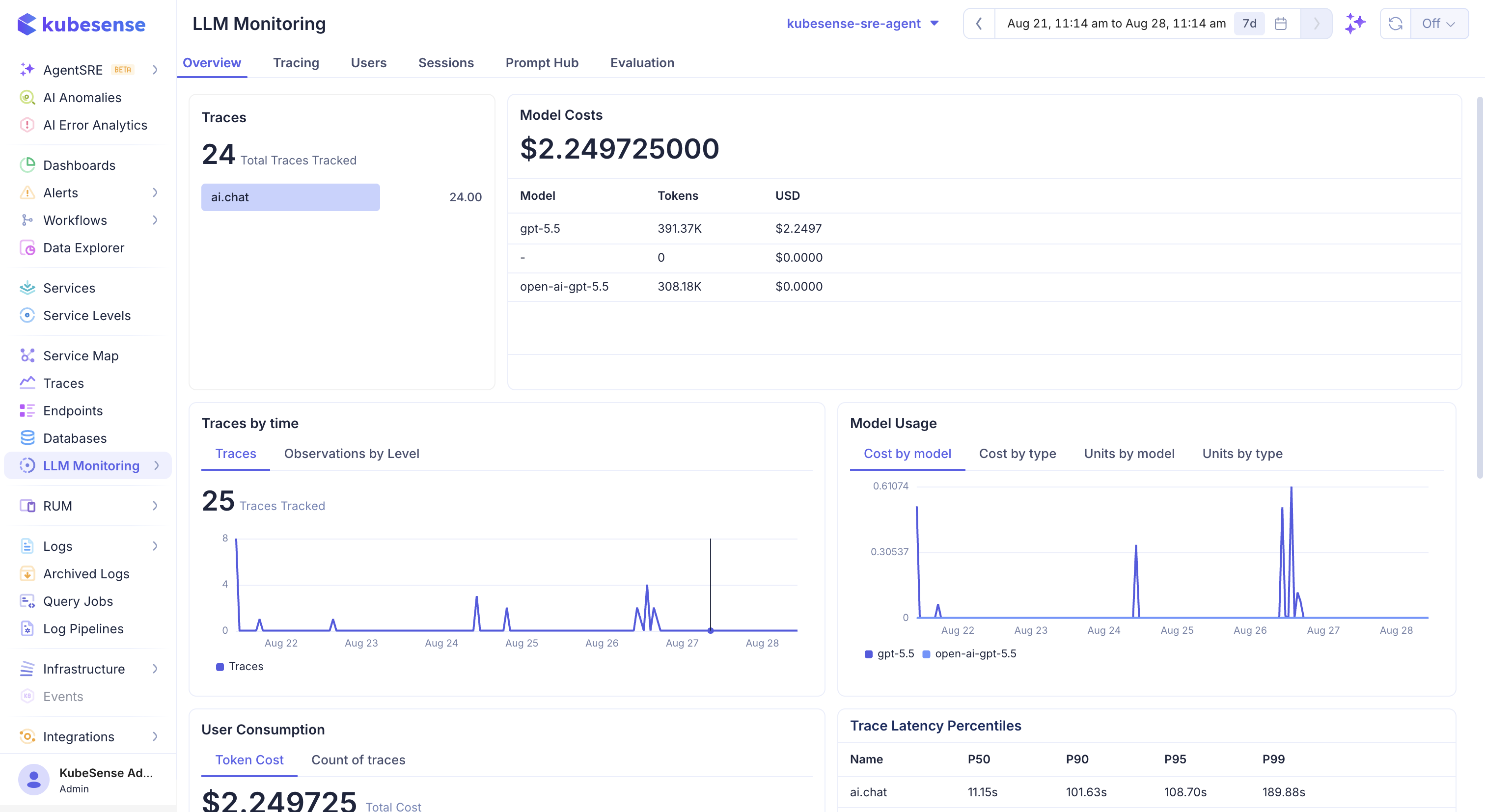
The overview begins with the main application and time-range context, followed by summary cards for trace activity, model usage, latency, and cost. Use these cards to identify a change in traffic or spend before drilling into individual traces.
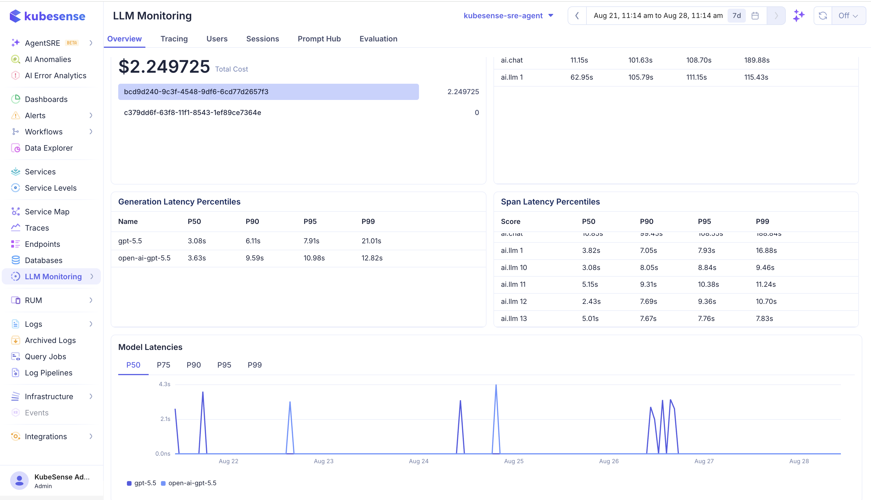
The charts show how traces, model usage, users, and latency change over time. Use the application selector and global time range together: comparing different applications or different windows can make normal workload changes look like regressions.
Dashboard panels
Traces
The Traces panel displays the total number of tracked traces in the selected application and time range. The breakdown below the total groups trace activity by operation name, such as ai.chat. Use this panel to answer:
- How many requests were received?
- Which operation is generating the traffic?
- Did traffic increase or decrease during the selected period?
A trace represents a complete tracked workflow. It may contain several observations, including generations, retrieval operations, and tool calls, so trace count is not the same as the number of model calls.
Model Costs
The Model Costs panel shows the total estimated USD cost for the selected period and a model-level breakdown. Each row includes the model name, token usage, and calculated cost. Rows with a dash or $0.0000 indicate that the span had no recognized model or no cost that could be calculated from the available usage data.
The total is calculated from SDK-reported cost when available. Otherwise, KubeSense uses the model registry and token usage to estimate input, output, cached, reasoning, audio, and image costs. A model can therefore appear in the table even when its cost is zero.
Traces by time
The Traces by time chart plots request volume across the selected time range. Use the tabs to switch between:
- Traces: Number of tracked traces in each time bucket.
- Observations by Level: Distribution of observations by their severity or observation level.
Spikes identify periods that deserve a closer look in Tracing. A flat line can mean there was no traffic, the application filter is too narrow, or the SDK did not export its buffered spans.
Model Usage
The Model Usage panel provides four views of usage data:
| View | Meaning |
|---|---|
| Cost by model | Estimated spend for each model over time |
| Cost by type | Spend grouped by operation or usage type |
| Units by model | Token or media units consumed by each model |
| Units by type | Units grouped by operation or usage type |
Use Cost by model to find the largest contributor to spend. Use Units by model when comparing models with different prices, because a model with fewer requests can still consume more tokens.
User Consumption
The User Consumption panel groups cost and traffic by user_id. Switch between Token Cost and Count of traces to distinguish expensive users from high-volume users. A user with many traces is not necessarily the user with the highest cost; prompt length, completion length, model choice, and cached usage all affect spend.
Trace Latency Percentiles
The Trace Latency Percentiles table reports the duration distribution for each operation or trace name. It includes P50, P90, P95, and P99 values:
| Percentile | Interpretation |
|---|---|
| P50 | Typical request duration; half of requests are faster |
| P90 | Tail latency affecting the slowest ten percent |
| P95 | Tail latency affecting the slowest five percent |
| P99 | Extreme tail latency affecting the slowest one percent |
For example, a much higher P99 than P50 means most requests are healthy but a small number are very slow. Investigate those requests in Tracing rather than relying on the average alone.
Generation Latency Percentiles
The Generation Latency Percentiles table isolates model-generation duration and compares models such as gpt-5.5 and open-ai-gpt-5.5. Use it to compare provider or model response performance independently from retrieval, tool, and application spans.
Span Latency Percentiles
The Span Latency Percentiles table covers individual span names, including application operations such as ai.chat and other LLM workflow steps. Compare this table with Generation Latency to determine whether the delay comes from the model or from work around the model call.
Model Latencies
The Model Latencies chart compares model response latency over time. Use the P50, P75, P90, P95, and P99 tabs to change the percentile plotted on the chart. The model legend lets you compare multiple models in the same time window.
When the lines diverge, check whether the models received similar workloads and prompt sizes. A model comparison is meaningful only when the application, environment, time range, operation, and sampling behavior are comparable.
Dashboard sections
| Section | What it shows |
|---|---|
| Traces and model costs | Trace volume and estimated spend |
| Traces by time and model usage | Request activity over time and model distribution |
| User consumption and trace latency | Consumption and latency grouped by user |
| Generation and span latency | Latency for model generations and other spans |
| Model latencies | Latency comparison across models |
Use the global time range and application selector to keep the dashboard focused on one workload. Select a model, user, or time-series point to continue into the corresponding trace or detail view.
Dashboard navigation
The LLM area is organized into the following views:
| View | Purpose |
|---|---|
| Overview | Monitor traffic, latency, model usage, and cost |
| Traces | Inspect individual traces, generations, inputs, outputs, and errors |
| Users | Compare usage and performance by user or tenant |
| Sessions | Follow multi-turn conversations and agent runs |
| Prompt Hub | Manage prompt versions and test them in the playground |
| Evaluation | Score production traces, run experiments, and review annotations |
The dashboard is read from ingested LLM spans. If it is empty, first verify that the application ID is present in the exported resource attributes and that the SDK flushed its pending batch.
Cost calculation
KubeSense uses costs reported by the SDK when present. When a span contains token usage but no cost, kubecol resolves the model in its pricing registry and calculates input, output, cache, reasoning, audio, and image costs. Unknown models remain visible with zero calculated cost until pricing is available.
Useful dimensions
Use application ID, service name, environment, model, provider, user ID, and session ID to compare workloads. Kubernetes context such as cluster, namespace, pod, workload, and region is attached automatically when the application runs in Kubernetes.
Reading the dashboard
Start with trace volume and cost to identify changes in demand. Compare those values with model usage before interpreting latency: a change in model mix can change both spend and response time even when request volume is stable.
Use the latency sections to separate generation latency from the rest of the trace. High span latency with normal generation latency usually points to retrieval, tool execution, serialization, or application code. High generation latency can indicate provider load, a larger prompt, a different model, or streaming behavior.
Cost interpretation
Costs are estimates based on provider pricing and the usage reported by each span. They can be incomplete when a provider does not return token counts, when the model name is not recognized, or when the SDK omits cache and reasoning usage. Compare cost trends using the same time range, model, and environment filters.
Suggested investigation workflow
- Select the affected LLM application and time range.
- Compare trace volume, error rate, latency, and cost with the previous period.
- Break down the change by provider and model.
- Open representative traces from the affected model or time window.
- Inspect prompt size, token usage, retrieval spans, tools, and status messages.
- Add a score or annotation when the issue is related to response quality.