Explorer View
Switch to the Explorer tab to enter a visual exploration mode for building aggregations, charts, and dashboards directly from your log data. The Explorer view is designed for trend analysis, capacity planning, and building reusable visualizations.
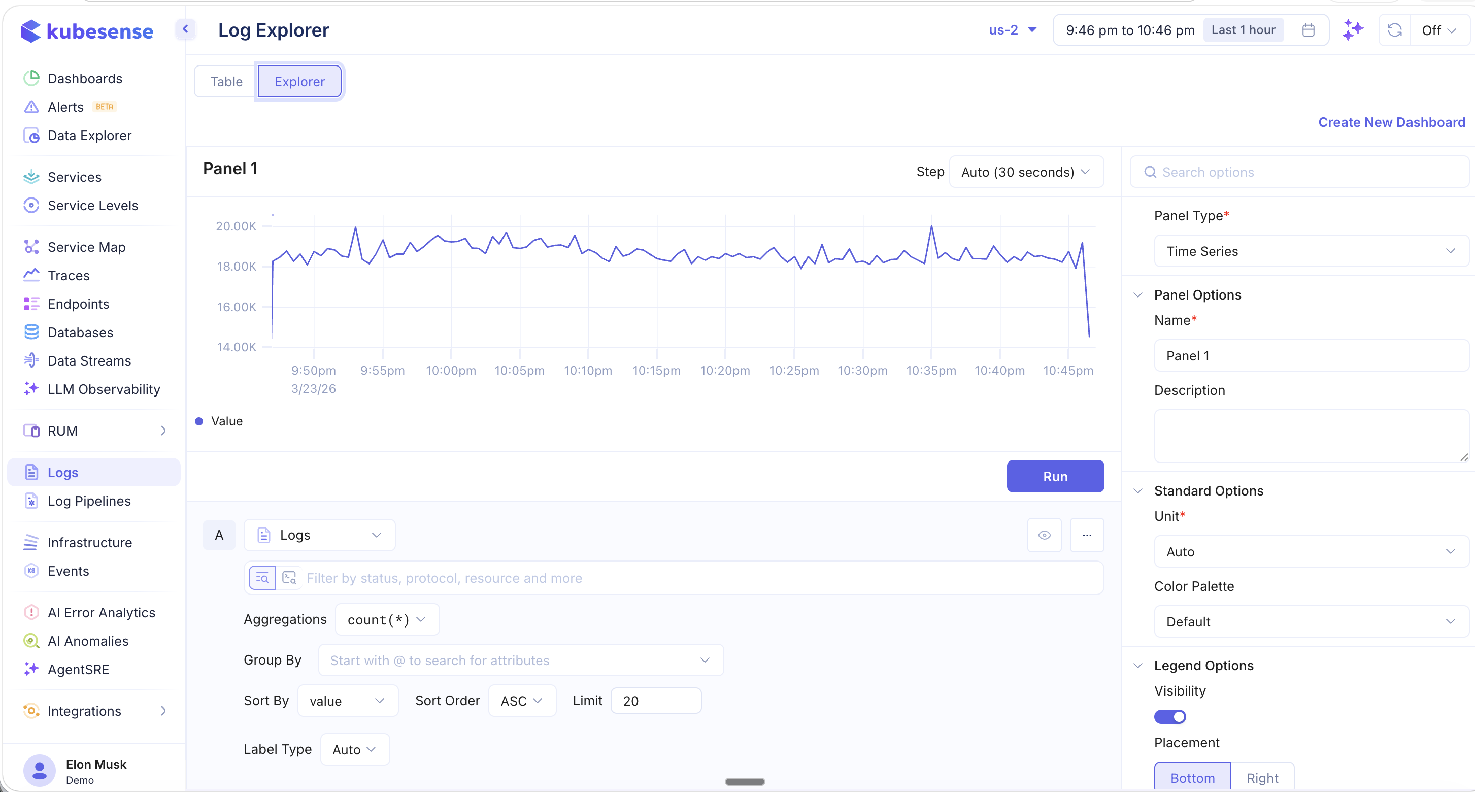
Time Series Panel
The Explorer view starts with a time-series panel that plots log counts over time. You can configure:
- Step — The time bucket size (e.g., Auto 30 seconds)
- Aggregations — Choose from
count(*),sum(),avg(), and other aggregation functions - Group By — Group results by any attribute (e.g.,
@workload,@namespace,@node) - Sort By / Sort Order — Control the ordering of results
- Limit — Cap the number of groups displayed
- Label Type — Control how labels appear in the chart
Panel Types
The right sidebar lets you change the Panel Type to different visualization formats:
| Panel Type | Description |
|---|---|
| Time Series | Line or area chart showing values over time |
| Top List | Horizontal bar chart ranking items by count or value |
| Table | Tabular display of aggregated results |
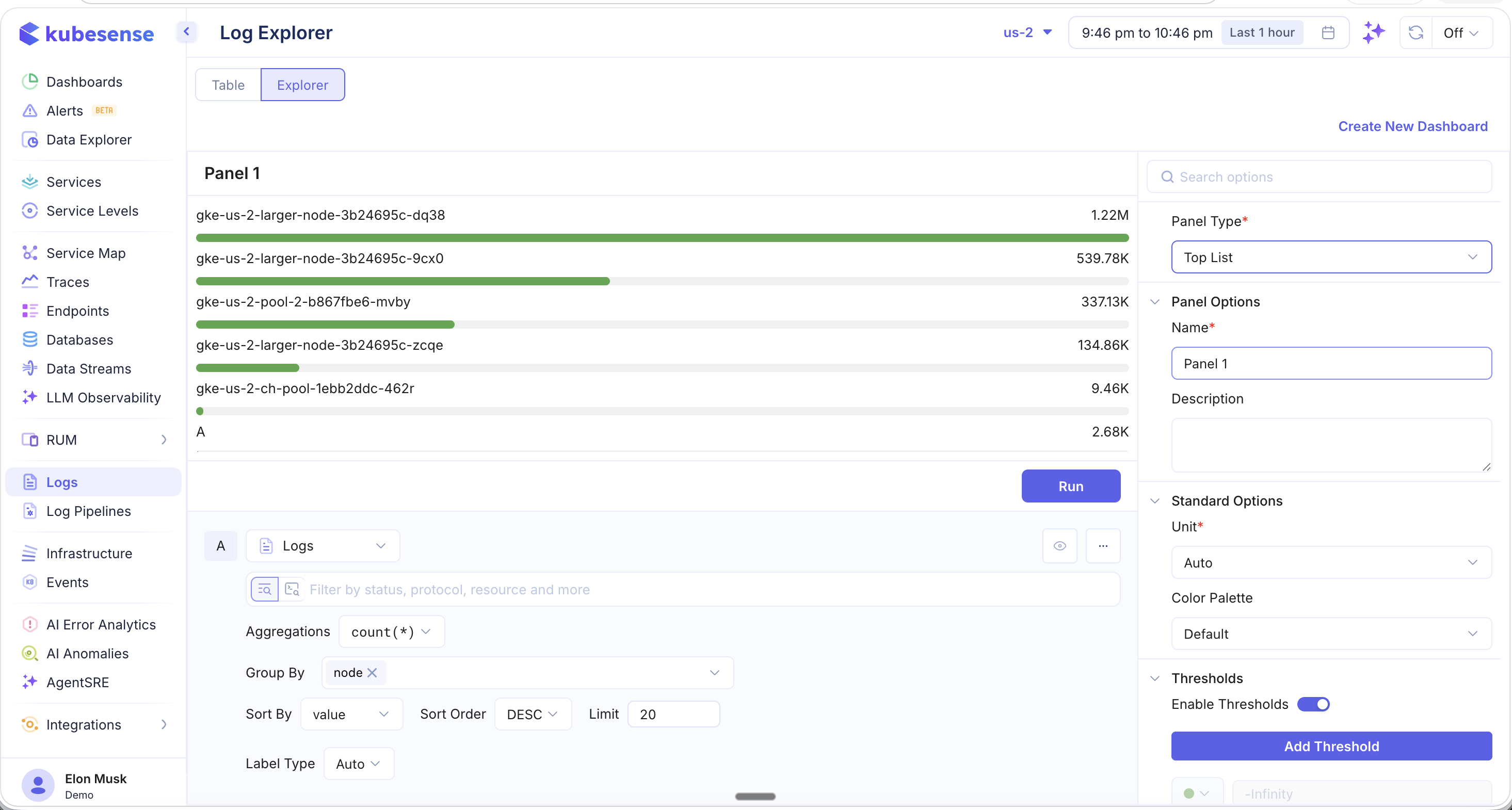
Top List Example
Use the Top List panel type with a Group By node configuration to see which nodes are producing the most logs:
Panel Options
Customize each panel with:
- Name and Description for documentation
- Unit — Auto-detect or specify a unit type
- Color Palette — Choose a color scheme
- Legend — Control visibility and placement (Bottom or Right)
- Thresholds — Define threshold lines for alerting conditions
Create Dashboard
Click Create New Dashboard in the top-right corner to save your Explorer panels as a reusable dashboard. This lets you build custom log analytics dashboards that can be shared with your team and accessed from the Dashboards section.