
Event Overlays
Mark deployments, releases, merges and other events as vertical lines on dashboard charts
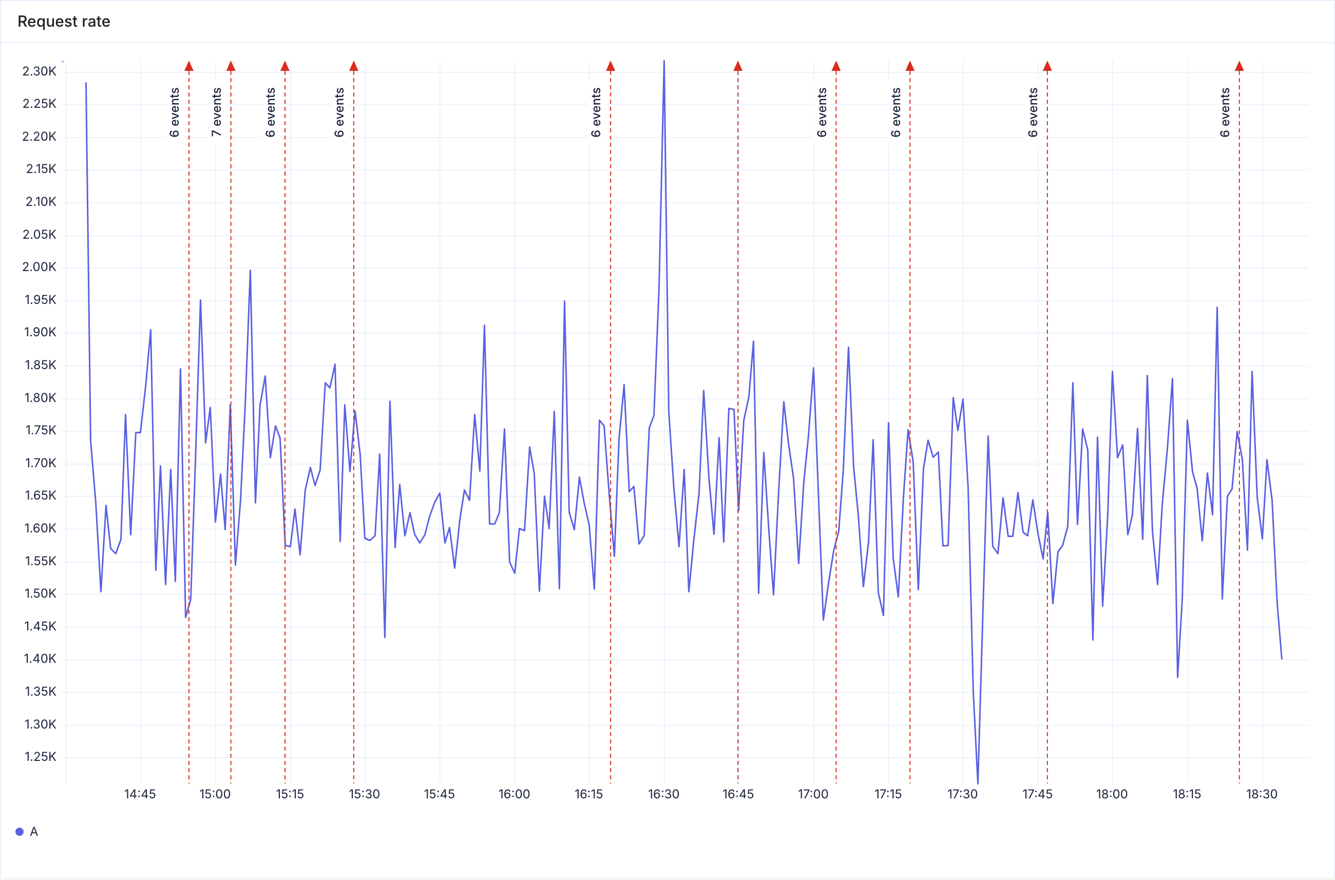
Event overlays draw a vertical marker on a chart for each event that matches a filter. Each marker sits at the exact time of its event. Use them to see whether a change lines up with a change in your data, for example whether a deploy happened just before a spike in 5xx errors.
Events come from the Events datasource. With the GitHub integration connected, that includes deployments, releases, merged pull requests and GitHub Actions runs.
Requirements
- Your role has access to the Infrastructure module. Events are part of it. Without it, the Event overlays menu item and panel section do not appear. See Role Access.
- Something sends events to KubeSense, for example the GitHub integration.
- To change a dashboard's overlay, you need permission to edit that dashboard.
Where markers appear
Markers appear on Time Series and Bar panels. They do not appear on Stat, Pie, Top List, Table, List, Tree Map or Alert panels, or on panels written in SQL or SPL.
Markers cover the time range the panel shows. When you change the time range or refresh the dashboard, the markers update.
Markers do not appear on public dashboards.
Adding an overlay to a dashboard
A dashboard overlay applies to every Time Series and Bar panel on the dashboard that inherits it, on every tab. New panels inherit it by default.
- Open the dashboard.
- Click the ⋮ menu in the toolbar and select Event overlays.
- In Name, type a label for the overlay, for example
Deployments. If you leave it empty, the overlay is called Events. - In Marker color, select Red, Purple, Orange, Gray, Green or Blue.
- In Events, build the filter for the events to mark. This is the same filter bar as the Events page, in Basic or Advanced mode. With no filter, every event is marked.
- Click Save.
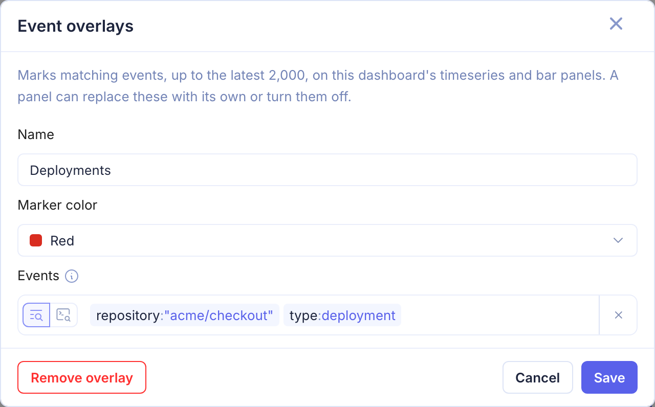
The overlay is saved to the dashboard immediately. You do not need to click Save Changes.
To delete the overlay, open the dialog again and click Remove overlay.
Filtering with dashboard variables
The Events filter can use dashboard variables, such as $service. The filter bar offers the dashboard's variables as values. When you change a variable at the top of the dashboard, the markers update to match.
Filter examples
The fields are the same as on the Events page. For GitHub events, see Fields you can filter on.
| You want to mark | Filter (Advanced mode) |
|---|---|
| Deployments | type = "deployment" |
| Deployments of one repository | repository = "acme/api" AND type = "deployment" |
Pull requests merged into main | type = "pull_request.merged" AND @vcs.ref.base.name = "main" |
| Failed GitHub Actions runs | type = "workflow_run" AND status = "failure" |
Setting overlays for one panel
Each Time Series and Bar panel decides whether it uses the dashboard overlay.
- Open the panel in the panel editor.
- In the right sidebar, go to the Event overlays section.
- In Markers, select an option:
| Option | Result |
|---|---|
| Inherit dashboard | Default. The panel draws the dashboard overlay. The hint below the field names it, or says the dashboard has none |
| Custom | The panel draws its own overlay instead. Set its Name, Marker color and Events filter here |
| Off | The panel draws no markers |
- Save the panel.
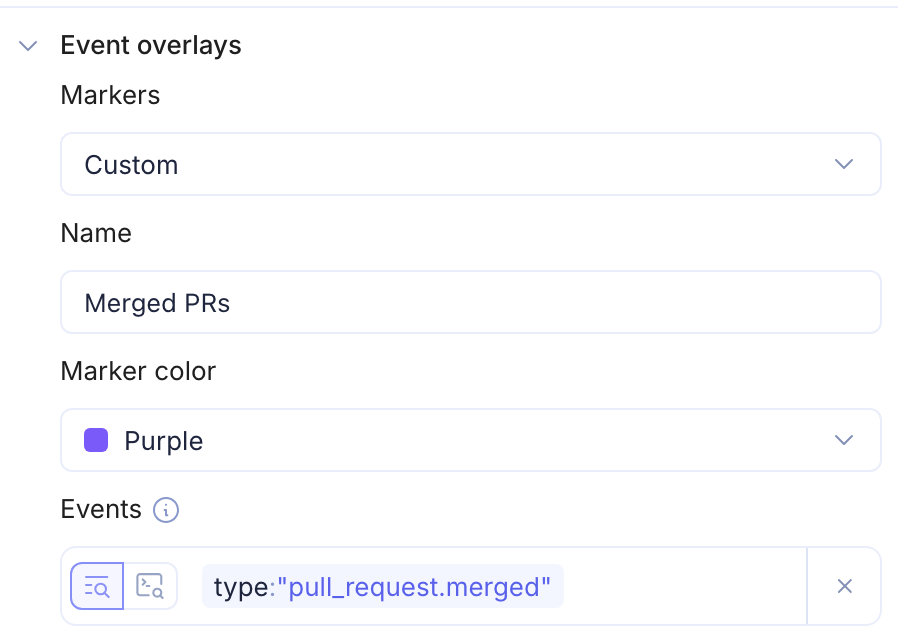
A Custom overlay replaces the dashboard overlay. The two are never combined. The chart in the editor shows the markers as you change the settings.
In the Data Explorer
The Data Explorer has the same Event overlays section for Time Series and Bar panels.
- Inherit dashboard draws nothing in the Data Explorer, because the panel is not on a dashboard yet. When you add the panel to a dashboard, it draws that dashboard's overlay.
- Custom draws markers in the Data Explorer as you edit.
The setting is saved with the panel when you click Create Dashboard or add the panel to an existing dashboard.
Reading the markers
Each marker is a dashed vertical line with an arrow at the top, in the overlay's color.
- Close events merge. When events are too close together to draw separately, they share one marker labelled with a count, for example 6 events. Zoom in on the chart to separate them.
- Hover over a marker to highlight it.
- Click a marker to open a popover that lists its events.
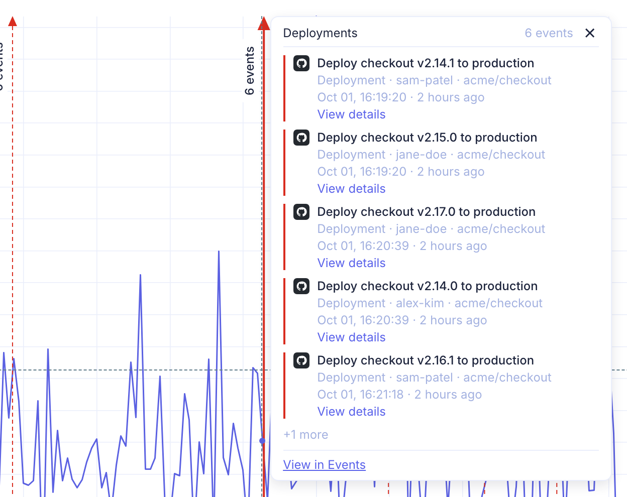
The popover shows the overlay name and the number of events. For each event it shows:
- The title.
- The event type, the user or app that triggered it, and the repository.
- The time, and how long ago that was.
- View details, which opens the event in a details drawer.
- Open in GitHub, or the name of the event's source, when the event has a link.
The popover lists the first 5 events. Click +N more to see the rest.
Click View in Events to open the Events page in a new tab. It uses the overlay's filter, with dashboard variables replaced by their current values, over the time of the listed events plus 5 minutes either side. If the marker holds events from more than one overlay, there is one link for each overlay.
To close the popover, click ✕, press Esc or click outside it.
Limits
- Each overlay draws up to the latest 2,000 events in the panel's time range. When an overlay has more, the chart shows a note in its top-left corner, such as
Showing the latest 2,000 Deployments events. Narrow the filter or the time range to see the older events. The same note appears if some of the events failed to load. - The dashboard dialog and the panel editor each set one overlay.