Data Explorer
The Data Explorer is an interactive query builder and visualization tool for your observability data. Use it to explore metrics, logs, and traces — then save your work as dashboard panels.
Overview
The Data Explorer lets you:
- Build queries against Metrics, Logs, and Traces data sources
- Choose from multiple visualization types
- Configure panel appearance and behavior
- Export panels to new or existing dashboards
The explorer state is synced to the URL, so you can bookmark or share any query configuration.
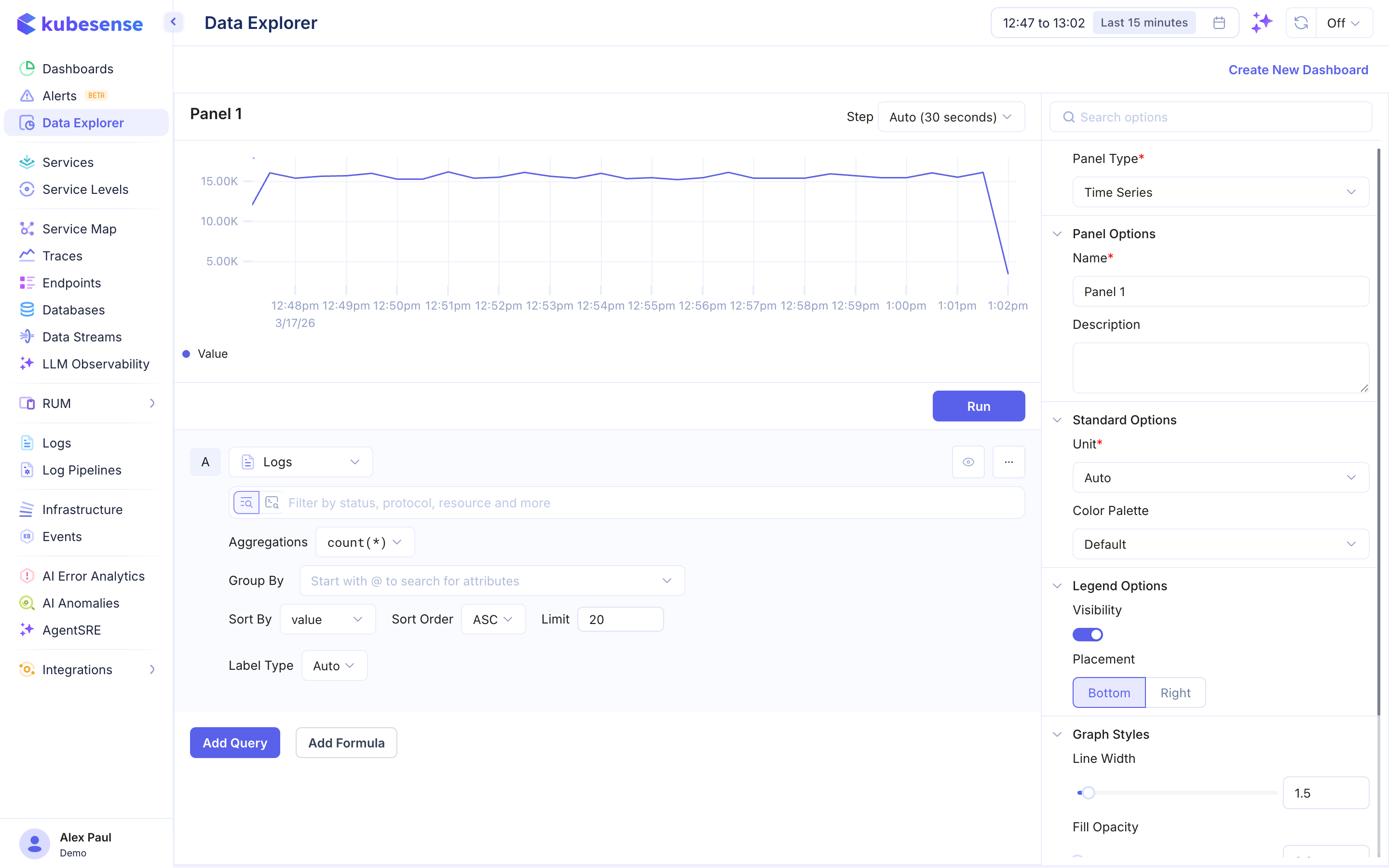
Query Builder
Data Sources
Select the data source for your query:
- Metrics — Query time-series metrics using PromQL
- Logs — Query log data with filters and aggregations
- Traces — Query distributed trace data with filters and aggregations
Builder Mode vs Code Mode
The query builder offers two modes for Metrics queries:
| Mode | Description |
|---|---|
| Builder (visual) | Select a metric, add label filters, and apply transformations step by step |
| Code | Write raw PromQL queries directly, with variable substitution support |
Metrics Transformations
In Builder mode, you can apply transformations to your metric queries:
- Rate — Calculate per-second rate of change
- Aggregations — Sum, average, min, max, count across label dimensions
- Top/Bottom K — Show only the highest or lowest K series
- Rollup — Control how data points are aggregated over time intervals
- Math operations — Apply arithmetic to query results
Logs and Traces Queries
Logs and Traces queries support:
- Filters — Filter data using advanced query, MFD, or SPL modes
- Aggregation functions —
row_count,unique_count,avg,sum,max,min,p99,p95,p90,p75,p50 - Group By — Group results by one or more attributes
- Sorting — Sort results by value or time, ascending or descending
- Pagination — Control the number of results returned
Multiple Queries
Click Add Query to add additional queries to the same panel. Each query is labeled alphabetically (A, B, C, etc.).
Formulas
Click Add Formula to create computed values by combining queries with math expressions. For example:
- Error rate:
B / A - Combined throughput:
(A + B) / C
Visualization Types
Choose the visualization that best fits your data:
| Type | Best For |
|---|---|
| Time Series | Trends over time — line and area charts |
| Bar | Categorical comparisons |
| Stat | Single-value KPIs and summary numbers |
| Pie | Proportional breakdowns |
| Top List | Ranked lists of values |
| Table | Tabular data display |
| List | Scrollable log entry list |
Step Control
Configure the Step interval for data aggregation (e.g., Auto, 30 seconds, 1 minute, 5 minutes). This controls the resolution of your query results.
Exporting Panels
Once you have built and configured a panel, you can:
- Add to an existing dashboard — Select a dashboard and the panel is appended to it
- Create a new dashboard — Creates a new dashboard with this panel as the first entry