Pie
The Pie visualization displays data as a pie chart, useful for showing proportional breakdowns and relative distributions.
When to Use
- Showing the proportion of each category relative to the whole (e.g., log volumes by level, traffic by protocol)
- Visualizing percentage-based distributions
- Summarizing group-by query results
Building a Pie Panel
- Open the Data Explorer
- Select your data source (Metrics, Logs, or Traces)
- Configure your query with a Group By attribute (see Query Builder)
- Select Pie as the Panel Type in the right sidebar
- Click Run to render the chart
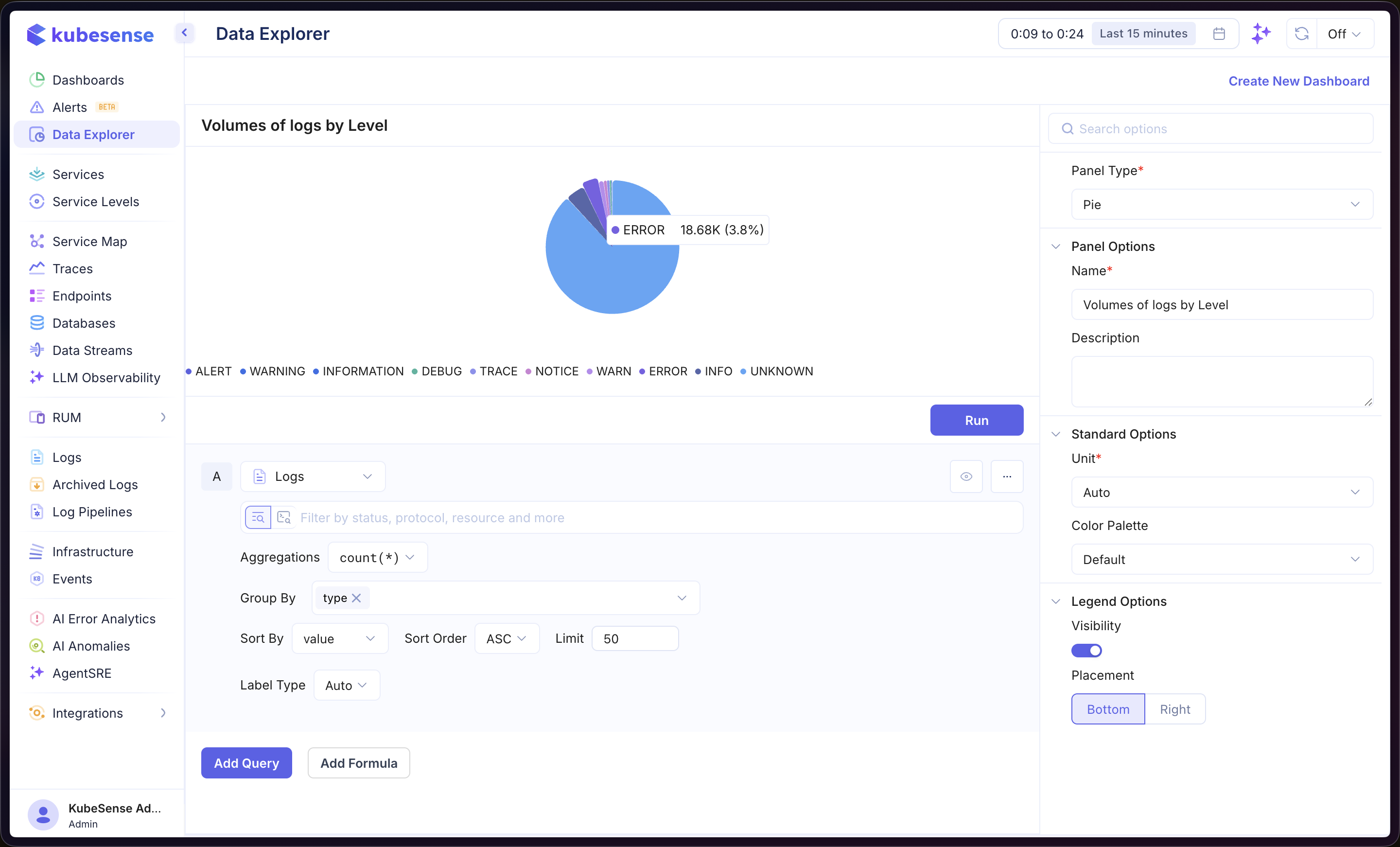
In the example above, the panel queries Logs data with count(*) aggregation, grouped by type. Each slice represents a log level (ALERT, WARNING, INFORMATION, DEBUG, etc.), and hovering over a slice reveals its count and percentage of the total.
Multiple Queries
Add multiple queries to combine data from different sources into the same pie chart. Each query is labeled alphabetically (A, B, C, etc.).
Formulas
Use formulas to create computed values from your queries. Click Add Formula and enter an expression combining your queries (e.g., A / B). See Time Series — Formulas for more details.
Panel Configuration
Panel Options
| Option | Description |
|---|---|
| Name | Display name shown in the panel header |
| Description | Optional description for additional context |
Standard Options
| Option | Description |
|---|---|
| Unit | Unit formatter for the displayed values — choose from 100+ units including bytes, percentage, duration, requests/sec, and more |
| Color Palette | Color scheme for the pie segments |
Legend Options
| Option | Description |
|---|---|
| Visibility | Show or hide the legend |
| Placement | Position the legend at the Bottom or Right of the panel |