Bar
The Bar visualization displays data as vertical bars, useful for categorical comparisons and side-by-side analysis.
When to Use
- Comparing values across categories (e.g., error counts by service, request counts by status code)
- Displaying aggregated data grouped by a label or attribute
- Showing distributions or breakdowns
Building a Bar Panel
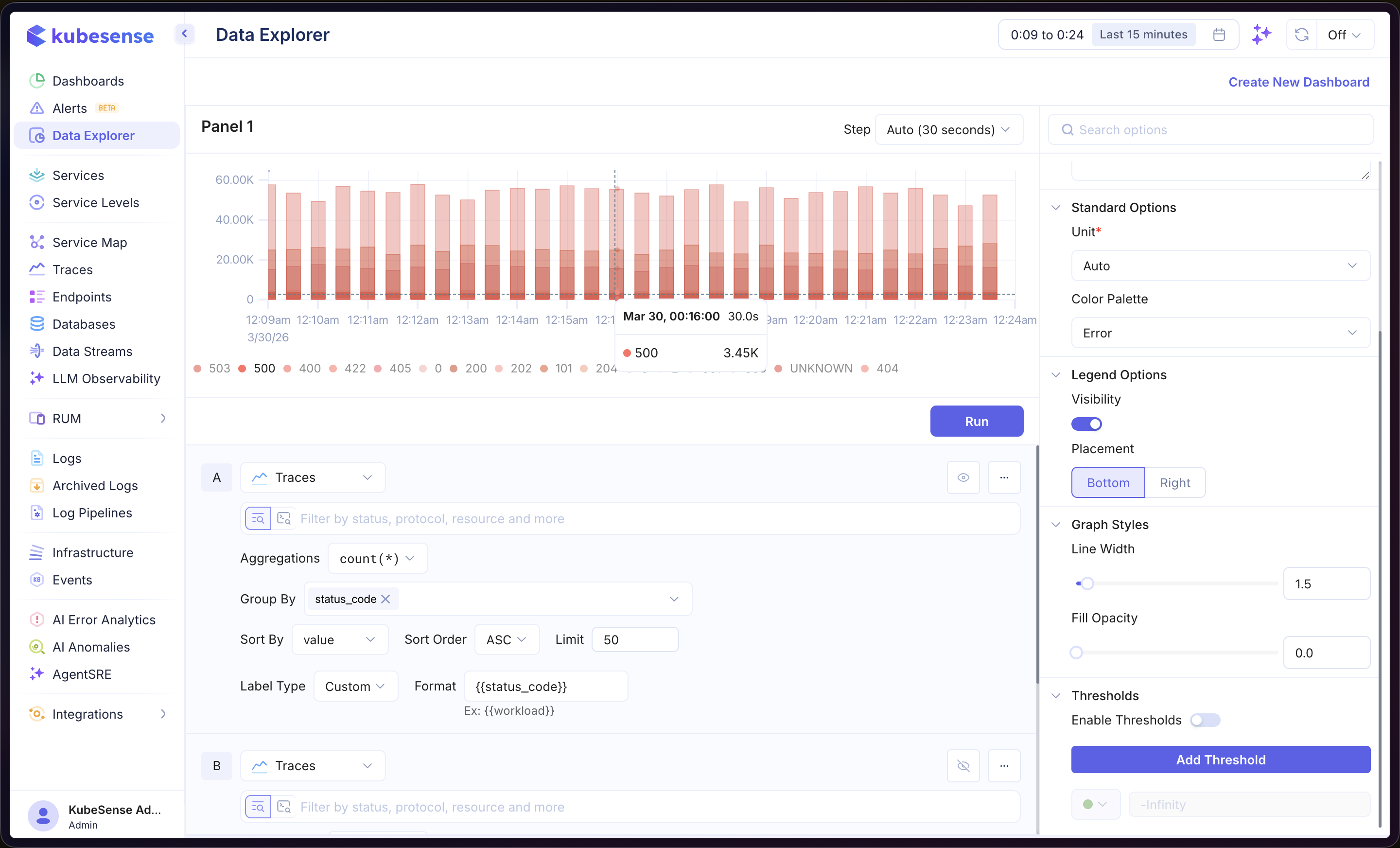
- Open the Data Explorer
- Select your data source (Metrics, Logs, or Traces)
- Configure your query (see Query Builder)
- Select Bar as the Panel Type in the right sidebar
- Click Run to render the chart
In the example above, the panel queries Traces data with count(*) aggregation, grouped by status_code. Each bar represents a different status code, making it easy to compare request volumes across response types.
Multiple Queries
Add multiple queries to overlay different series on the same chart. Each query is labeled alphabetically (A, B, C, etc.) and rendered as a separate set of bars.
Formulas
Use formulas to create computed series from your queries. Click Add Formula and enter an expression combining your queries (e.g., A / B, A + B). See Time Series — Formulas for more details.
Label Configuration
When using Logs or Traces queries with a Group By field, you can customize how bar labels are displayed:
| Option | Description |
|---|---|
| Label Type | Choose Auto (default) or Custom to define your own label format |
| Format | Template string using {{field_name}} syntax (e.g., {{status_code}}) |
Panel Configuration
Panel Options
| Option | Description |
|---|---|
| Name | Display name shown in the panel header |
| Description | Optional description for additional context |
Standard Options
| Option | Description |
|---|---|
| Unit | Axis unit formatter — choose from 100+ units including bytes, percentage, duration, requests/sec, and more |
| Color Palette | Color scheme for the bars |
Legend Options
| Option | Description |
|---|---|
| Visibility | Show or hide the legend |
| Placement | Position the legend at the Bottom or Right of the panel |
Thresholds
Add horizontal threshold lines to highlight important values. Enable thresholds in the right sidebar, then click Add Threshold and set the value. Each threshold is displayed as a dashed line with a custom color.