Stat
The Stat visualization displays a single prominent value, ideal for KPIs, summary numbers, and at-a-glance metrics.
When to Use
- Displaying a single important value (e.g., total requests, error rate, uptime)
- Showing a key metric with trend context via a sparkline
- Dashboard headers or summary panels
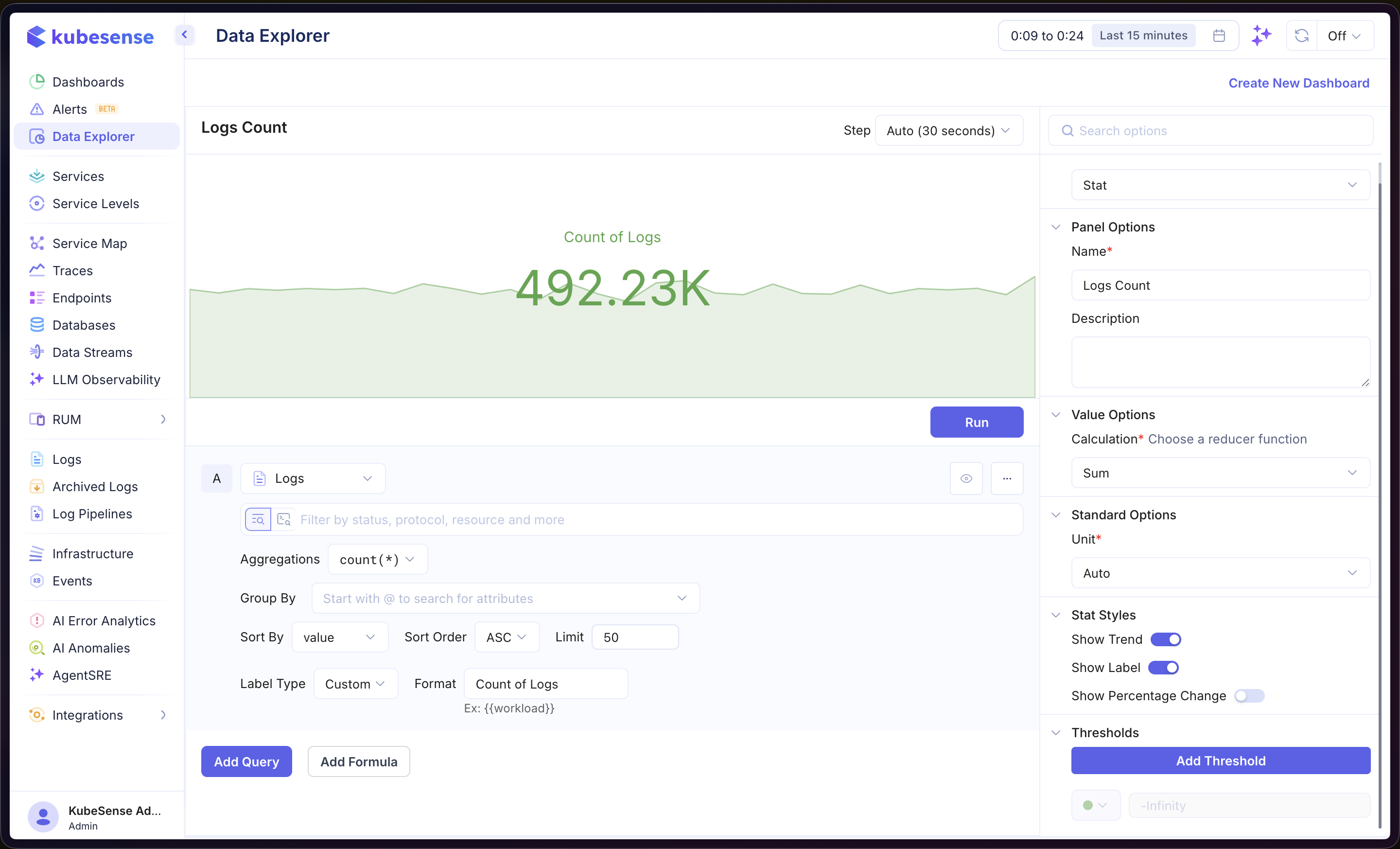
Building a Stat Panel
- Open the Data Explorer
- Select your data source (Metrics, Logs, or Traces)
- Configure your query (see Query Builder)
- Select Stat as the Panel Type in the right sidebar
- Click Run to render the stat
In the example above, the panel queries Logs data with count(*) aggregation and displays the total count as a single stat value with a sparkline trend behind it.
Multiple Queries
Add multiple queries to display several stat values side by side in the same panel. Each query produces its own stat card with an independent value and label.
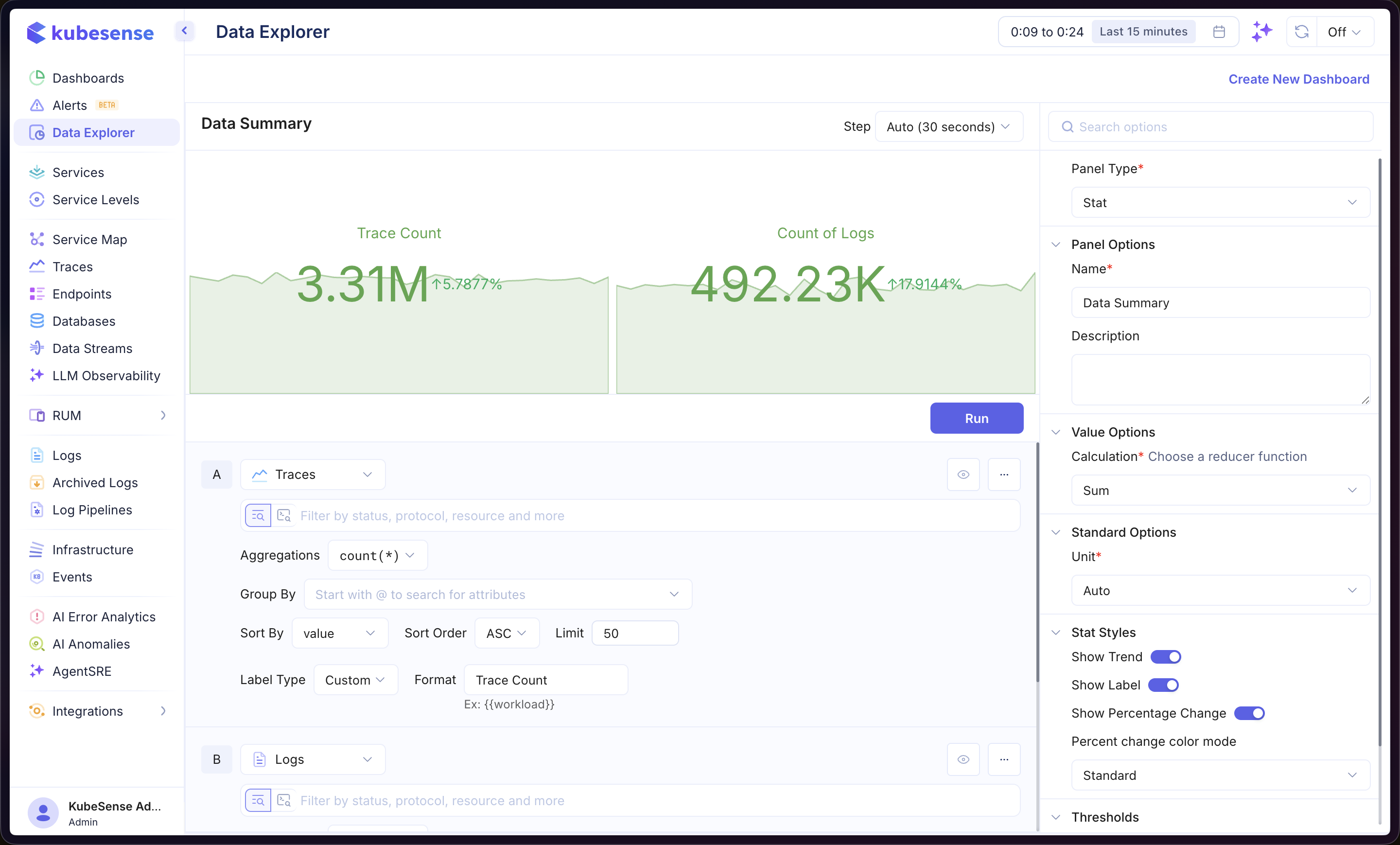
In the example above, query A shows the Trace Count and query B shows the Count of Logs, displayed together with percentage change indicators.
Formulas
Use formulas to create computed stats from your queries. Click Add Formula and enter an expression combining your queries (e.g., A / B). See Time Series — Formulas for more details.
Panel Configuration
Panel Options
| Option | Description |
|---|---|
| Name | Display name shown in the panel header |
| Description | Optional description for additional context |
Value Options
| Option | Description |
|---|---|
| Calculation | Reducer function that computes the displayed value from the query results — Sum, Mean, Last, Max, Min, etc. |
Standard Options
| Option | Description |
|---|---|
| Unit | Unit formatter for the displayed value — choose from 100+ units including bytes, percentage, duration, requests/sec, and more |
Stat Styles
| Option | Description |
|---|---|
| Show Trend | Toggle the sparkline trend graph behind the stat value |
| Show Label | Toggle the label text above the stat value |
| Show Percentage Change | Display the percentage change over the selected time range alongside the stat value |
| Percent change color mode | Controls how percentage change is colored — Standard (green for positive, red for negative) or Inverted |
Thresholds
Add color-coded thresholds to change the stat color based on value ranges. Enable thresholds in the right sidebar, then click Add Threshold and set the value.