Time Series
The Time Series visualization displays data as line or area charts over time. It is the default and most commonly used panel type in the Data Explorer, ideal for monitoring trends, comparing series, and spotting anomalies.
When to Use
- Monitoring metric trends over time (CPU usage, request rate, latency)
- Comparing multiple series side by side
- Tracking log or trace volumes over time
- Visualizing computed formulas like error rates
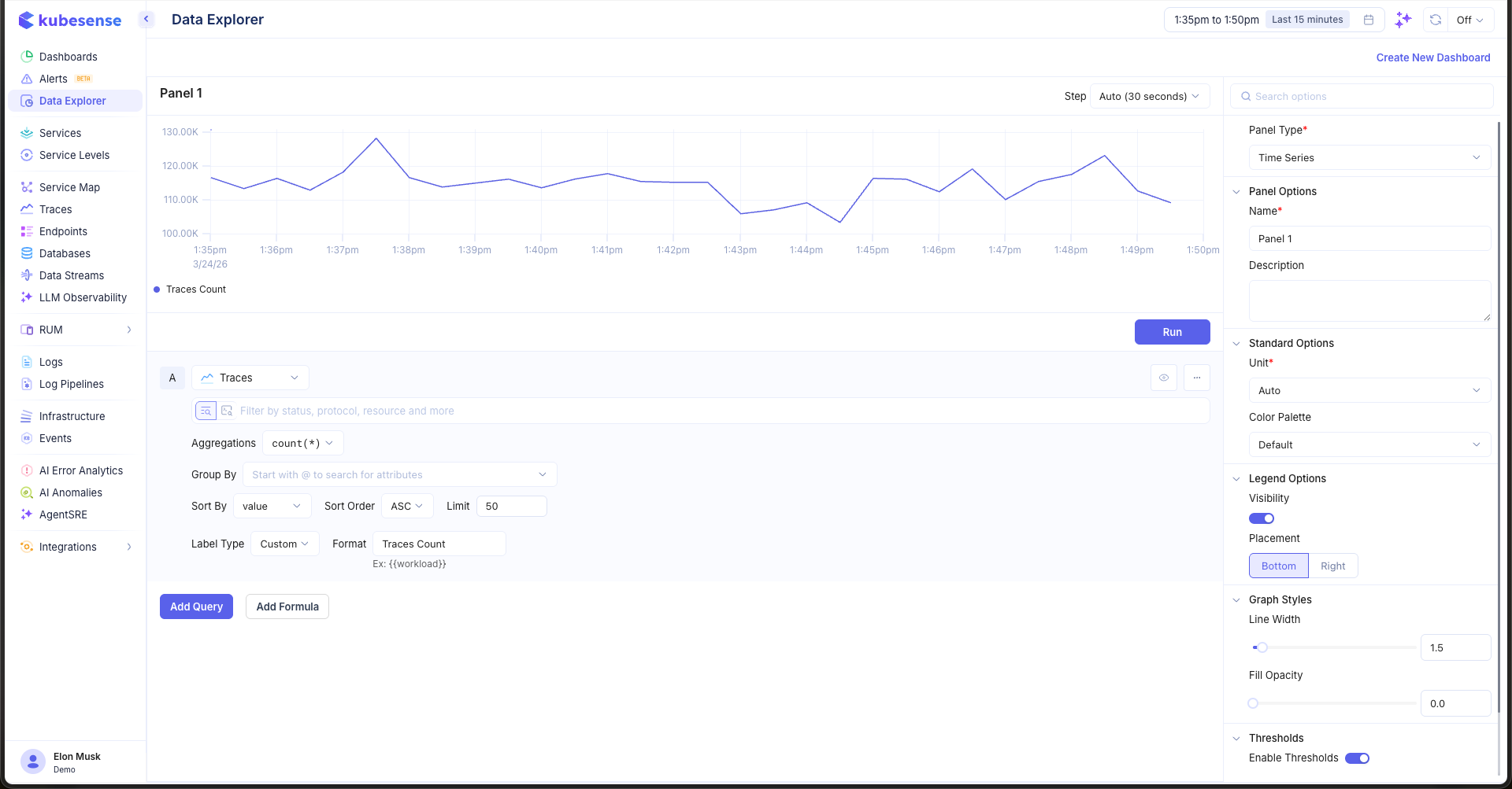
Building a Time Series Panel
- Open the Data Explorer
- Select your data source (Metrics, Logs, or Traces)
- Configure your query (see Query Builder)
- Select Time Series as the Panel Type in the right sidebar
- Click Run to render the chart
Multiple Queries
Add multiple queries to overlay different series on the same chart. Each query is labeled alphabetically (A, B, C, etc.) and rendered as a separate line in the chart.
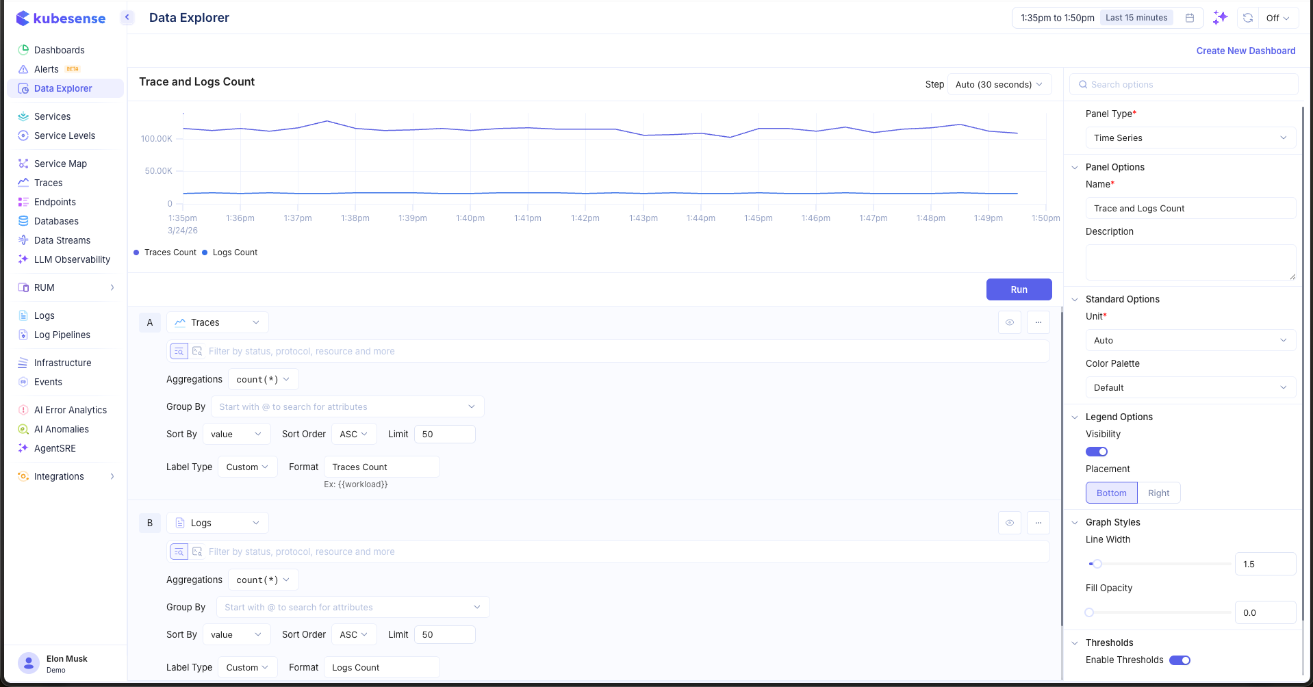
In the example above, query A shows Traces Count and query B shows Logs Count, both plotted on the same time axis with a shared legend.
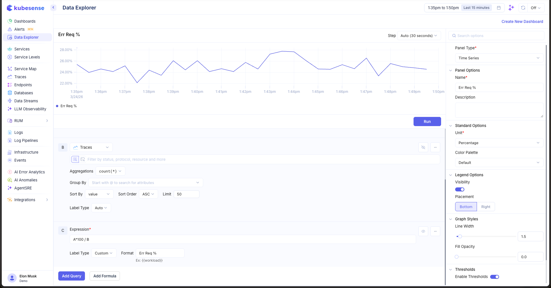
Formulas
Use formulas to create computed series from your queries. For example, to calculate an error request percentage:
- Add a query B for error trace counts
- Click Add Formula to add expression C
- Enter
A*100 / Bas the expression - Set the Unit to Percentage
Panel Configuration
Panel Options
| Option | Description |
|---|---|
| Name | Display name shown in the panel header |
| Description | Optional description for additional context |
Standard Options
| Option | Description |
|---|---|
| Unit | Y-axis unit formatter — choose from 100+ units including bytes, percentage, duration, requests/sec, and more |
| Color Palette | Color scheme for the chart lines and fills |
Legend Options
| Option | Description |
|---|---|
| Visibility | Show or hide the legend |
| Placement | Position the legend at the Bottom or Right of the panel |
Graph Styles
| Option | Description |
|---|---|
| Line Width | Thickness of chart lines (default: 1.5) |
| Fill Opacity | Transparency of the filled area under lines (0 = no fill, 1 = solid) |
| Stacking | Stack series on top of each other instead of overlaying |
Thresholds
Add horizontal threshold lines to highlight important values. Enable thresholds in the right sidebar, then click Add Threshold and set the value. Each threshold is displayed as a dashed line with a custom color.
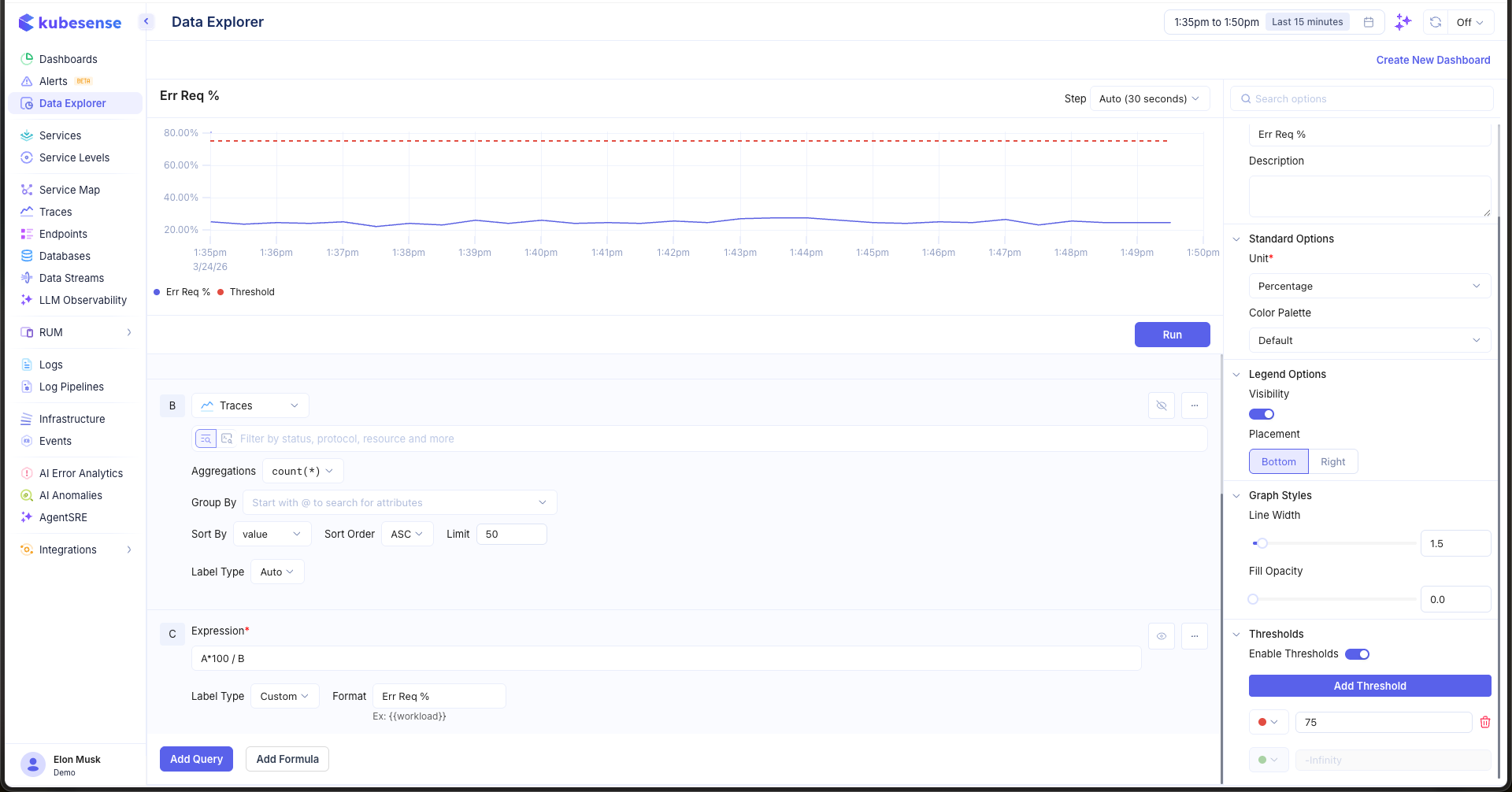
In the example above, a threshold is set at 75% to mark a warning level on the error request percentage chart.