
Table
The Table visualization displays query results in a tabular format with rows and columns, suited for detailed data inspection.
When to Use
- Viewing raw or aggregated query results in detail
- Displaying multi-column data (e.g., workload, request count, log count)
- Comparing values across multiple queries side by side
- Exporting or inspecting data that doesn't fit well into charts
Building a Table Panel
- Open the Data Explorer
- Select your data source (Metrics, Logs, or Traces)
- Configure your query (see Query Builder)
- Select Table as the Panel Type in the right sidebar
- Click Run to render the table
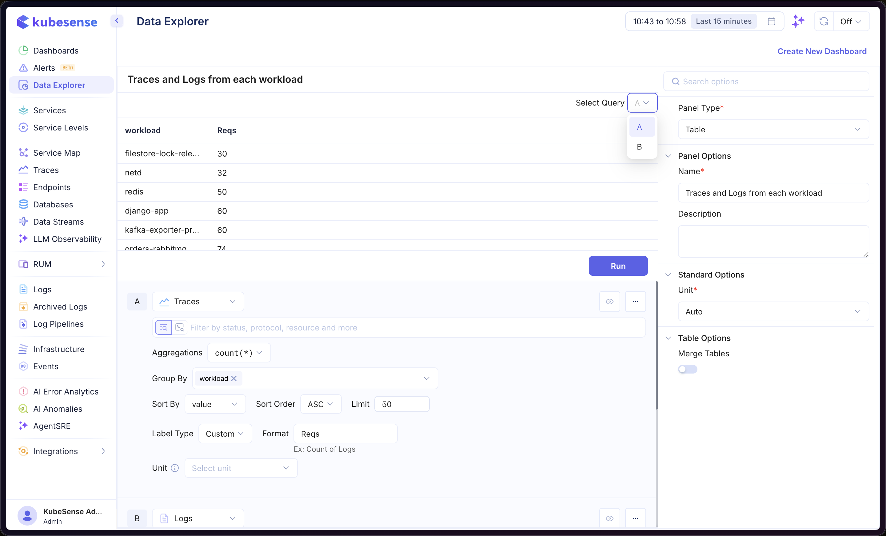
In the example above, the panel queries Traces data with count(*) aggregation, grouped by workload. The Select Query dropdown lets you switch between viewing results from query A or query B individually.
Multiple Queries
Add multiple queries to display data from different sources in the same table. Each query is labeled alphabetically (A, B, C, etc.). Results from all queries are always combined into a single merged table — rows are joined on shared columns (e.g., a common Group By field like workload), with each query contributing its own value column.
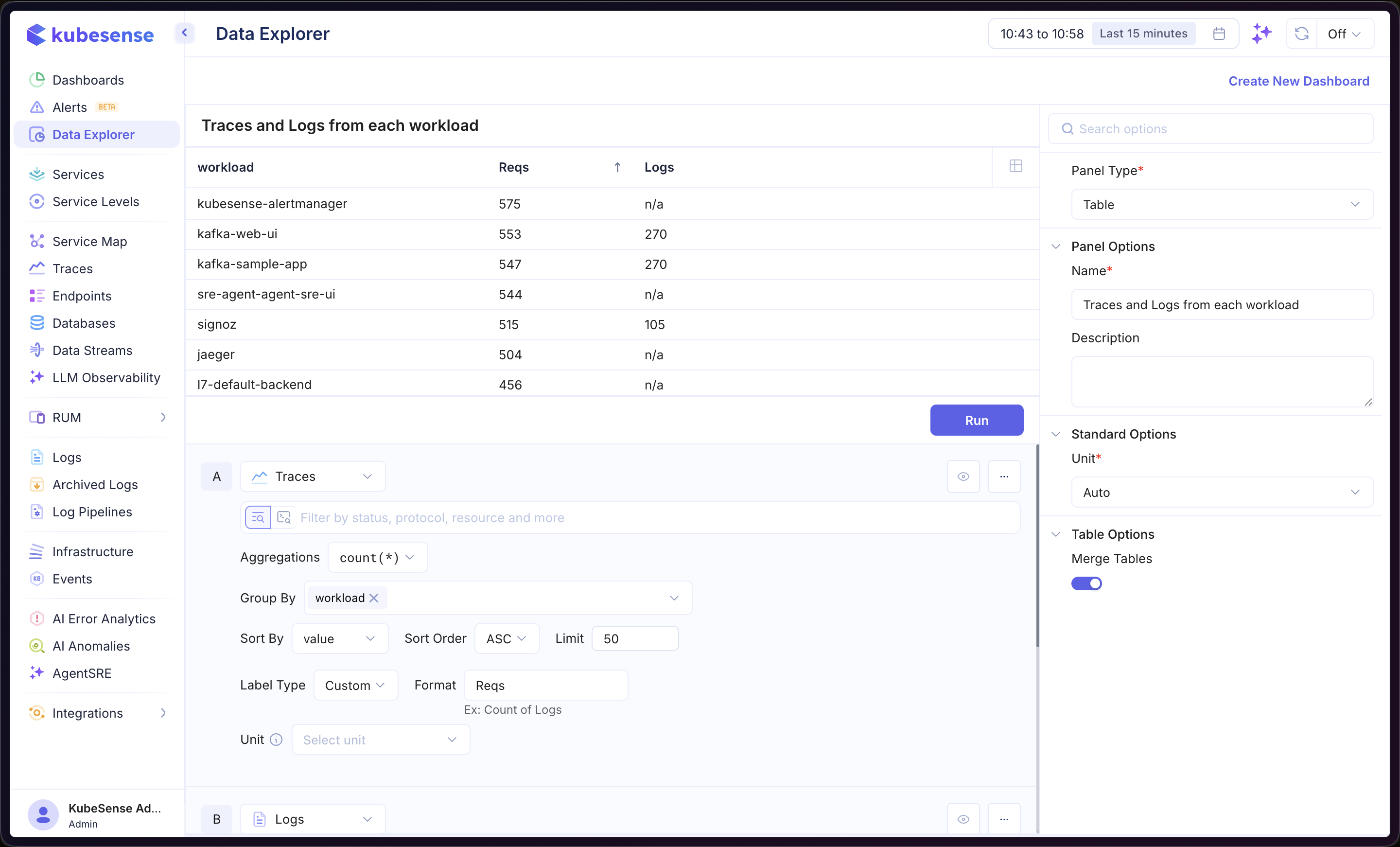
In the example above, query A (Traces) provides the Reqs column and query B (Logs) provides the Logs column, merged on the shared workload column. Workloads without data for a query show n/a.
Dimensions
Columns from different queries are joined automatically when their names match. Dimensions let you explicitly align columns that represent the same thing but come from differently named fields — for example, joining a Traces query grouped by k8s.namespace with a Logs query grouped by namespace under a single merged Namespace column.
When to Use Dimensions
- Queries use different field names for the same concept (e.g.
service.namevsservice) - A metrics PromQL query exposes a label name that differs from the corresponding logs/traces attribute
- You want to control the merged column's display name instead of relying on the first query's field name
Configuring Dimensions
Dimensions are configured in Table Options → Align columns in the panel editor. They are only applicable to Table panels with two or more visible queries.
- Click Add dimension to create a new alignment row
- Set a Merged column name (e.g.
Namespace) — this becomes the column header in the merged table - For each query, pick the group-by field that should contribute to this dimension, or leave it as Not mapped if the query doesn't have a corresponding field
Repeat for each logical column you want to align. Columns whose names already match across queries are merged automatically and do not need a dimension entry.
Example
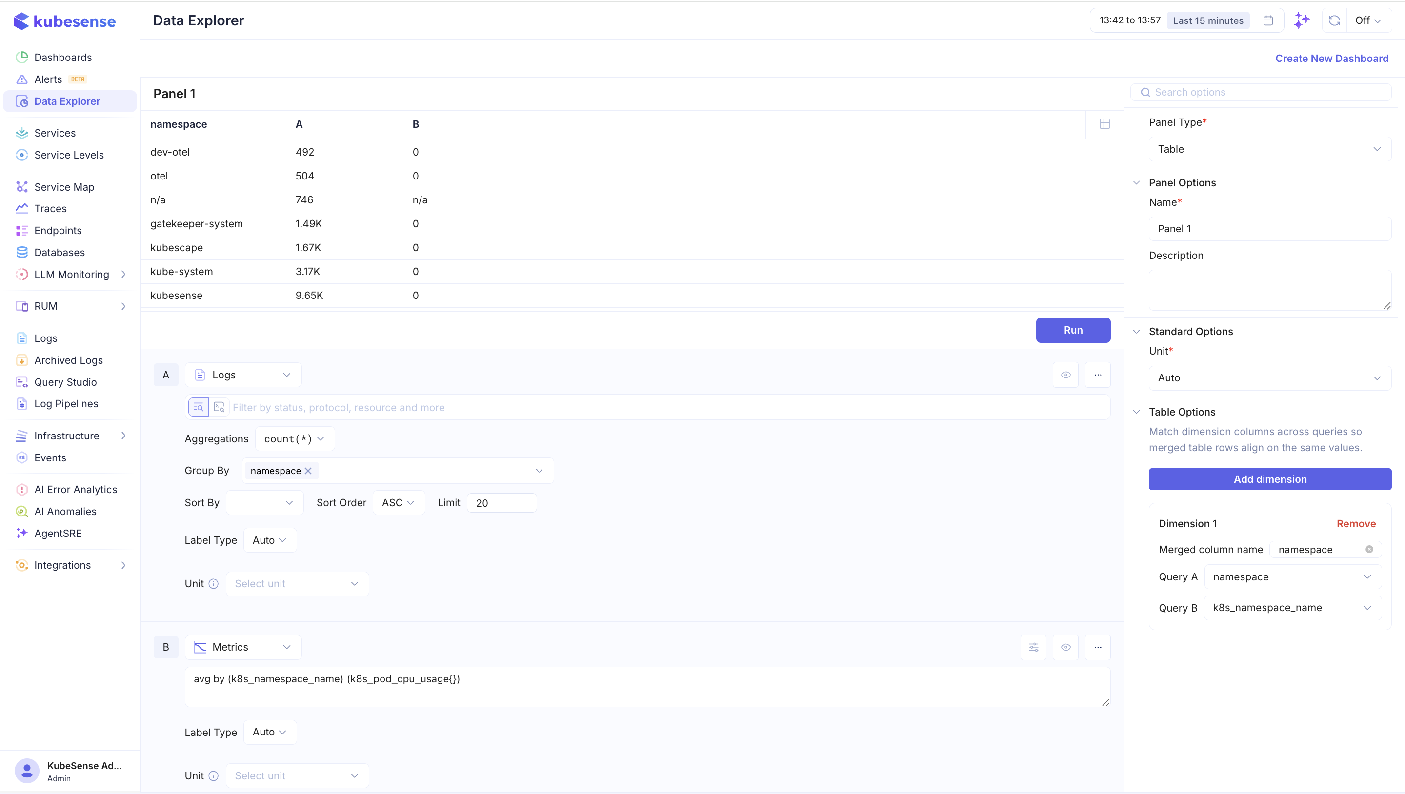
In the screenshot above, the panel merges two queries that count and measure activity per Kubernetes namespace:
- Query A (Logs):
count(*)grouped bynamespace— the field name used in log attributes - Query B (Metrics, PromQL):
avg by (k8s_namespace_name) (k8s_pod_cpu_usage{})— the same concept, but the label name comes from OTel metrics and isk8s_namespace_name
Without a dimension the two columns would not join (namespace ≠ k8s_namespace_name) and the merged table would show two separate columns with mostly n/a values. Configuring a single dimension named namespace and mapping Query A → namespace and Query B → k8s_namespace_name tells the table to treat them as the same column. The merged result shows one namespace column with both the log count (A) and the CPU usage average (B) side by side for each namespace. The n/a row visible in the table corresponds to a namespace value that exists in Query A but has no matching series in Query B.
Coverage Warnings
If a query has a group-by field that isn't mapped to any dimension, a warning appears next to that field in the query builder:
...is not mapped to any dimension. Rows with the same dimension values but different values for this field will collide in the merged table.
This is a correctness signal: the merged table joins on the configured dimensions only, so unmapped group-by values can cause rows that should be distinct to collapse into one. To resolve, either map the field to an existing dimension, add a new dimension for it, or remove it from Group By.
For metrics queries written in raw PromQL (code mode), the available labels are read from the query's latest response — run the query at least once so the editor can list the labels returned by the backend.
Formulas
Use formulas to create computed columns from your queries. Click Add Formula and enter an expression combining your queries (e.g., A / B). See Time Series — Formulas for more details.
Column Formatting
Column Formatting controls how each column in the table is named, whether it is shown, and how its cells are rendered and coloured. Open it from Column Formatting in the panel editor, then pick the column you want to format from the tab strip — every column the table currently renders has a tab, whether or not it already has formatting applied.
A column carries no formatting until you change something for it, so a table you never touch renders with its default names and plain numeric cells.
Naming and Visibility
| Option | Description |
|---|---|
| Display name | Override the column header. Leave it empty to fall back to the column's derived name (from dimensions, query alias, or the field label). Clearing the field restores the derived name rather than blanking the header. |
| Hide column | Remove the column from the rendered table while keeping it in the query. Useful for columns you group or join on but don't want to display. |
Cell Type
Numeric columns can be rendered as one of two cell types:
- Number — the value written into the cell as text. This is the default.
- Bar — the value written into the cell alongside a horizontal bar whose length reflects the value relative to the column's range.
Text columns have no cell type. They are rendered as plain text and formatted with text rules instead of value colouring.
Colouring
Numeric cells can be coloured to make outliers and patterns easy to spot. There are two colouring modes:
Threshold
Threshold colouring applies a style when a value satisfies a condition. Click Add Condition and configure:
- Operator — one of
>,>=,<,<=,=,!= - Value — the number to compare against
- Style — a background or text colour (red, yellow, green, and lighter variants) or a custom background/text colour
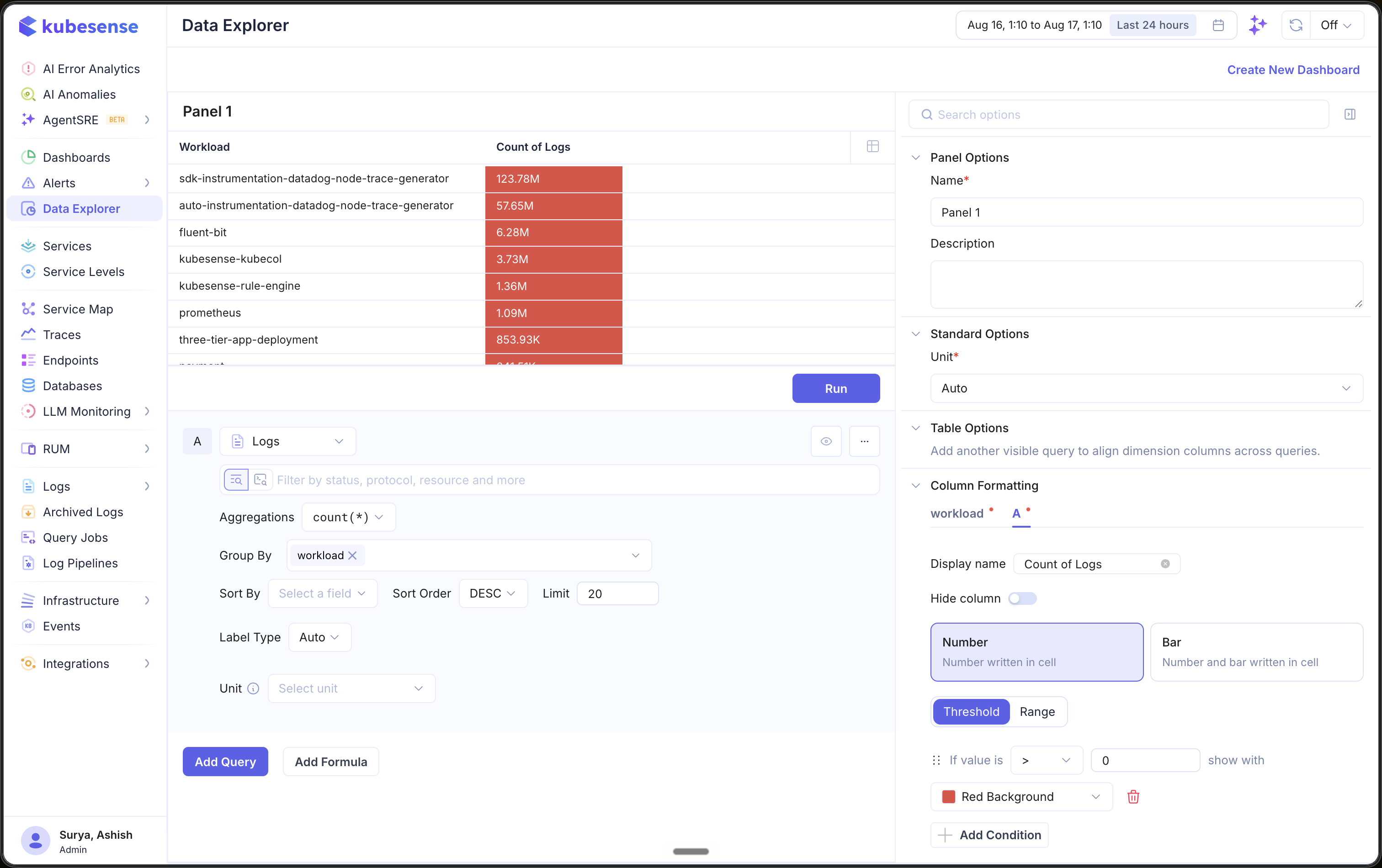
In the example above, the Count of Logs column has a single condition — if value is > 0, show with Red Background — so every cell with a count is filled red regardless of magnitude.
Conditions are evaluated in list order and the last condition a value satisfies wins. A list of conditions reads as escalating — > 10 green above > 100 red paints a value of 500 red — so put the most specific rule at the bottom.
Bar cells are always coloured by threshold — the bar length already carries the magnitude, so a continuous range palette would be redundant.
Range
Range colouring (available for Number cells) applies a continuous colour ramp across the column's values:
- Color palette — a gradient (transparent at the minimum, full colour at the maximum) or a solid palette. Two-hue ramps name their direction —
Red-Greenis red at the minimum and green at the maximum. - Scale — Logarithmic (the default) suits the power-law counts most telemetry produces, where a linear ramp would leave every row but the largest near-transparent; Linear suits bounded values such as percentages.
- Min / Max — the bounds the ramp maps onto. Leave them as auto to derive the bounds from the data.
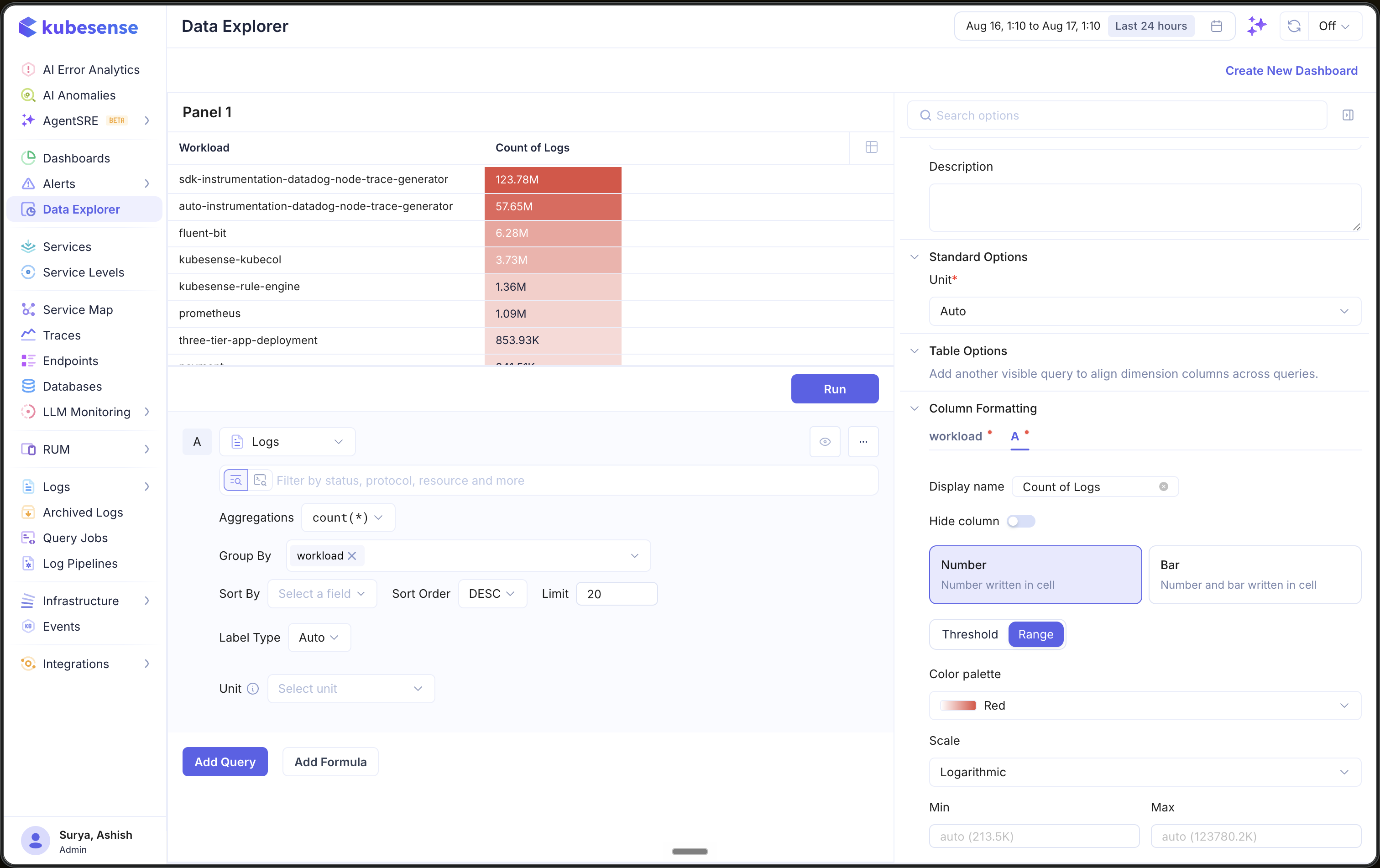
The example above colours the same Count of Logs column with the Red palette on a Logarithmic scale and auto bounds. Unlike the threshold example, the shade now tracks magnitude — the largest workloads are deep red and the smaller ones fade toward transparent.
Text rules
A text column is formatted by a list of rules rather than by value thresholds. Each rule matches with an operator — is, is not, contains, does not contain, starts with, ends with — against text you supply, compared case-sensitively. is empty and is not empty ask about a blank cell and take no value.
A matching rule can rewrite the cell, paint it, or both:
- Replace swaps the whole cell for a value, or swaps every occurrence of a search text within it.
- Show with paints the cell using the same styles as a threshold.
The colour comes from the last matching rule that sets one. Replacements all apply in list order, each on the output of the one before, and every rule is matched against the cell's original text. Rules apply only where the value is text.
Text rules are shared with list panels, where they are documented in full.
Panel Configuration
Panel Options
| Option | Description |
|---|---|
| Name | Display name shown in the panel header |
| Description | Optional description for additional context |
Standard Options
| Option | Description |
|---|---|
| Unit | Unit formatter for numeric columns — choose from 100+ units including bytes, percentage, duration, requests/sec, and more |
Table Options
| Option | Description |
|---|---|
| Align columns | Define dimensions that map differently named group-by fields across queries onto a single merged column |
| Column Formatting | Per-column display name, visibility, cell type, colouring, and text rules |