
Alert
The Alert visualization draws an existing alert rule rather than running a query of its own. Point it at a rule and choose one of three widgets: the rule's condition chart, its current value, or a roll-up of many rules at once.
When to Use
- Putting the alert that matters next to the data it watches, on the same dashboard
- Showing a service's health as a single number a room can read from a distance
- Giving a team dashboard one panel that answers "is anything on fire right now"
An alert panel reports what the rule engine has already evaluated. That is the difference between it and a Time Series panel with a threshold drawn on: the line here is what the engine actually compared against the threshold, reduced over the rule's own evaluation window, so the panel and the alert cannot disagree.
Building an Alert Panel
- Open the Data Explorer
- Select Alert as the Panel Type in the right sidebar
- Pick a widget under Show — Graph, Value or Summary
- Choose the rule under Alert rule (Graph and Value), or leave it unset and filter (Summary)
- Click Run to render the panel
The panel is served by the alert endpoints rather than the query engine, so there is no Step control and no query builder beneath it. The rule already defines its own query, window and threshold.
Graph
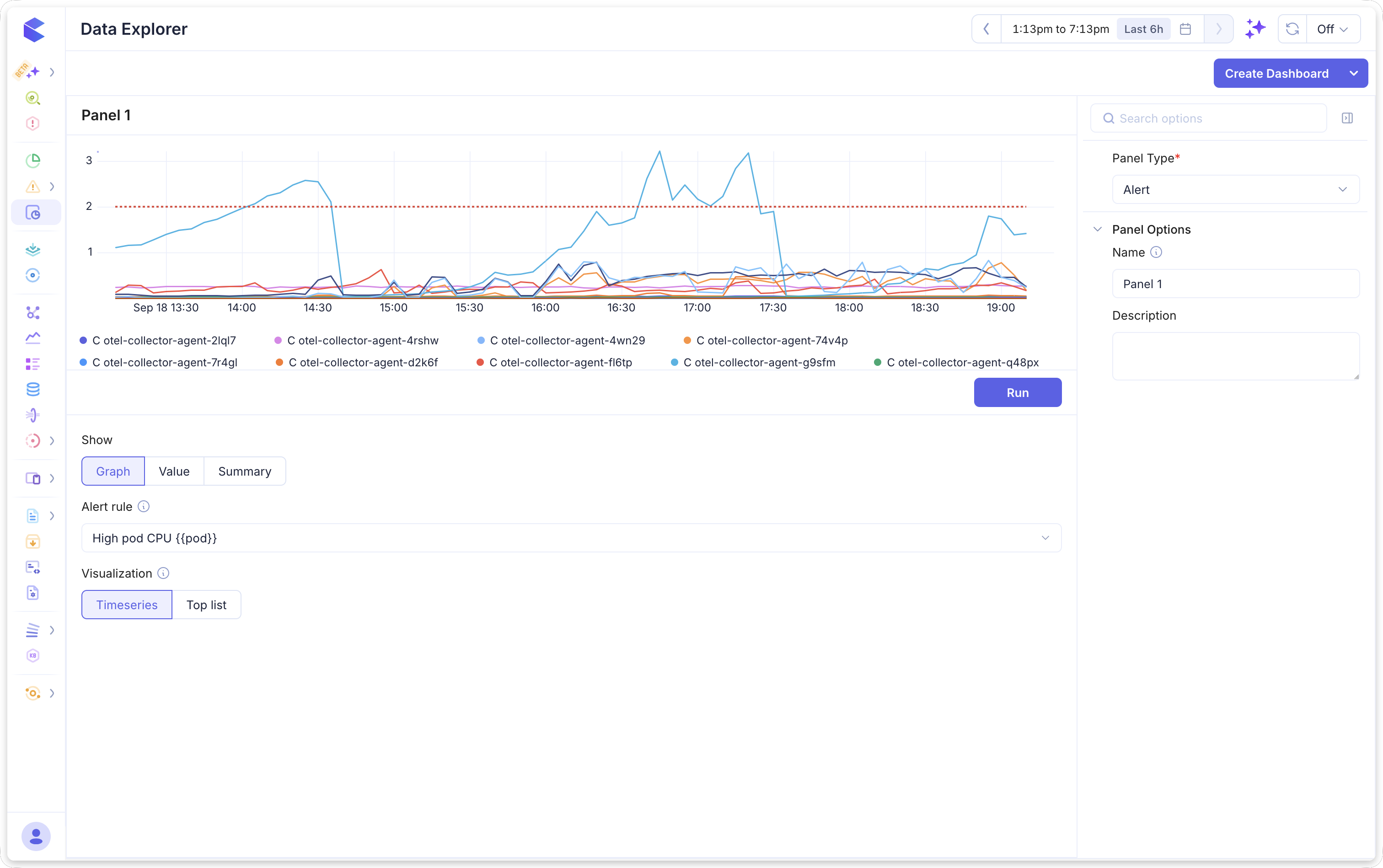
The rule's condition chart: its query over time with the threshold drawn as a dashed red line.
Visualization switches how the same query is drawn.
Timeseries is the default and plots each series over the selected time range.
Top list ranks the series by their last value, largest first. Use it when a rule fires across many series and the timeseries becomes a thicket of overlapping lines — a rule grouped by pod across forty pods is far easier to read as a ranked list. It ranks the same way a Top List panel does.
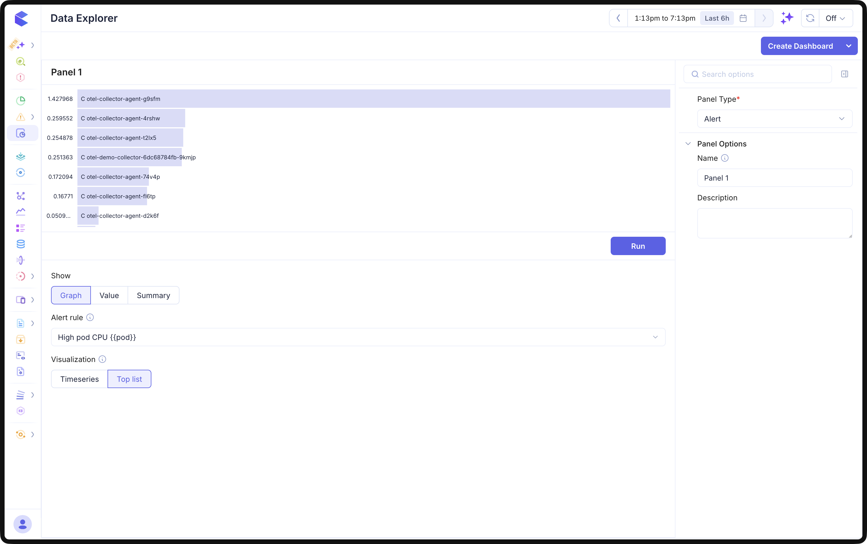
In the example above, the rule High pod CPU {{pod}} groups by pod, so the timeseries draws one line per collector pod against a threshold of 2. The same rule as a top list ranks those pods by their last value, putting otel-collector-agent-g9sfm at 1.43 on top.
The chart follows the dashboard's global time picker, so changing the range moves this panel with everything else on the grid.
Value
One number: the rule's current value, on a panel filled with its status colour.
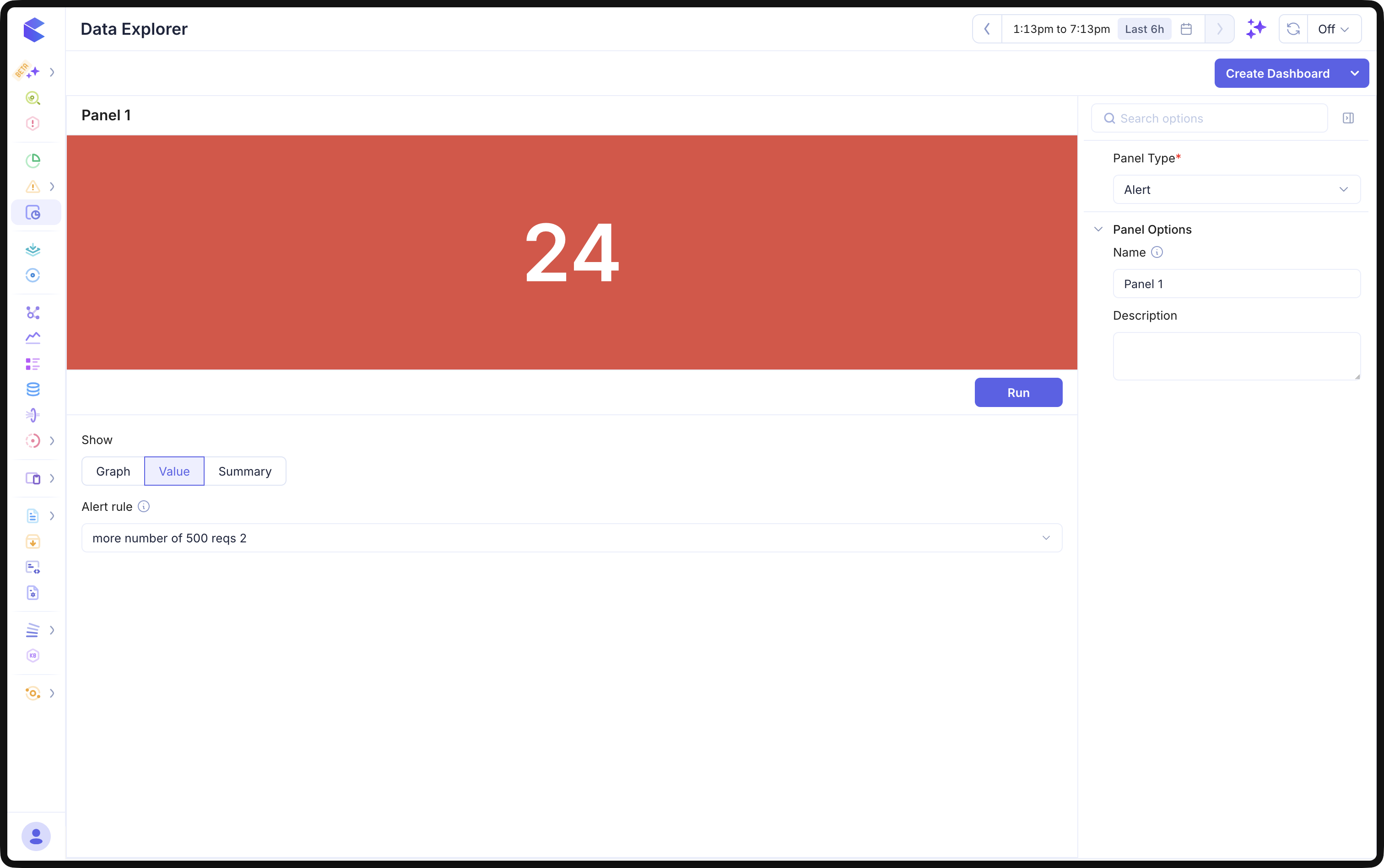
The colour is the state the rule is in right now. A healthy rule is green — the engine has evaluated it and found nothing wrong. A firing rule takes the colour of its own severity, so the panel says how serious its author considered it rather than painting everything red.
| Panel | State |
|---|---|
| Green | Healthy, or firing at info severity |
| Amber | Firing at warning |
| Red | Firing at critical or error, or at a severity this panel does not recognise |
A firing info rule is green, the same as a healthy one. That is deliberate — info says the rule is worth recording rather than worth acting on — but it does mean the colour alone will not tell you an info rule is firing. Use Summary if you need those counted.
Which number it shows, when a rule fires on many series. A rule grouped by pod fires once per breaching pod, and each is a separate instance with its own value. The panel shows the instance furthest past the threshold: the highest value for a greater than rule, the lowest for a less than one. So the figure is the worst case rather than whichever instance happened to breach most recently. The rule picker's info icon says the same thing, since it is the one thing about this widget a reader cannot see from the panel.
The panel's own title names the rule, so the widget prints nothing but the figure. Give the panel a name under Panel Options if the default does not read well on your dashboard.
Summary
A roll-up across many rules: status counts, the rules behind them, or both.
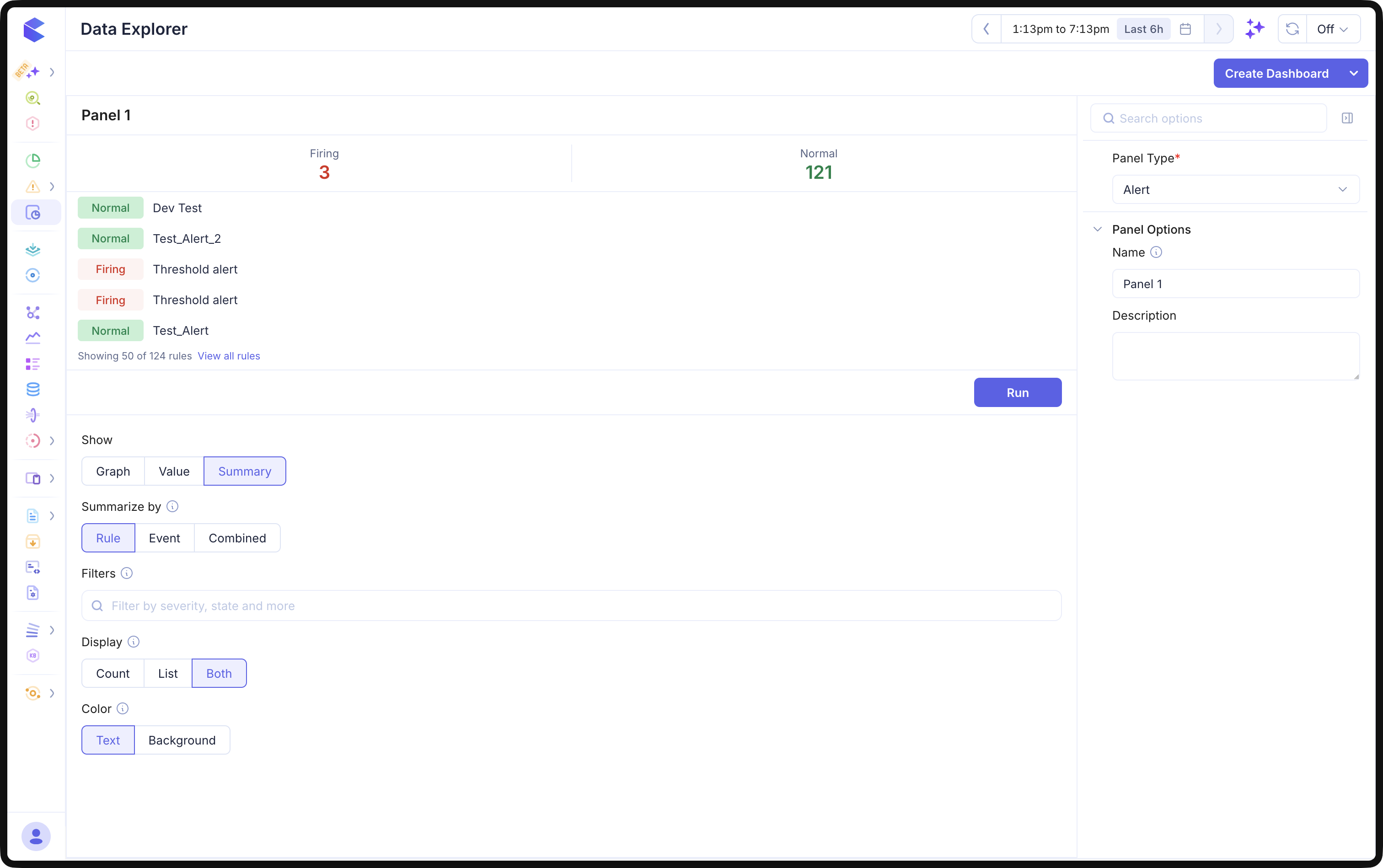
Unlike Graph and Value, Summary names no single rule. It reads Filters instead, which scope it the same way the Alerts page does — by severity, by state, by label. Leave the filters empty to summarise every rule you can see.
Summarize by
Summarize by decides what one row stands for, and it is the first control to set because everything below it follows.
Rule gives one row per alert rule, carrying that rule's overall state. The counts above read Firing and Normal — 3 and 121 in the example above.
Event gives one row per firing instance. A rule grouped by workload contributes one row per breaching workload, each tagged with the label that identifies it. The counts switch to Critical, Error, Warning and Info, because an instance only exists while it is firing — a "Normal" count would read zero forever.
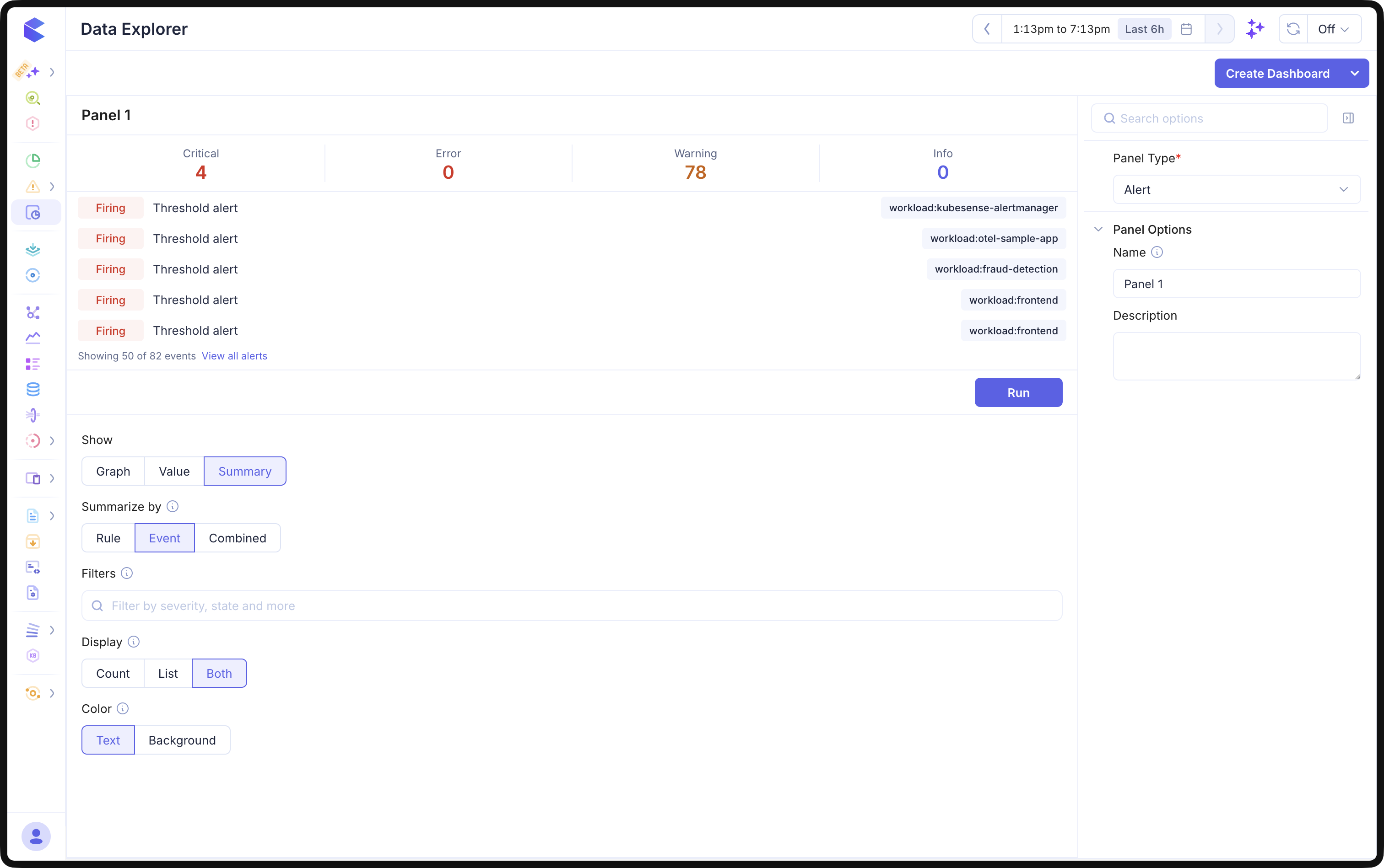
Note what changes between the two screenshots. Rule mode counts 124 rules; Event mode counts 82 events, because one rule firing on many workloads contributes many. The counts and the list always describe the same population.
Combined gives one row per rule, as Rule does, with that rule's firing instances counted beside it.
info: Datadog's equivalent can list groups that are healthy, because a multi-alert monitor enumerates every group whether or not it breaches. KubeSense materialises an instance only while it is firing, so a series that never breached has no row to show. Event here means "firing instances".
Display and Color
Display chooses what the widget draws: Count for the status tiles alone, List for the rules alone, or Both.
Color decides how a status count is painted — Text colours the number, Background fills the tile behind it.
The list shows the first 50 rows and links to the rest — View all rules in Rule mode, View all alerts in Event mode. Each row opens in a new tab, so a dashboard you are watching stays open.
Limits
- An alert panel draws one rule for Graph and Value. To compare several rules side by side, use several panels, or use Summary.
- Datadog's fourth alert widget, Check Status, has no equivalent. The engine persists
normalandfiringonly and carries no warning threshold, so a four-state widget would have nothing to put in two of its cells. - Summary counts and rows are scoped by the same filters, so they always describe the same population.