
Tree Map
The Tree Map visualization fills the panel with one rectangle per series, each sized by its share of the total. It is the fastest way to see which few values account for most of a measure.
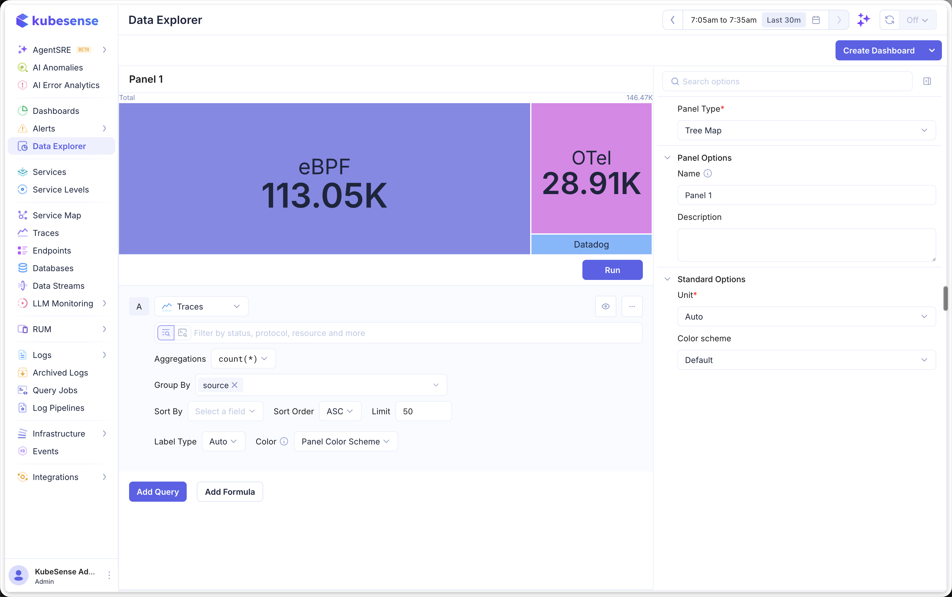
When to Use
- Spotting the handful of values that dominate a total (e.g., the services burning most CPU, the namespaces holding most pods)
- Comparing many categories at once, where a pie would collapse into unreadable slivers
- Reading relative magnitude at a glance, without a legend to cross-reference
A tree map answers "which is biggest, and by how much" better than a ranked list, because the area is the answer. Use Top List instead when the exact ordering and values matter more than their relative size.
Building a Tree Map Panel
- Open the Data Explorer
- Select your data source (Metrics, Logs, or Traces)
- Configure your query with a Group By attribute (see Query Builder)
- Select Tree Map as the Panel Type in the right sidebar
- Click Run to render the chart
Each rectangle is one series from the group-by. Cells are laid out largest first, from the top-left, and sized in proportion to their value. The panel header shows the label Total and the summed value of everything drawn.
In the example above, the panel queries Traces with a count(*) aggregation grouped by source. Each cell is one telemetry source, and the areas make the split obvious at a glance: eBPF accounts for 113.05K of the 146.47K total, with OTel and a much smaller Datadog cell making up the rest.
A tree map runs as an instant query: it reports one value per series for the selected time range rather than a value per time bucket. There is no Step control for this panel type, the same as Pie and Top List.
Reading a Cell
Each cell shows its series name and formatted value, centred, with the text sized to the space available — so the largest cell carries the largest type, and its share of the panel is legible from across a room.
Cells too short to hold both lines show the name alone, as the Datadog cell does above. A name too long for its cell is shortened with an ellipsis rather than clipped, and cells smaller still are drawn without a label. In every case the full name and value remain available on hover.
Hovering a cell outlines it and opens a tooltip with its share of the total and its value.
Drilling In
Click any cell to fill the panel with just that series. The header becomes a breadcrumb — ← Back followed by the series name — and reports that series' own value instead of the panel total. Click Back to return to the whole map.
Cells are keyboard reachable: Tab to a cell and press Enter or Space to drill into it.
Multiple Queries
Add multiple queries to compare breakdowns side by side. Each query gets its own block of cells, labelled with the query letter (A, B, C, etc.) above it. Percentages are always shares of the grand total across every query, so a cell's readout means the same thing whichever block it sits in.
Each query can also carry its own Color, overriding the panel palette for that query alone. See Time Series — Query Colors.
Formulas
Use formulas to create computed values from your queries. Click Add Formula and enter an expression combining your queries (e.g., A / B). See Time Series — Formulas for more details.
Colors
Cells are coloured categorically: each takes the next entry from the panel's color palette, the same way pie slices do. Colour distinguishes one cell from its neighbours; it does not encode magnitude, which the area already carries.
Because a tree map prints its labels directly on the fill, the palette is adjusted for contrast before it is drawn, so label text stays legible on every cell in both light and dark themes.
Panel Configuration
A tree map needs no configuration beyond the basics — size and colour come from the query itself.
Panel Options
| Option | Description |
|---|---|
| Name | Display name shown in the panel header |
| Description | Optional description for additional context |
Standard Options
| Option | Description |
|---|---|
| Unit | Unit formatter for the displayed values — choose from 100+ units including bytes, percentage, duration, requests/sec, and more |
| Color Palette | Color scheme for the cells |
Limits
- A tree map draws one level of grouping. A query with several group-by attributes renders one cell per unique combination rather than nesting them.
- Every series the query returns is drawn. Very large result sets produce many small cells, so use the query's own limit (or a
topkfunction on a metrics query) to keep a map readable.