
Host Map
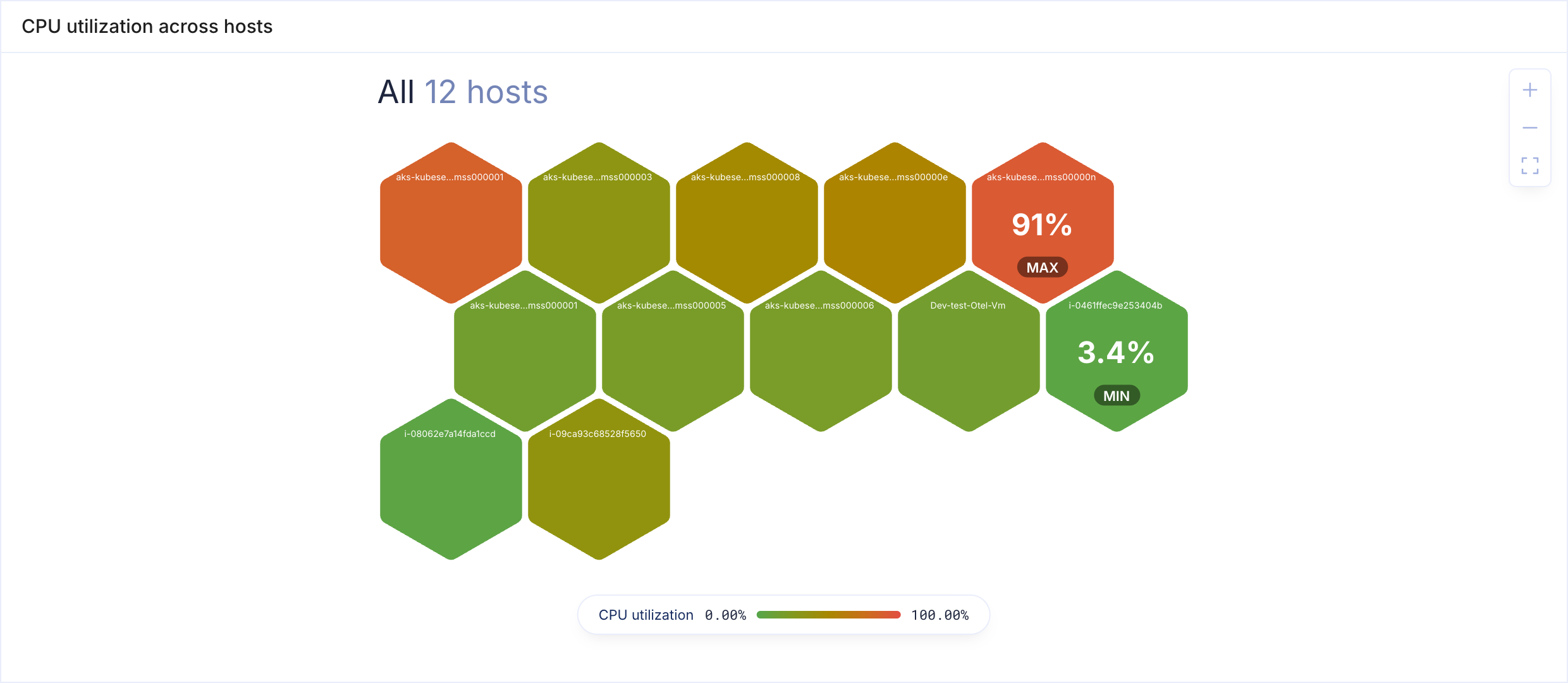
The Host Map visualization draws every host as a tile, with its pods and containers nested inside. Each level is coloured by a signal such as CPU utilization or readiness, so a hot host or a pod that is not ready stands out at a glance.
When to Use
- Finding the busiest hosts in a cluster, and the pods running on them
- Spotting pods that are not ready, or containers that keep restarting, across many hosts at once
- Comparing clusters or namespaces side by side, one section each
A host map answers "where is the problem" better than a chart, because every host is on screen at once and its position never changes. Use Time Series when you need to see how a value changed over time.
Building a Host Map Panel
- Open the Data Explorer
- Select Host Map as the Panel Type in the right sidebar
- Pick a Predefined query, or build your own levels (see below)
- Click Run to render the map
A new host map starts with hosts filled by CPU utilization, coloured green when idle and red when busy, in one section.
Host maps need no PromQL. You choose what to draw, and KubeSense works out the metrics for Kubernetes clusters and for plain VM or Docker hosts alike.
note: Host Map appears in the panel type list only for users with access to the Infrastructure module. See Role Access.
Predefined Queries
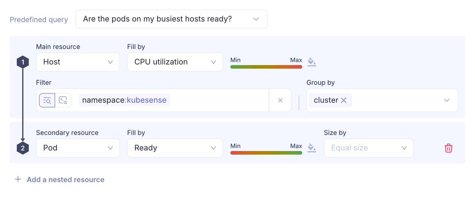
Each predefined query is a question, and picking one sets the levels, grouping and colours to answer it. Your filters are kept.
| Predefined query | Levels | Grouped by |
|---|---|---|
| What is the CPU utilization across my hosts? | Hosts by CPU utilization | Cluster |
| Which hosts are running out of memory? | Hosts by memory utilization | Cluster |
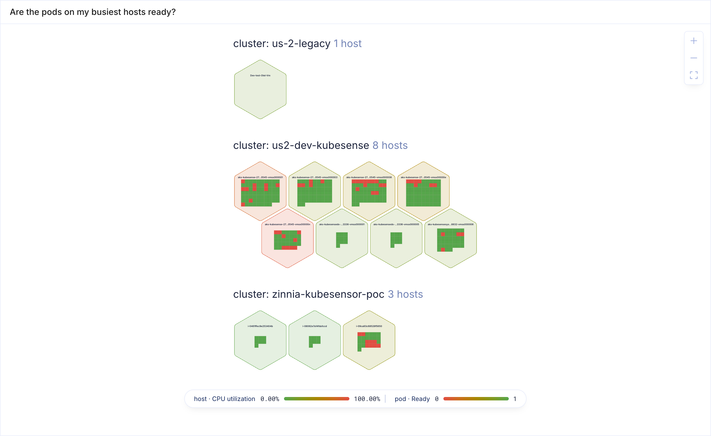
| Are the pods on my busiest hosts ready? | Hosts by CPU utilization, pods by readiness | Cluster |
| Which pods are restarting, by namespace? | Pods by restarts | Namespace |
| Which containers are closest to their memory limit? | Hosts and containers by memory utilization | Cluster |
| How full is each host? | Hosts by memory utilization, sized by pod count | Cluster |
| Where is CPU going, by workload? | Pods by CPU usage, sized by CPU usage | Workload |
When you change the levels or grouping, the picker shows Select a predefined query. Click the clear icon to go back to the default map.
Levels
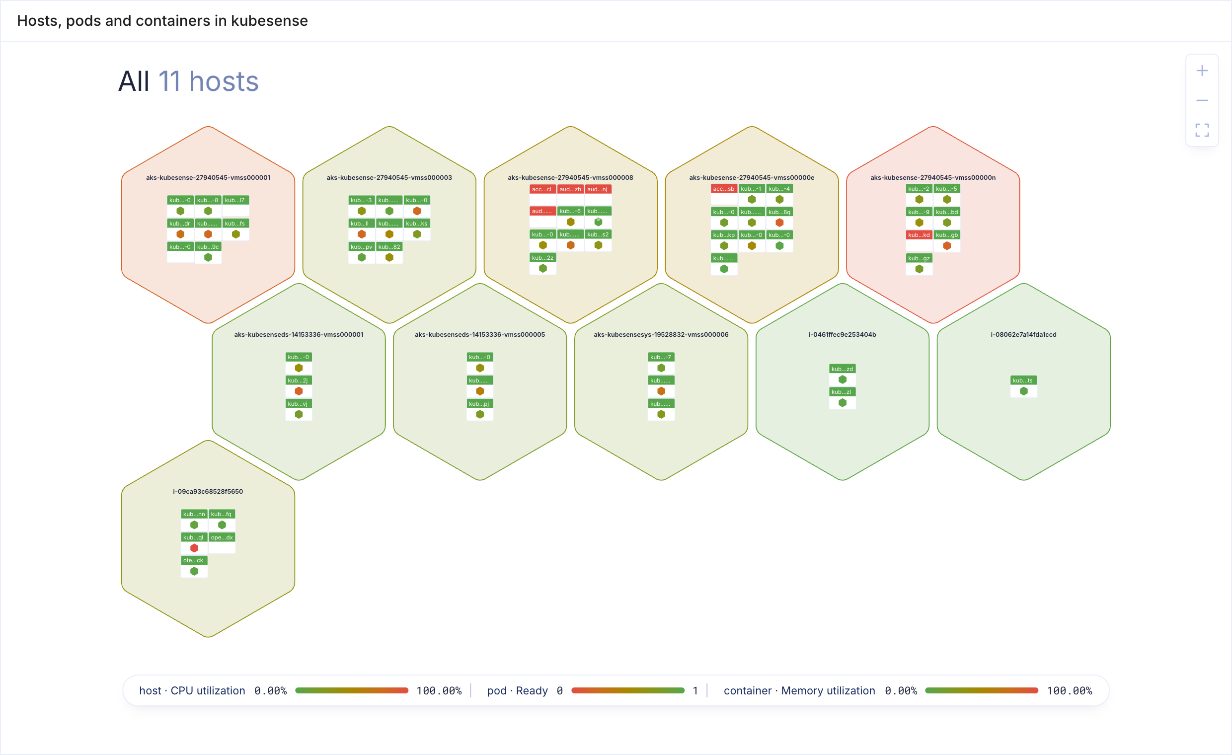
A host map has one to three levels, nested in a fixed order: host, then pod, then container.
| Level | Drawn as |
|---|---|
| First | Hexagons |
| Second | Squares inside each hexagon |
| Third | Hexagons inside each square |
Click Add a nested resource to add the next level inside the last one. Click the delete icon on a nested level to remove it. The first level cannot be removed: change its Main resource instead.
A level can be skipped. Host then Container is how VM and Docker hosts are drawn, because they have no pods. A level can never repeat or go back up: pods cannot contain hosts.
Fill and Size
Each level's Fill by signal sets the colour of its tiles. The innermost level can also set Size by, which scales its tiles by a second signal. Outer tiles are as big as what they hold.
| Signal | Unit | Host | Pod | Container |
|---|---|---|---|---|
| CPU utilization | % of the CPU limit for pods and containers, % of the host's capacity for hosts | ✓ | ✓ | ✓ |
| Memory utilization | % of the memory limit for pods and containers, % of the host's capacity for hosts | ✓ | ✓ | ✓ |
| CPU usage | Cores | ✓ | ✓ | ✓ |
| Memory usage | Bytes | ✓ | ✓ | ✓ |
| Ready | 1 when ready, 0 when not | ✓ | ✓ | ✓ |
| Restarts | Restarts during the selected time range | ✓ | ✓ | |
| Pod count | Pods running on the host | ✓ |
A pod or container with no limit has no utilization, and is drawn as No data. Restarts and pod count come from Kubernetes only, so VM and Docker hosts show them as No data.
A host map shows each tile's value at the end of the selected time range. There is no Step control for this panel type.
Reading the Map
Each tile shows its name, shortened in the middle when it does not fit, because names in one cluster often share a long prefix. Zoom in with the controls in the top-right corner, or click a tile to zoom to it. Labels stay readable as you zoom.
On a single-level map, the highest and lowest tiles also show their value with a MAX or MIN badge.
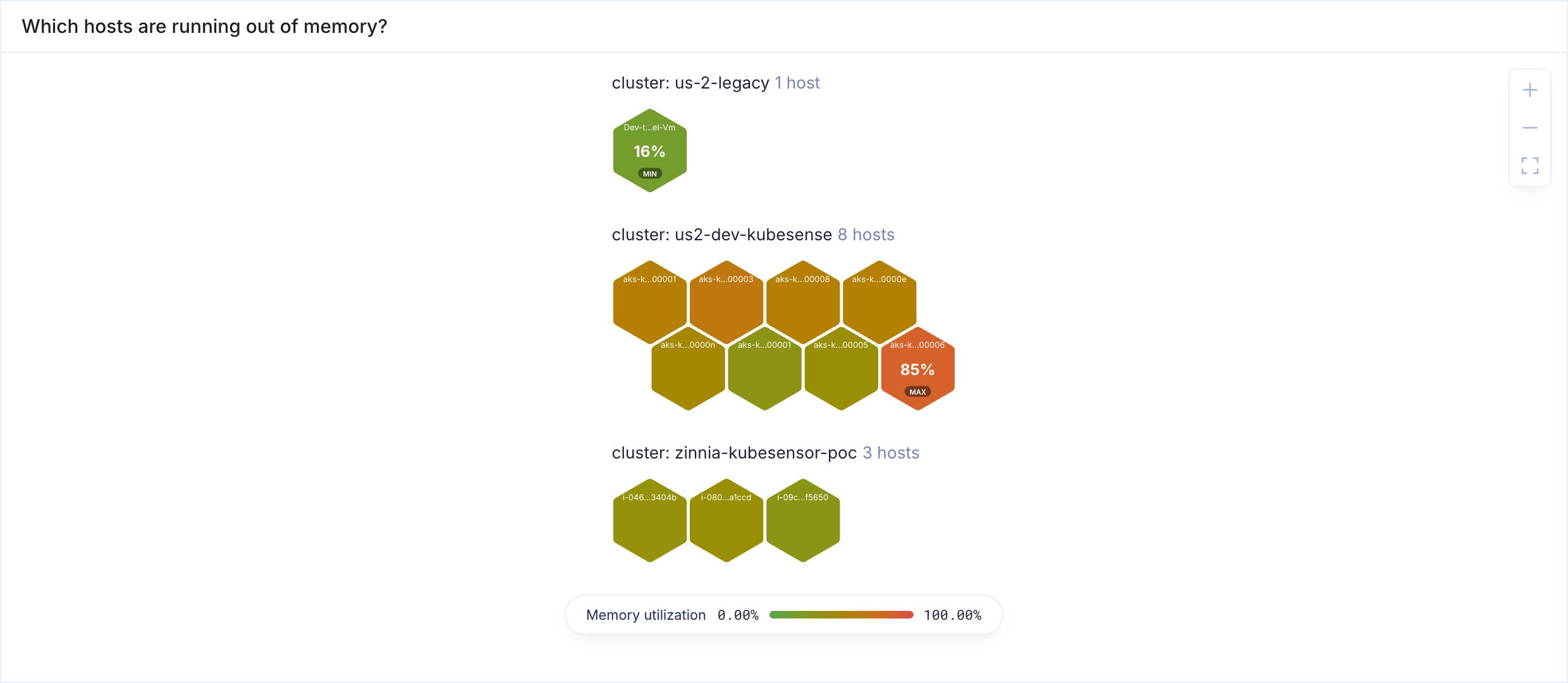
Hover a tile to see its name, type, value, and where it runs: cluster, namespace, workload and host.
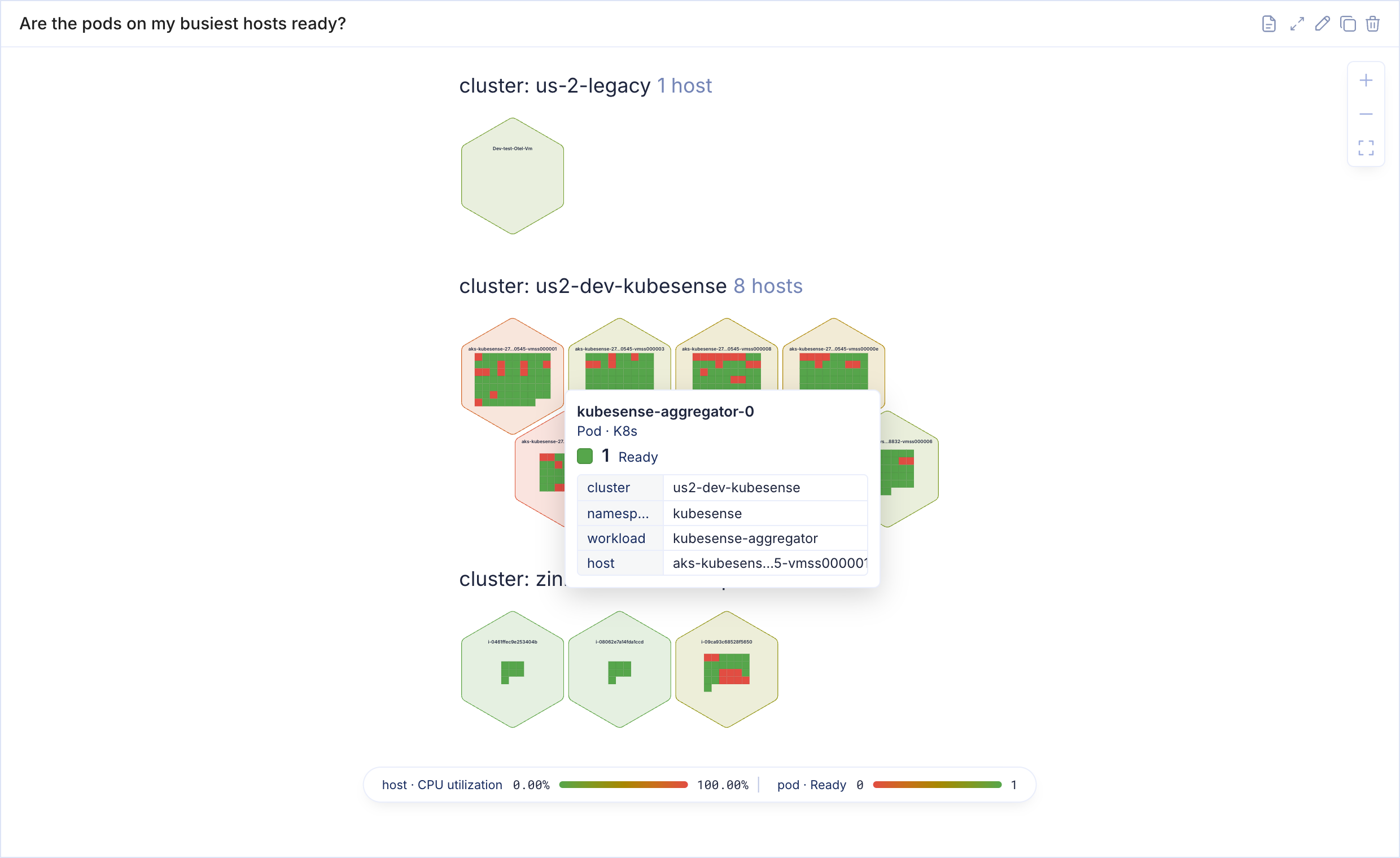
The legend at the bottom of the map shows each level's colour range, from its lowest to its highest value, named by the signal it colours. When the map has more than one level, each range also names its level. Tiles with no value for their signal are grey, and the legend lists them as No data whenever the map has any.
Filters
Filters narrow the map by cluster, host, namespace, workload and pod. Containers cannot be filtered, because no metric that places a container also names its host.
A filter on a pod-level field also narrows the hosts: filtering to one namespace shows only the hosts running its pods.
Basic
Pick a field and its values from the filter bar. Prefix a value with - to exclude it, for example -namespace:kube-system.
Advanced
Click the query icon in the filter bar to write an expression instead:

- Compare a field with
=,!=orIN, for examplenamespace IN (payments, orders) - Combine comparisons with
AND,ORand parentheses NOTgoes before a comparison:NOT namespace IN (kube-system, monitoring). Writingnamespace NOT IN (...)is not understood.- Values can be dashboard variables, for example
namespace = $namespace
LIKE, > and < are not supported, because filters match exact names. An expression may expand to at most 16 alternatives: (a OR b) AND (c OR d) AND (e OR f) is 8.
Group By
Group by splits the map into one section per value, with a heading such as cluster: prod 8 hosts. What you can group by depends on the first level:
| First level | Group by |
|---|---|
| Host | Cluster, environment type (Kubernetes or legacy) |
| Pod | Cluster, environment type, host, namespace, workload |
| Container | Cluster, environment type, host, namespace, workload, pod |
Leave it empty for one section.
Colors
Each level has its own colour range, shown as a ramp from Min to Max beside its Fill by. Click the ramp or the palette icon next to it to change it:
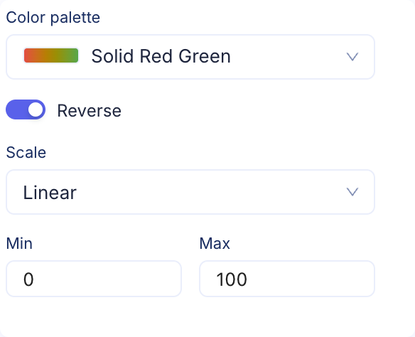
| Setting | Description |
|---|---|
| Color palette | The same palettes as a table column's range formatting, from single-colour ramps to two-colour ramps such as red to green |
| Reverse | Flips the palette's direction, for example green when low instead of red when low |
| Scale | Linear spreads colours evenly. Logarithmic suits counts such as restarts, where a few large values would otherwise wash out the rest |
| Min, Max | Fixed ends of the range. Leave empty to use the lowest and highest values on the map |
A level with no colour settings uses a neutral blue ramp over its own range, which suits a value that is neither good nor bad, such as memory usage. For a signal with a good and a bad end, set fixed bounds: 0 to 100 for utilization, or 0 to 1 for readiness.
Visual Formatting Rules
Rules colour the outermost tiles by their value, in the unit of their fill. Open Visual Formatting Rules in the right sidebar and click Add Condition, then choose an operator, a value and a style.
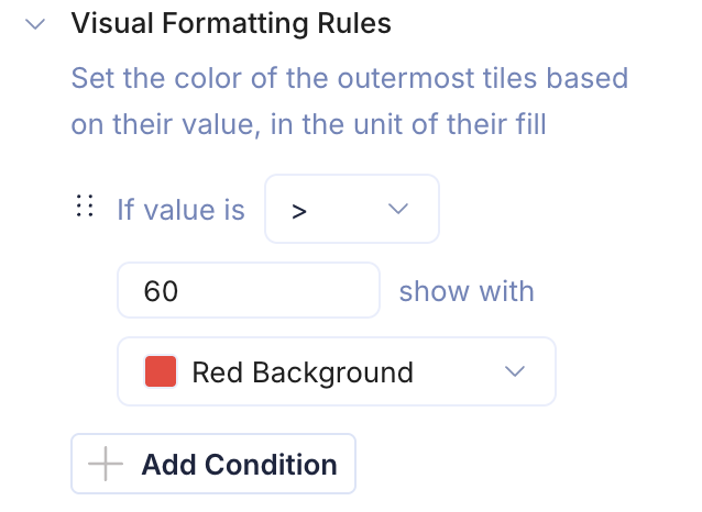
Once any rule exists, outer tiles that match no rule turn neutral, so the matching tiles stand out. Inner levels keep their own colours. Rules apply as soon as you add them, without clicking Run.
In this example, hosts above 60% memory utilization are red:
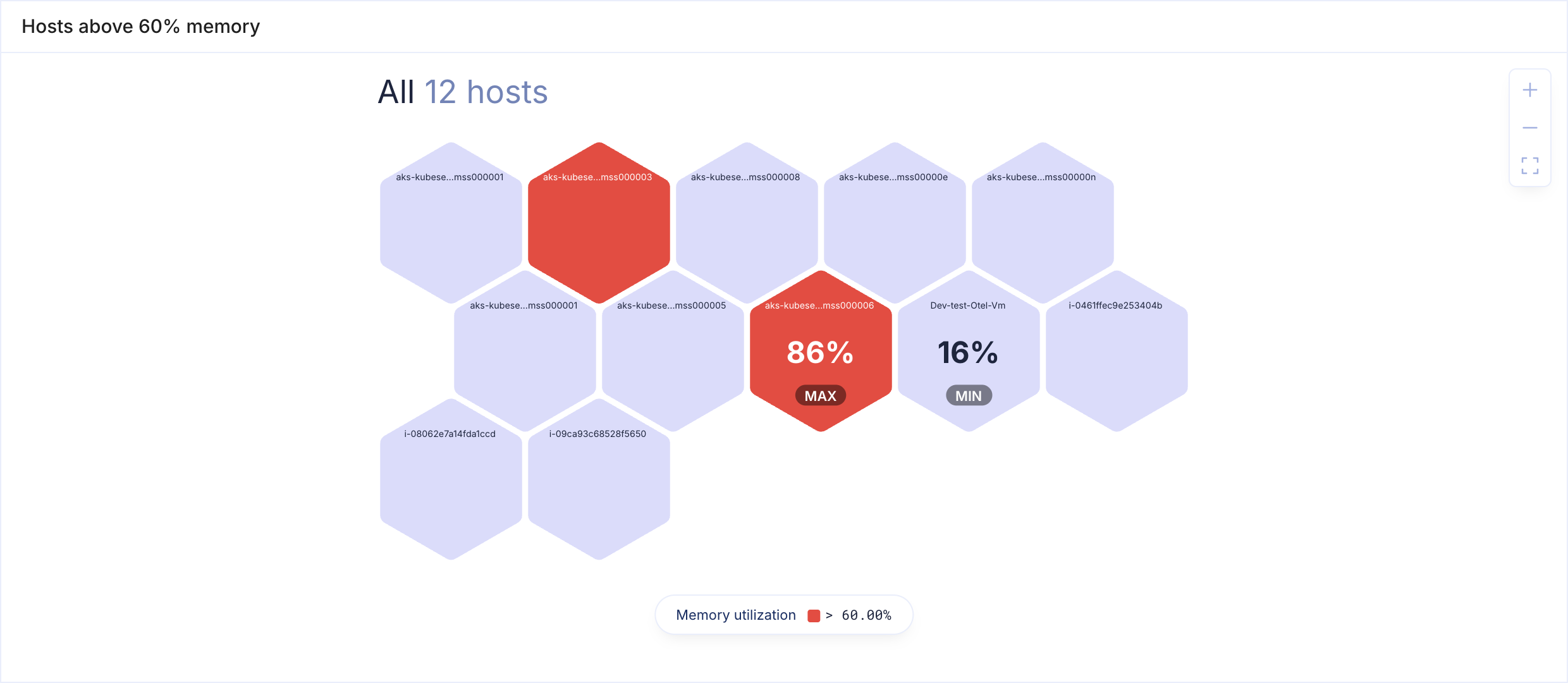
The last matching rule wins, as with Top List.
Access
A host map shows only the hosts, pods and containers your role can see. A role scoped to a namespace still sees the hosts of its cluster, but only its own namespace's pods.
Viewers without access to the Infrastructure module see a message in place of the map.
Building Host Maps with AgentSRE
AgentSRE and other agents connected through the KubeSense MCP server can create and edit host map dashboards. Ask for the question you want answered, for example "a host map of pod readiness on my busiest hosts". If the agent's draft would not run, such as pods placed above hosts or a filter on containers, KubeSense tells it exactly what to fix before the dashboard is saved.
Panel Configuration
Panel Options
| Option | Description |
|---|---|
| Name | Display name shown in the panel header |
| Description | Optional description for additional context |
Limits
- At most three levels, always nested host, pod, container
- One query per panel
- Containers cannot be filtered
- Clusters are shown as sections, not as a level of their own